In this guide I want to give an overview of the main features of the Pinegrow Web Editor, showing the main panels used to put together web pages.
If you are new to Pinegrow this should get you operational in no time. Going forward in future guides, we will do a deep-dive into each of the various panels and tools provided by Pinegrow to make putting together web sites quick and easy. Along the way I’ll try and point out “easter-eggs”, little features nested into Pinegrow that you might not know about.
Let’s get started!
Prefer to read? Scroll past the videos.
This tutorial is available in video and textual form. Watch the videos, or continue reading if you prefer to read. Of course, you can also do both!
The start screen
When you first open Pinegrow you are presented with four choices, “New page or project”, “Open File”, “Open url” and “Open project”, along with several links that lead to documentation and tutorials.
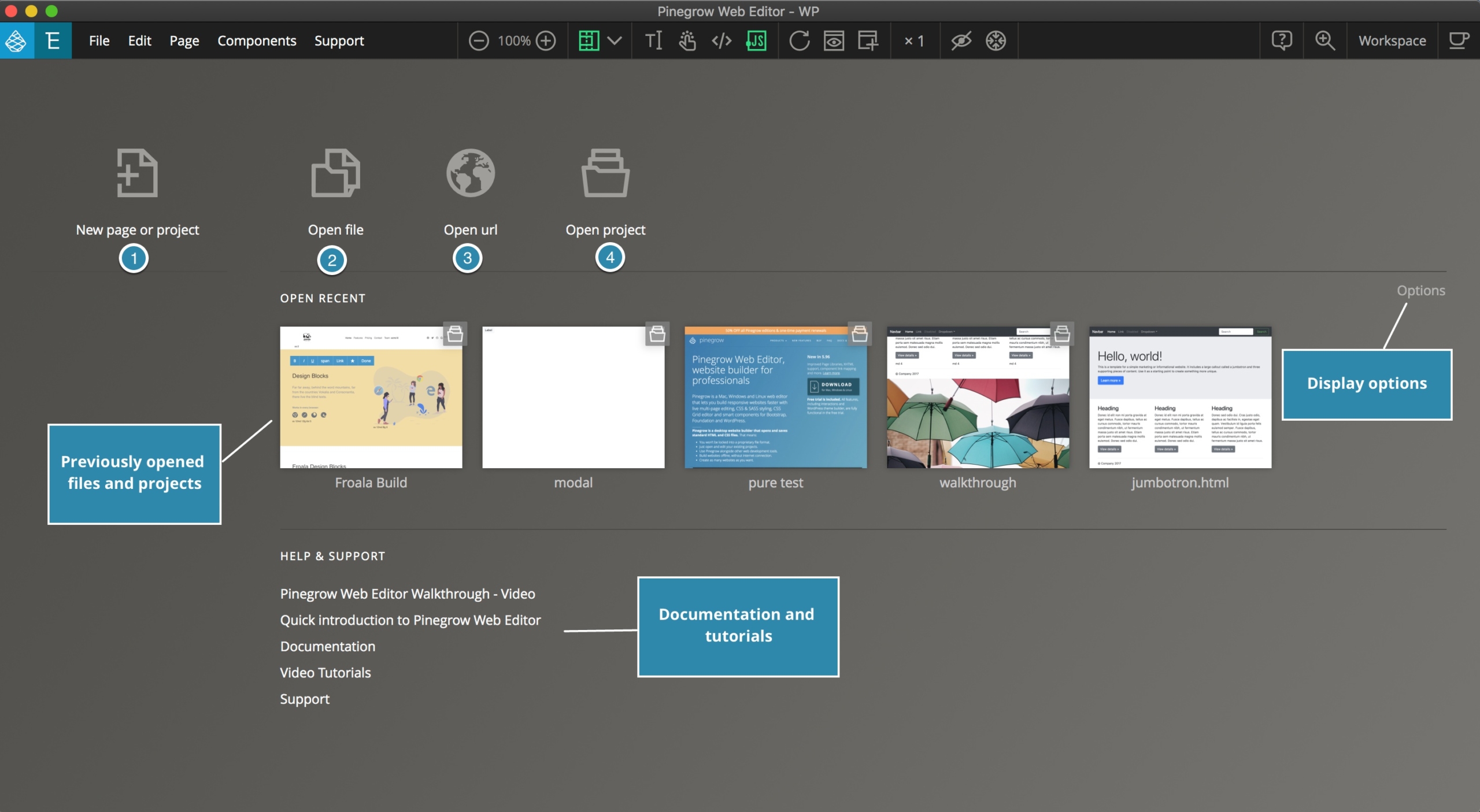
Clicking on the first icon will bring up a window where you can choose the type of page or project you wish to create, as well as various pre-made templates for the different project types. We will come back to this.
The second icon allows you to open either files previously created with Pinegrow, or any code editor.
The third icon, “Open url” allows you to open any website for making changes locally. Any changes to HTML and CSS will be saved to your computer. Note: all of these changes are just being made locally. No changes are uploaded – this has to be done manually when the changes are completed.
The final icon allows you to open a folder with your website as a project. This is the recommended way of opening a website because it gives you a complete view of all resources, including all of the HTML, CSS, PHP, or JavaScript for a particular set of web pages. In addition, many powerful Pinegrow features work only with projects.
Once you have opened a file or project, the next time you start Pinegrow or close all files and return to the base screen you will have an additional section for recently opened files or folders. You can control the appearance or clear out all of the stored files through the “Options” link on the right side of the window.
Starting your first project
Let’s quickly start a new project and then look through more Pinegrow features.
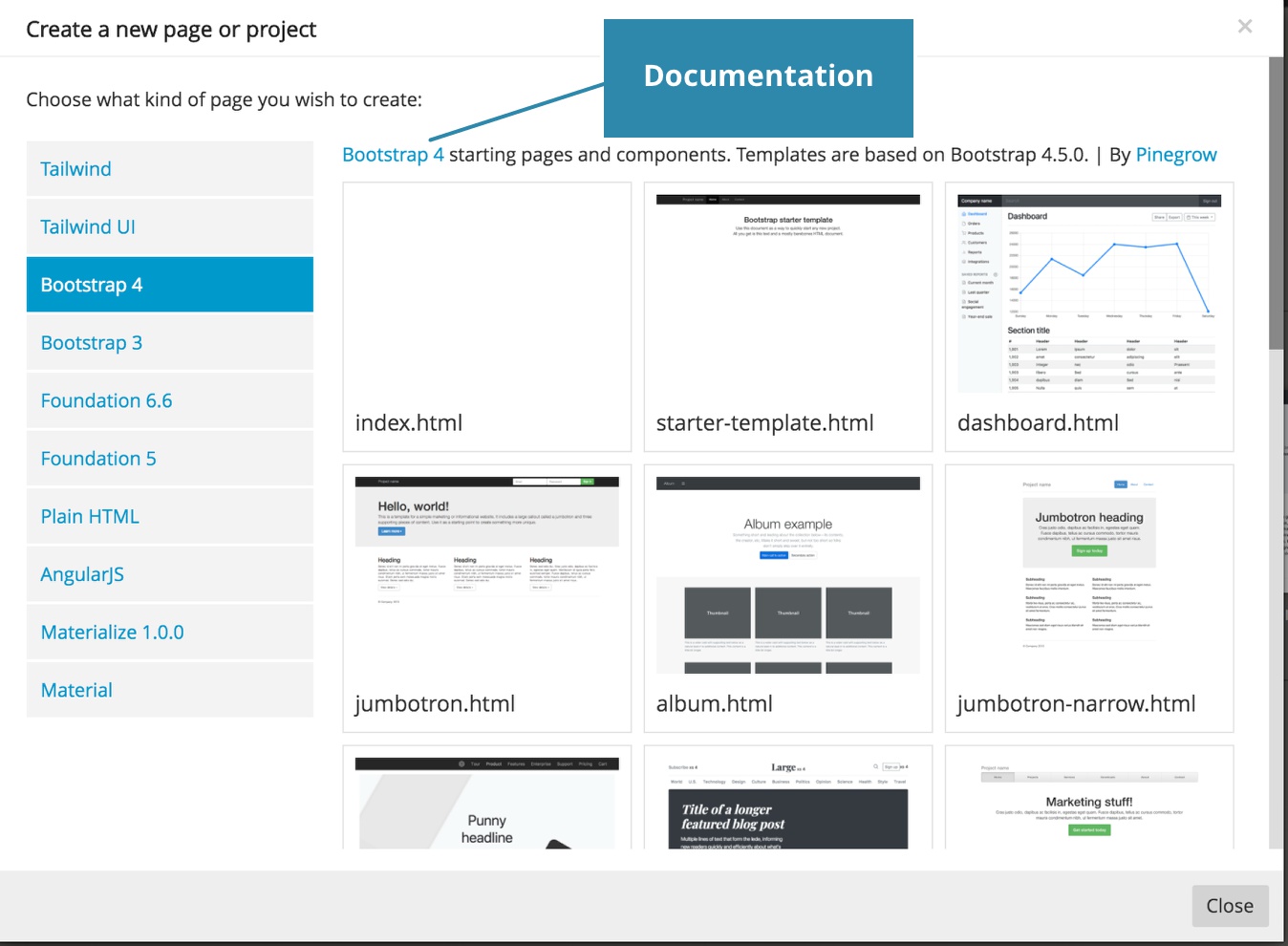
Clicking on the first icon opens a modal listing available frameworks on the left and a series of templates available as starter pages on the right. For more info about any of the frameworks you can click the link above the templates to go to the official documentation.
Starting a new project
I’m going to select the “Bootstrap 4” framework and “album.html” template just to show you some Pinegrow features.
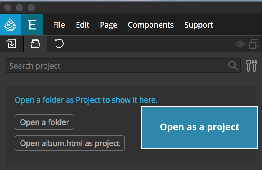
Once you have the template open it is best to save it and reopen as a project. Once you save the file there will either be a pop-up asking if you want to open your file as a project, or you can click on the button in the “Project” panel.
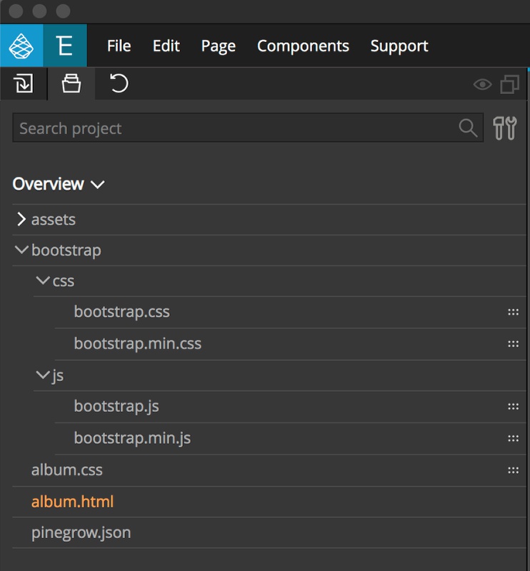
Once you have your project open the “project” panel will display not only your template page, but also the various assets like framework styling and JavaScript. The majority of these files can clicked to be opened and edited directly in Pinegrow, however only HTML, and certain templating languages can be visually edited. Other types like JavaScript will be opened in the built-in code editor.
Pinegrow panel overview
The Pinegrow web editor workspace is broken up into panels that each let us observe or edit some aspect of our project. Except for the main “Page View” panel, all of the panels can be rearranged by dragging them where we want. Each can be collapsed down by clicking on the panel icon, or moved to another monitor by clicking on the icon in the upper right corner. Let’s take a brief look at each of the basic panels.
The Page View panel
The main panel of Pinegrow is the Page View. This panel displays our code as it will appear in the browser. We can edit any of the on-screen elements. As you move your cursor around the page editable elements will become outlined.
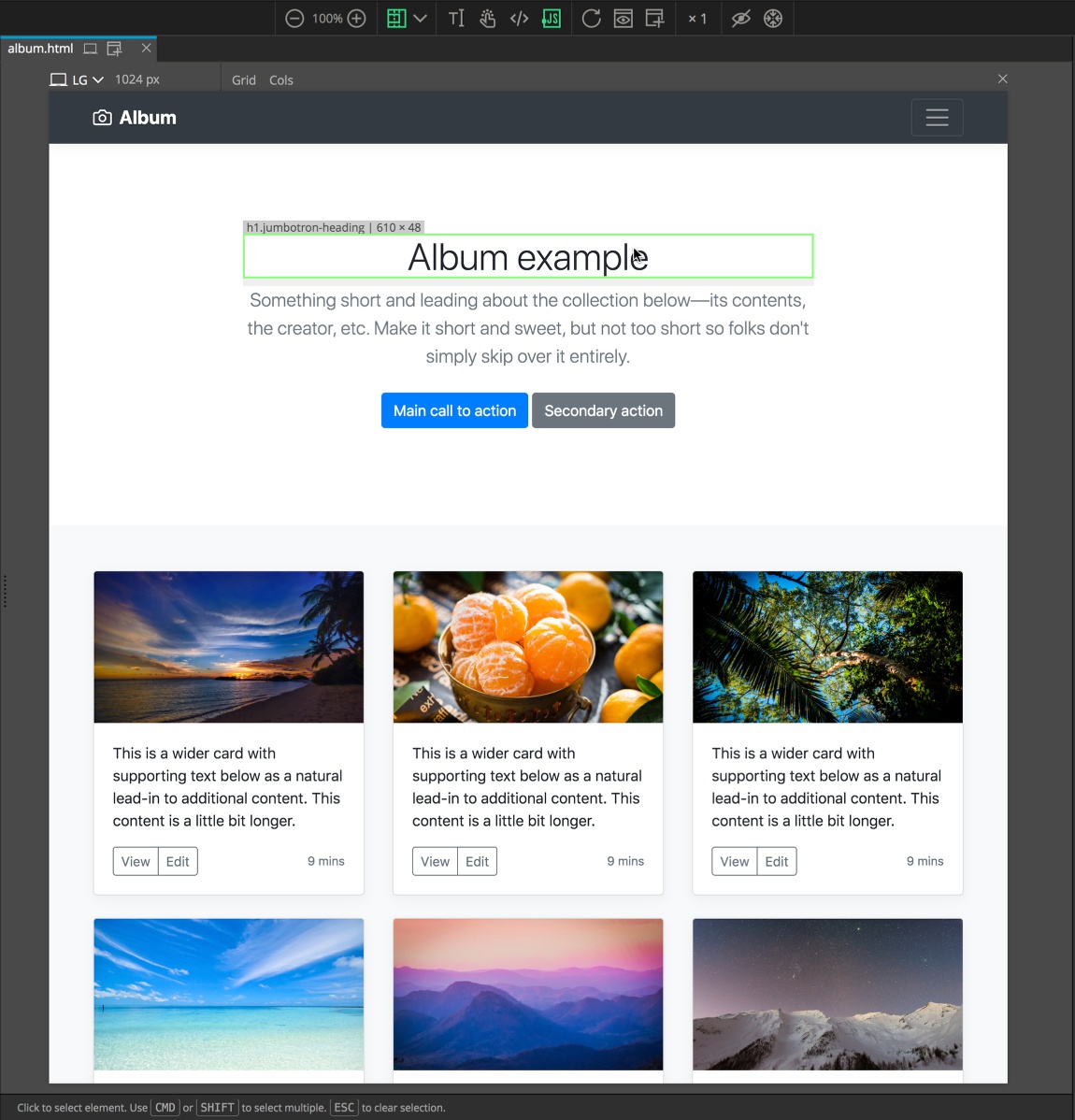
Clicking will select the item and change the color of the highlighting.
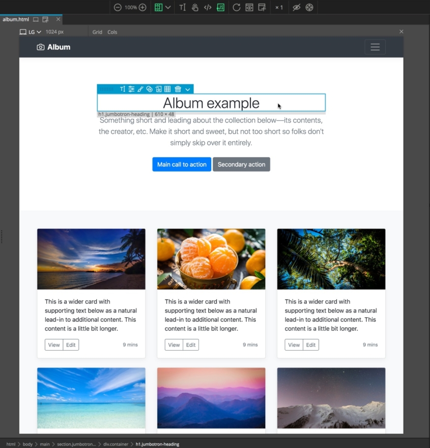
Depending on your options you will also see a small blue menu. This allows us to perform a number of functions and edits to the selected item that we will go into later.
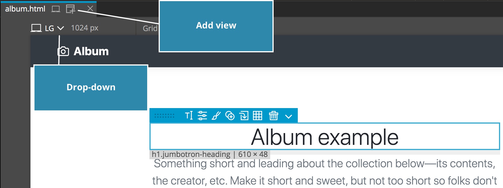
An additional option in the Page View panel is the ability to have our page displayed in different sized windows. This allows us to simulate how our page will look on a tablet or mobile, in addition to different sized desktops. You can select to have only one simulated page open at once and change sizes through the drop-down menu, or have several open at once by clicking on the add-view icon.
Next, let’s look at some of the other panels.
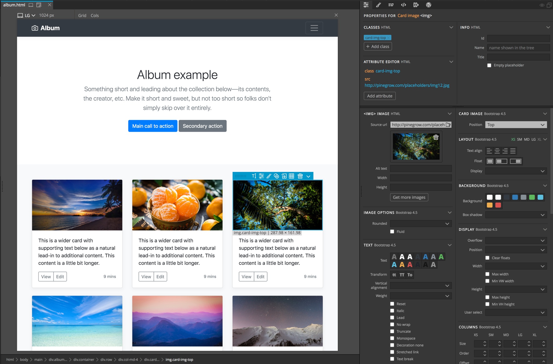
The Properties panel
The properties panel allows us to both see the attributes that have already been added to an element, but also to add or delete them. Attributes like class and id.
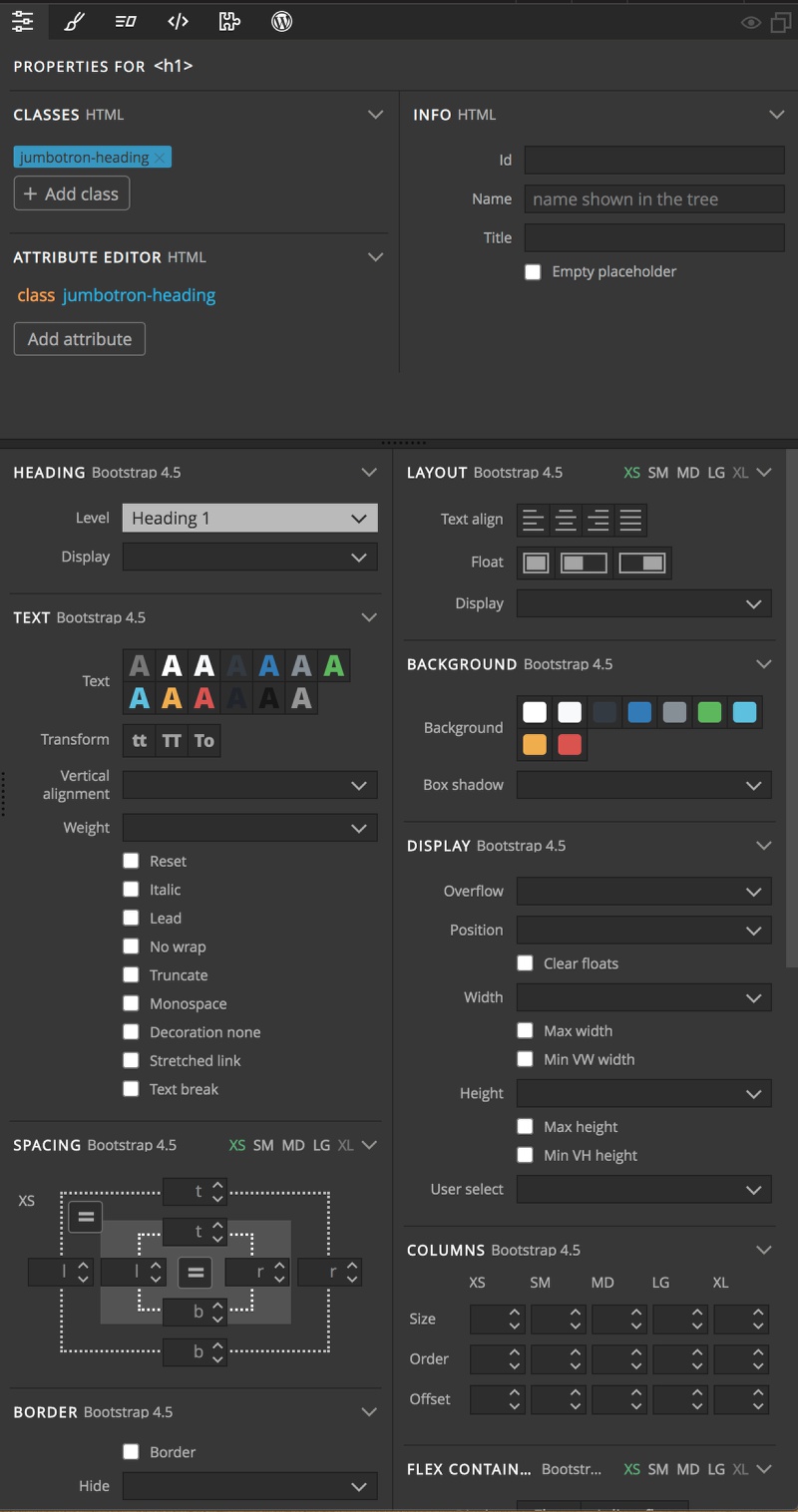
The lower section of this panel displays a number of controls. Depending on both the framework that is being used (in this case Bootstrap 4), and the type of element selected these controls will change.
In this case, I had selected the heading text, so I have controls for changing the text color and alignment. If I select an image on the page, you can see these options change to image appropriate controls,like the source url of the image.
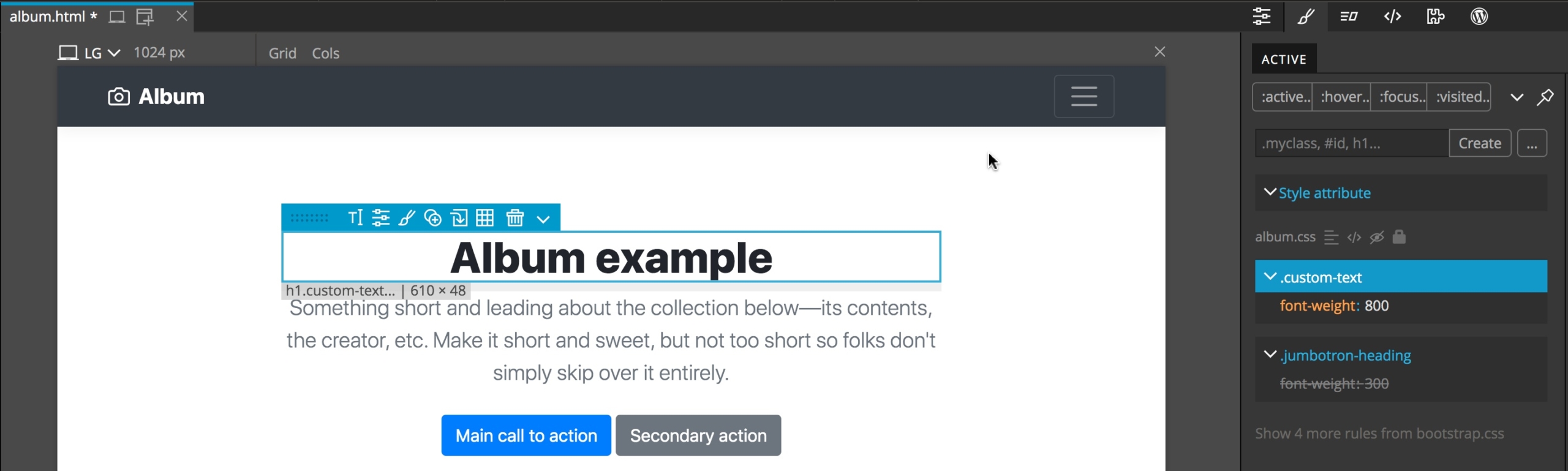
The Styles panel
The next major panel for putting together a custom page is the “Styles” panel.
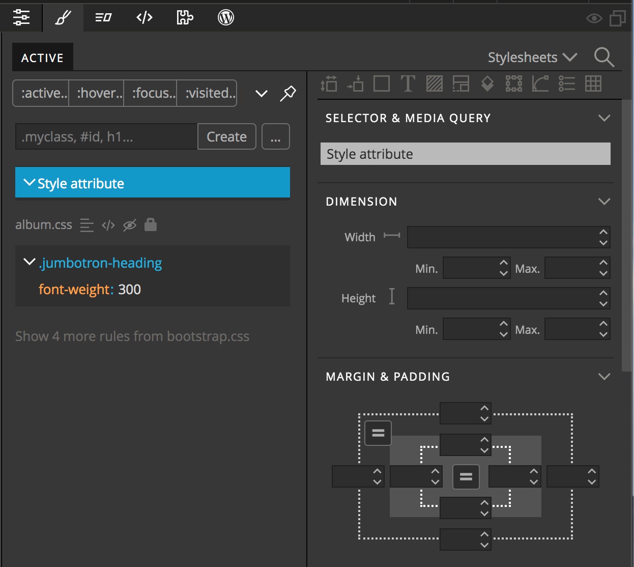
This allows us to create custom styling rules and apply them to the selected elements. It will also display any currently applied style rules. This is an important point that can trip up new users of Pinegrow. If we have rules that are only displayed at specific page sizes then unless we have our Page View set to that size the rule will not be displayed.
On the left side of the panel we can see here that there is one rule for styling our selected heading text being displayed. Below that in greyed-out text it says “Show 4 more rules from bootstrap.css”. By default any of the styling rules from the framework are not displayed because it isn’t good practice to alter the framework files.
On the right side there are controls for the majority of CSS styling rules. Once we create a new rule set by, for example creating a class, these controls can be used to set the styling.
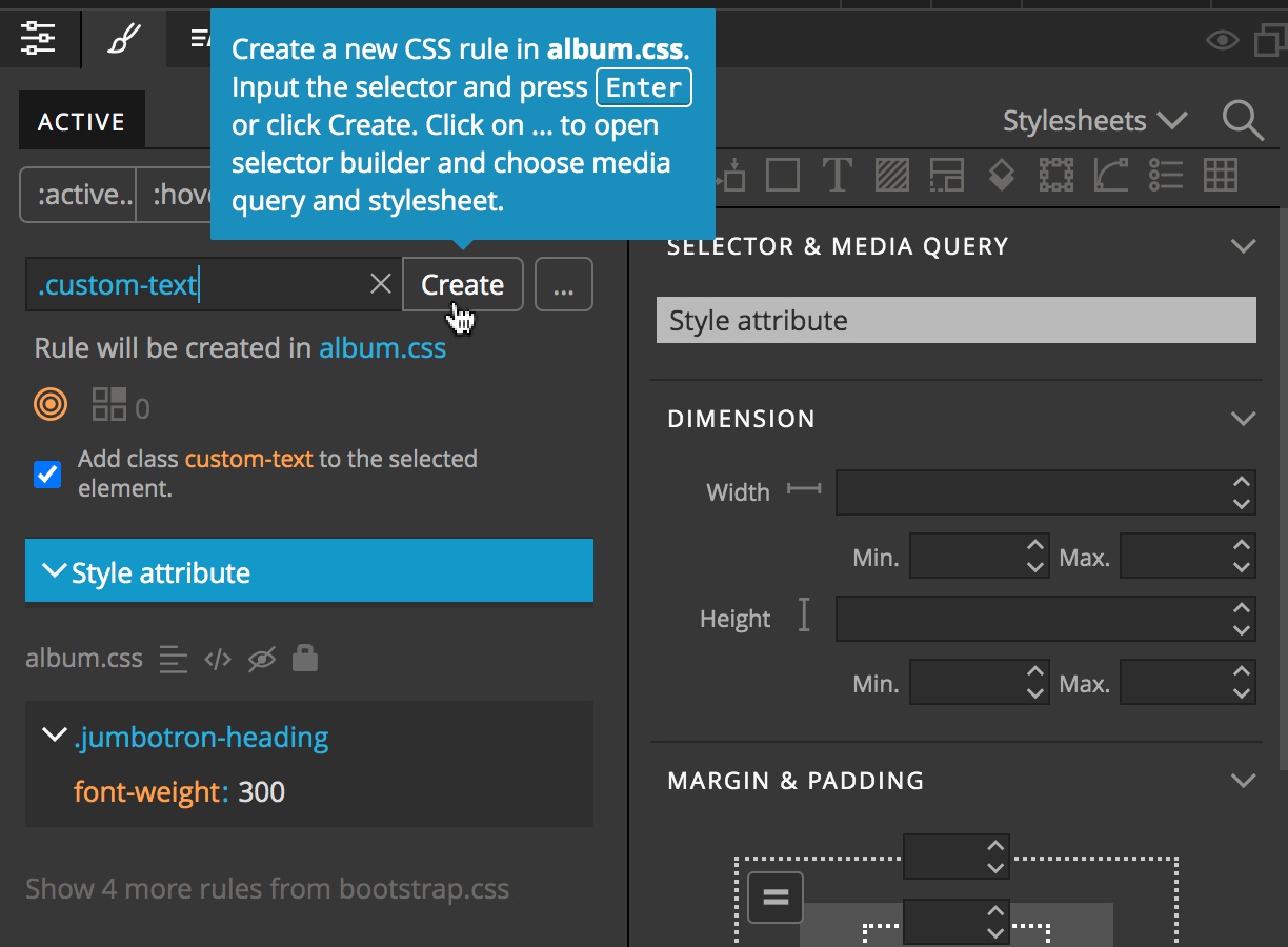
To create a new rule set we can add a selector into the input box at the upper left. I’ll create a new class called “.custom-text”. The class will be added to the selected element by default.
With the new ruleset created, we can scroll through the CSS rules, or jump to a section by clicking one of the icons at the top. We will click on the Text icon and change the font-weight.
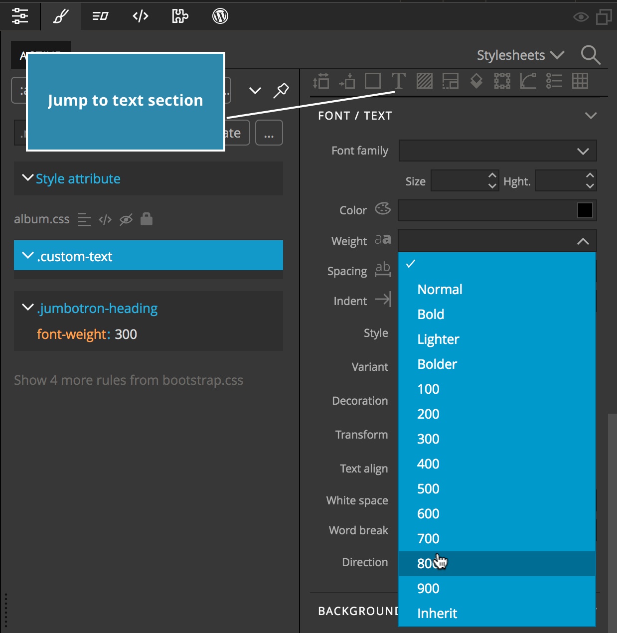
We can see the new rule applied in real-time to our element in the Page View.
Let’s move on to the next panel.
The Tree panel
The “Tree” panel gives us an overview of our page structure – basically it is an easy way to have an overview of the HTML code.
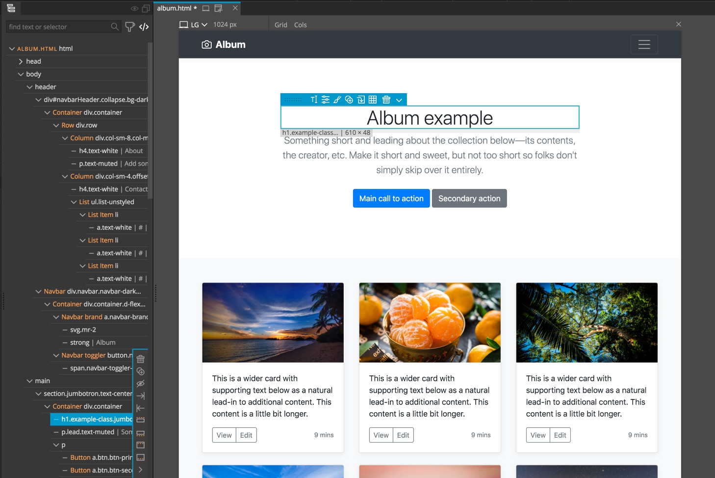
As you can see, the element I selected on the page is highlighted in the tree. You can also do the opposite – select an element in the tree and it will highlight in the Page View panel. Sometimes it is easier to select portions of a complex element this way. Again, anything selected in the tree will be available for editing just as selecting in the Page View allows.
Note: I prefer to have my Tree panel to the left of the Page View, next to the Library panel that we will talk about next. This is different from the default Workspace layout. But Pinegrow is wildly customizable, so conform it the way you want!
The Library panel
The final important basic panel of the Pinegrow Web Editor is the “Library” panel. This is the heart of the builder. Depending on the framework being used a whole host of elements will be displayed in the list tab.
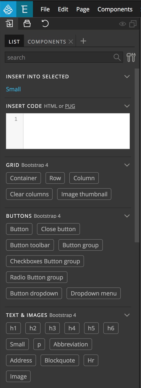
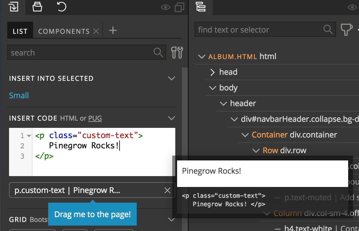
Any of these elements can be dragged from the Library either to the Page View or the Tree panel. At the top of the Library panel is a search box that lets you quickly find elements. If a component doesn’t exist, or you find some example code online there is also a code box for any custom code. Once code is entered into this box it will create an element that can be dragged to your page. This box is very useful for adding code found on the internet to your webpages.
Some frameworks have additional tabs. In this case, the Bootstrap 4 framework has a Components tab that displays additional elements that can be dragged to the page. Typically, these elements are the same as the elements in the List tab, but with styling options already added.
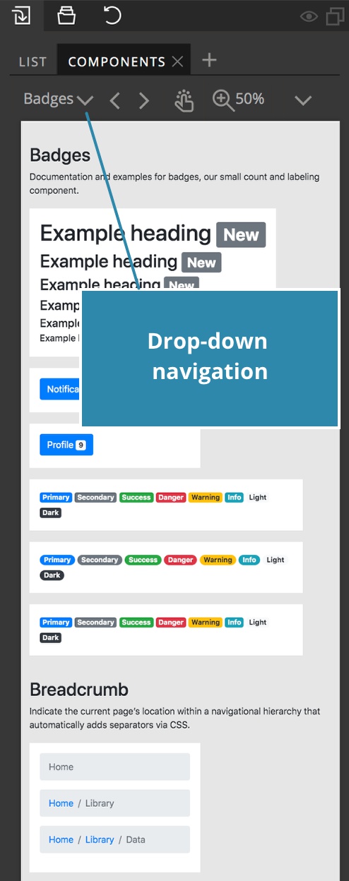
The various elements can be navigated either by scrolling or with the drop-down menu at the top.
Have questions or comments about this tutorial? Let’s talk about it on our forum.
Saving your project
After making changes to our pages we can save our project from the “File” menu at the upper-left of the Pinegrow window.
This will save all of our code locally to our selected project folder. Both HTML and CSS files are output as clean, normal code without any extra add-ons by Pinegrow.
That concludes this brief overview of the Pinegrow panel, but should be enough to get you started with designing. So far we have only scratched the surface of what Pinegrow can do. As you can see in the topbar, in addition to the normal menus, there are a number of other icons that control Pinegrow behavior. I encourage you to use the interactive tutorial to learn more.
In the next tutorials, I’ll dive deeper into more of the tools that Pinegrow offers by building out a small webpage.
I hope this tutorial has helped out to get you started with this powerful tool. Until next time, have fun designing with Pinegrow!
Discuss this tutorial
Have questions or comments about this tutorial? Let’s talk about it on our forum.
Get in touch
Would you like to see your favorite theme or blocks library featured in the next tutorial? Let us know in the forum or by email!