Learn how to easily and quickly add modals to your Bootstrap projects.
Modals are a great way to show extra content to your site users. They can also be useful for displaying enlarged images, presenting forms and notifications.
Let’s get started!
Prefer to read? Scroll past the videos.
This tutorial is available in video and textual form. Watch the videos, or continue reading if you prefer to read. Of course, you can also do both!
1. Open or start a Bootstrap 4 project.
Open up Pinegrow and click on either the “New page or project” or “Open project” buttons. If starting a new project, just make sure that you select a Bootstrap 4 project because Bootstrap 3 doesn’t natively support modals.
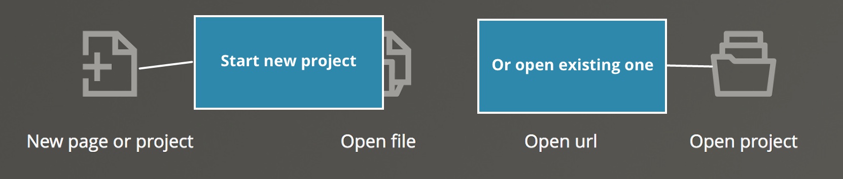
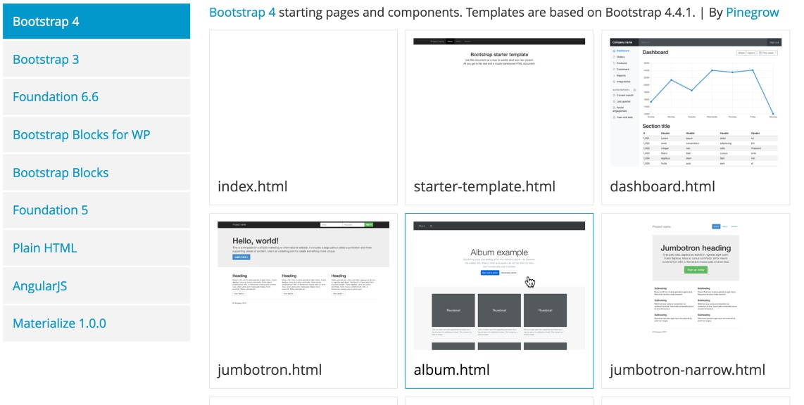
I’m going to start a new project and select the “album.html” template to use in this example, but you can use any template you wish. Next, save your file and open it as a project.
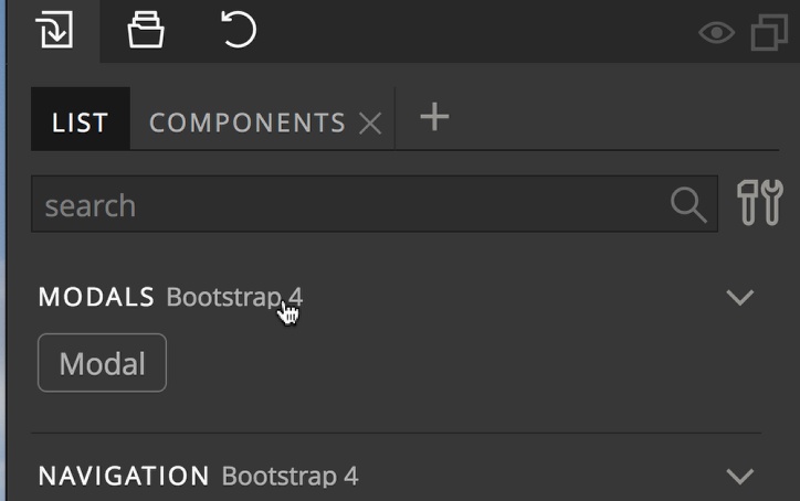
2. Select the modal element from the Library panel
Open the Library panel and select the modal element from either the “LIST” or “COMPONENTS” tab. The “LIST” only has a single element to select from while the “COMPONENTS” has 6. I’m going to choose the simple one from the list.
Drag the element to your page after the footer. Pinegrow will give each modal a unique id automatically, but I prefer to give my modals ids that describe their function. I’ll rename mine from “modal1” to “thumb_one”.
3. Edit the modal content
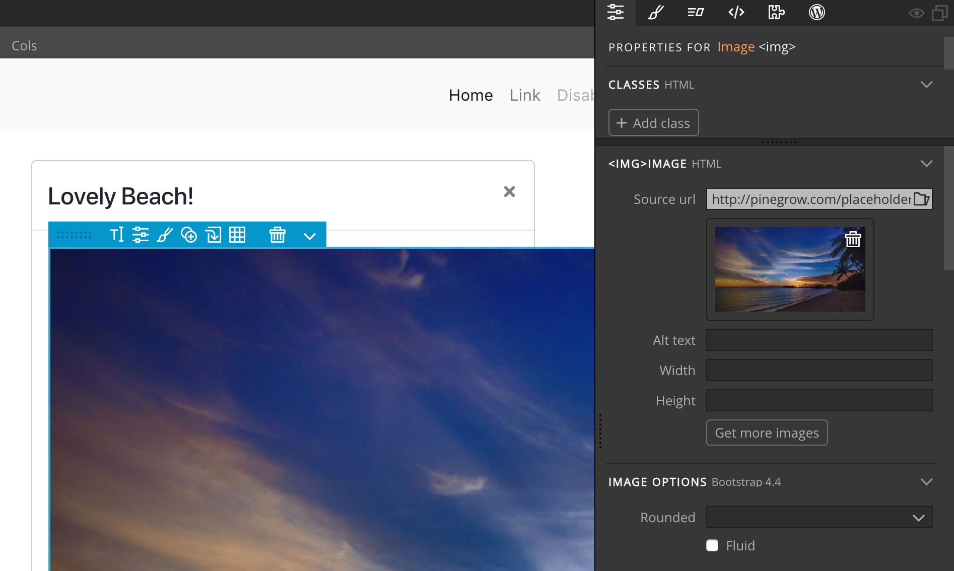
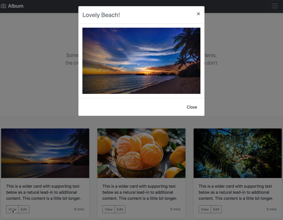
Style the modal as normal with the Pinegrow style and element tools. Since I’m using the album template I’ll use my modals as zoomed images for each of the album thumbnails. To accomplish this I’ll place an image element into the modal element body by dragging an Image from the Library panel to the Modal body.
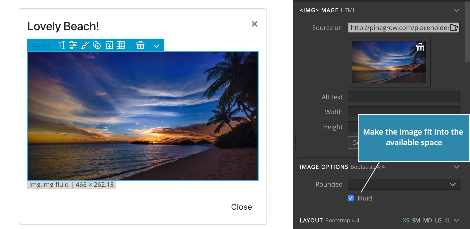
This modal will show a zoomed-in image of the thumbnail of the card at the top-left, so I’ll change the image to the same placeholder. The result doesn’t looks so great – the image is too large:
To keep the image constrained to the modal body, I’ll make the image fluid. That’s a Bootstrap property for making the image fit into the available space:
4. Select a modal trigger
There are multiple options for opening your modal. The simplest method is to use an existing button, or add one to the page and then set it as a trigger with the built-in Pinegrow tool. You can also use Javascript to allow any element on the page to be used as a trigger. This is useful when you want to pass in additional information. I’ll demonstrate both.
Using a button as trigger
For a button, I’m going to select the already existing “View” button of the first album card. In order to make a button a modal trigger we need two attributes. One that identifies it as a trigger, and one that tells Bootstrap which modal to open. We can either manually add these to any page element, but Pinegrow has a built-in tool for that!
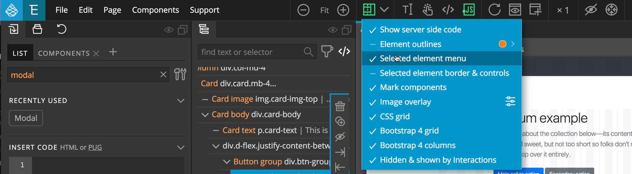
Make sure that Pinegrow is set to show the “Selected element menu”. Open the “Toggle visual helpers” dropdown from the top bar of the app and make sure it displays a checkmark next to the “Selected element menu”.
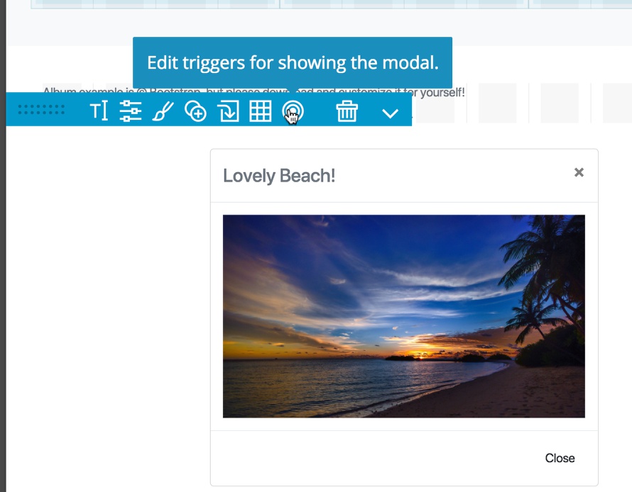
Select the modal in either the Tree or Page view and you will see the element menu in the Page view.
Select the bullseye icon.
When the popup modal appears click on the button to be used as the trigger. You can also select multiple elements by holding down the appropriate key for your OS (CMD for Mac and Linux, CTRL for Windows).
You should see the element(s) added to a list at the bottom of the modal.
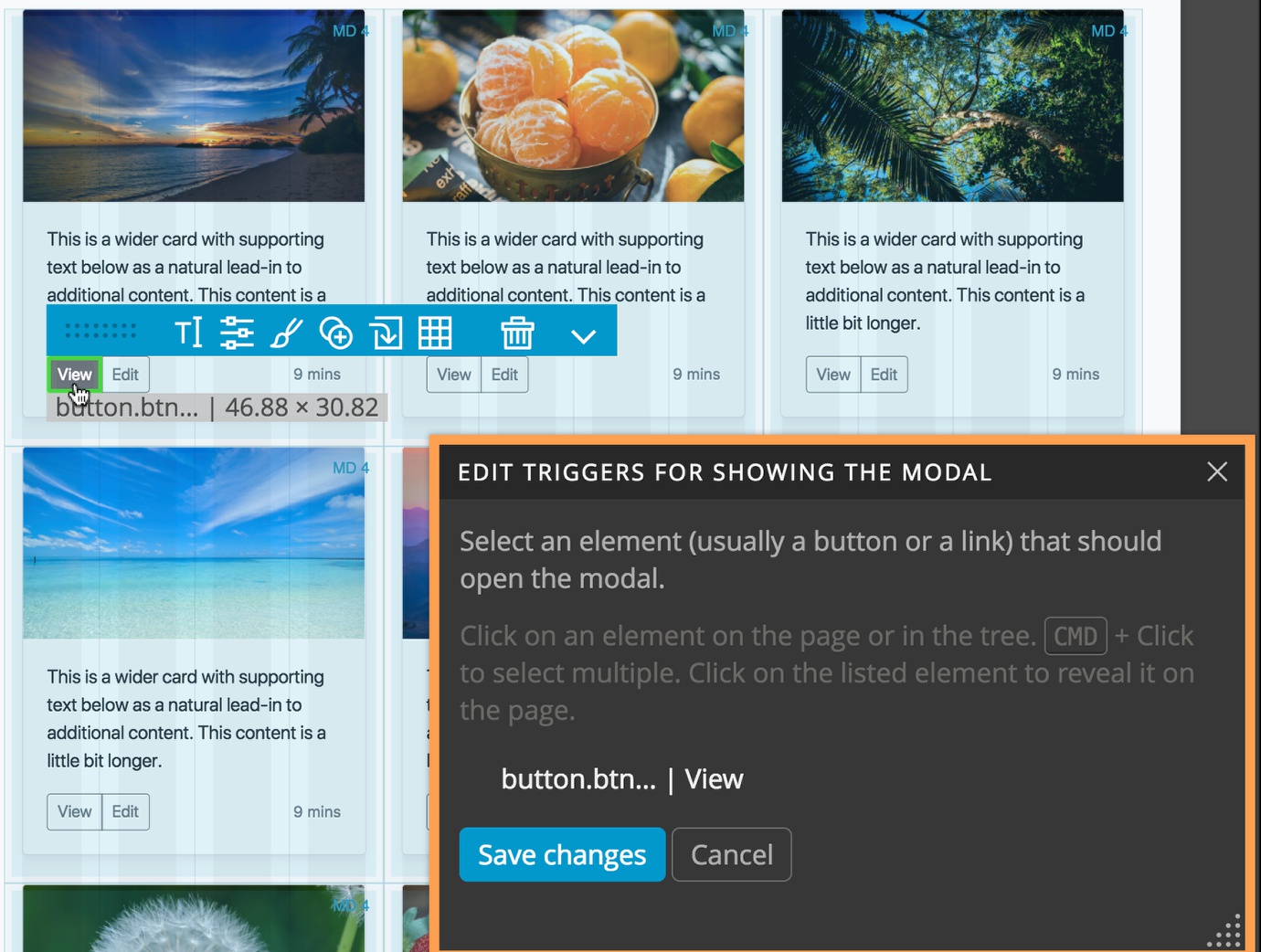
Click on the “Save changes” button.
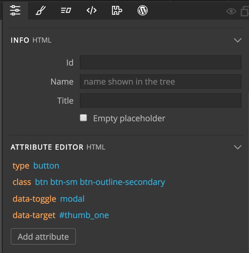
If we examine the button in the “Attribute Editor” on the Properties panel we can see two new attribute. The “data-toggle” attribute with a value of “modal”, telling Bootstrap to use this button as a modal trigger, and the “data-target” attribute with a value of “#thumb_one”, telling Bootstrap which modal to open on click.
If you check your page, you should now be able to trigger your modal!
Selecting a trigger with JavaScript
Another way to use an element on the page to trigger a modal to appear is through a click listener. This can be useful if you need to pass additional information at the same time as the click. For example, the Bootstrap modals are not automatically focused when opened and it has to be done programatically. As an example, I’ll use the image of the first thumbnail. There are a couple of ways (as usual) that you can do this. We are going to use a method that requires a little less code.
Select the element you want to use as a trigger in the Tree or Page view.
Click on the “Add attribute” button and type “onclick”, hit return, and then give it a value of “openModal()”.
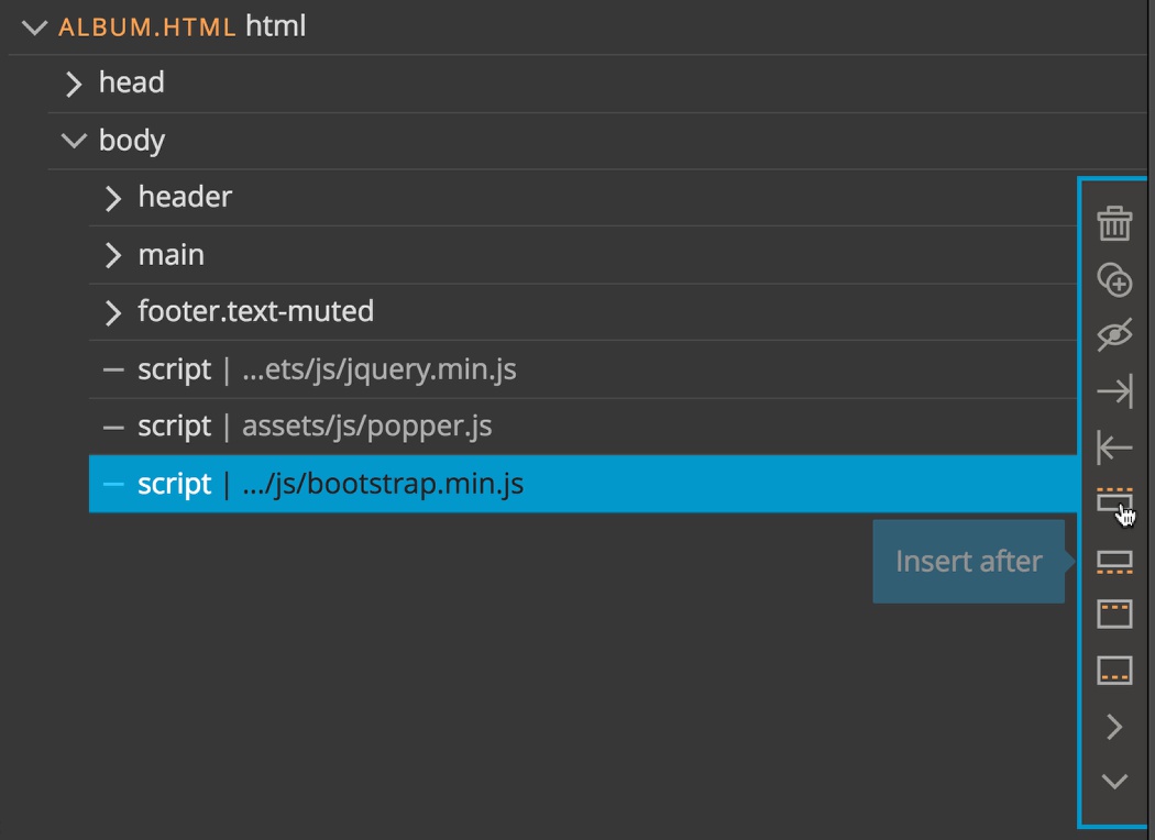
Next, select the last script on the page and click on the insert after button.
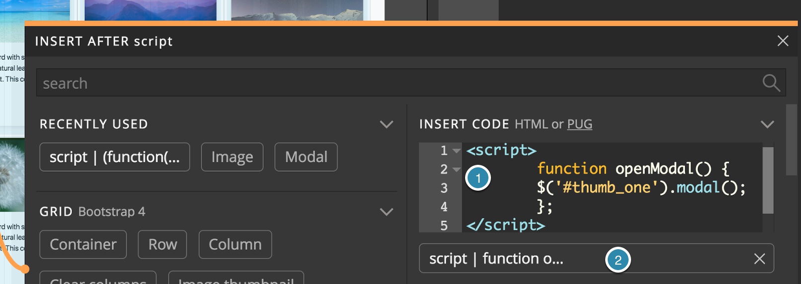
Within the “INSERT CODE” text area add the following code:
<script>
  function openModal() {
    $('#thumb_one').modal();
  };
</script>
This code is the simplest needed to open a modal with Bootstrap. There are a number of options that you can pass that are detailed in the Bootstrap documentation.
Click on the button below the “INSERT CODE” text area to add the code to the page.
Clicking on the image will now open your modal!
If you need to open multiple modals it would make sense to modify this code to take the modal id as an option, instead of hard-coded like this example, and pass it in the onclick. e.g. “openModal(thumb_one)”
5. Hide your modal during editing
Right now, even though the modal is after the footer, we can still see it and it might cause problems when we are checking our breakpoint styling. Pinegrow has a neat little trick for helping us out!
If we select the main modal element on the Tree or in the Page view we can see the modal properties in the Properties panel:
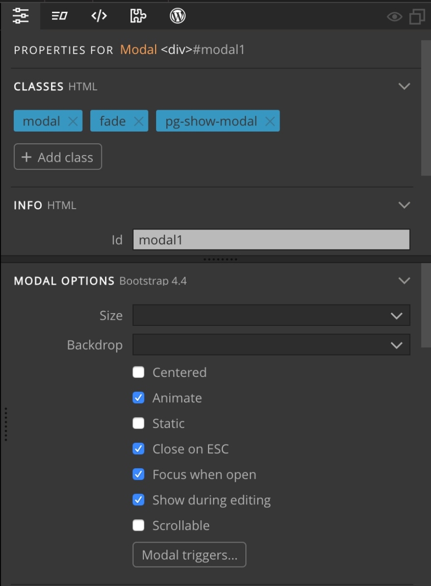
There we can disable “Show during editing” to hide the modal when editing the page in Pinegrow.
Pinegrow uses an internal class “pg-show-modal” to make the modal visible during editing in Pinegrow. This class has no effect on your page when viewed in the browser.
Modal options contain further useful settings for the modal. Just experiment with them to see what they do.
Discuss this tutorial
Have questions or comments about this tutorial? Let’s talk about it on our forum.
Get in touch
Would you like to see your favorite theme or blocks library featured in the next tutorial? Let us know in the forum or by email!