Pinegrow is all about choices. Adding styling to your page is no exception. Whether all code, low-code, or no code Pinegrow can let it happen!
One of the things that I love about Pinegrow is the ability to use it in my work flow the way I feel comfortable. There are multiple ways to accomplish many tasks, so I can work to put together pages in a fashion that I want, rather than having to adapt my workflow to how Pinegrow wants me to put together a page. However, for new users of Pinegrow (and sometimes even experienced users) this feature can cause a bit of decision paralysis.
In this short tutorial I’m going to break down several ways that you can add CSS to a page. How you decide to use Pinegrow in the end will be up to you, there is no right or wrong way!
Let’s get started!
Prefer to read? Scroll past the video.
This tutorial is available in video and textual form. Watch the video, or continue reading if you prefer to read. Of course, you can also do both!
Video – Pinegrow CSS overview
To illustrate the variety of different ways you can accomplish the same thing with CSS, I’m going to use an old project. This project set-up a Twitter clone called Woofer that had a toggle for day and night theme, as well as a dropdown to change the font size.
For this tutorial we are just going to look at styling some of the paragraphs. The first way that we can add styles is through the visual editor and inline styling.
Note: for those that are new to writing HTML and CSS, inline styling is when you add a “style” attribute to your HTML element along with the styles you want to add.
The easiest way to add styling in Pinegrow is to add it using the Visual Editor in the Styles panel as inline styling. To accomplish this, we just have to select the item and then add any styling using the editor.

So, for example, with the paragraph selected we can first click on the “T” icon to scroll to our Font/Text styling. Then, within the Color input we can type green. We could also click on the square on the right side of the input to get a visual color selector. As we can see, the text of the paragraph is now green. Looking at the actual HTML code of the element we can see the “style” attribute with a CSS property of “color” that has a value of “green”.
This is an easy way to add styling, but not the best practice for several reasons. First, if we want to make changes later, for example to change the color of all the paragraphs to red, we would need to make changes in several parts of our page. Second, adding our styles inline can make our page load time a lot slower.
We will come back to what we can do if we have a lot of inline styles already on our page after we cover another way to add styling.
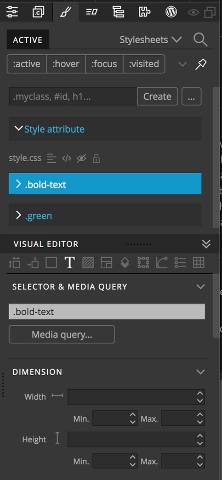
If you prefer using the Visual Editor to add your custom styling, the best way to do it is through adding classes to your elements and then rules to an attached stylesheet. This can be accomplished several ways.
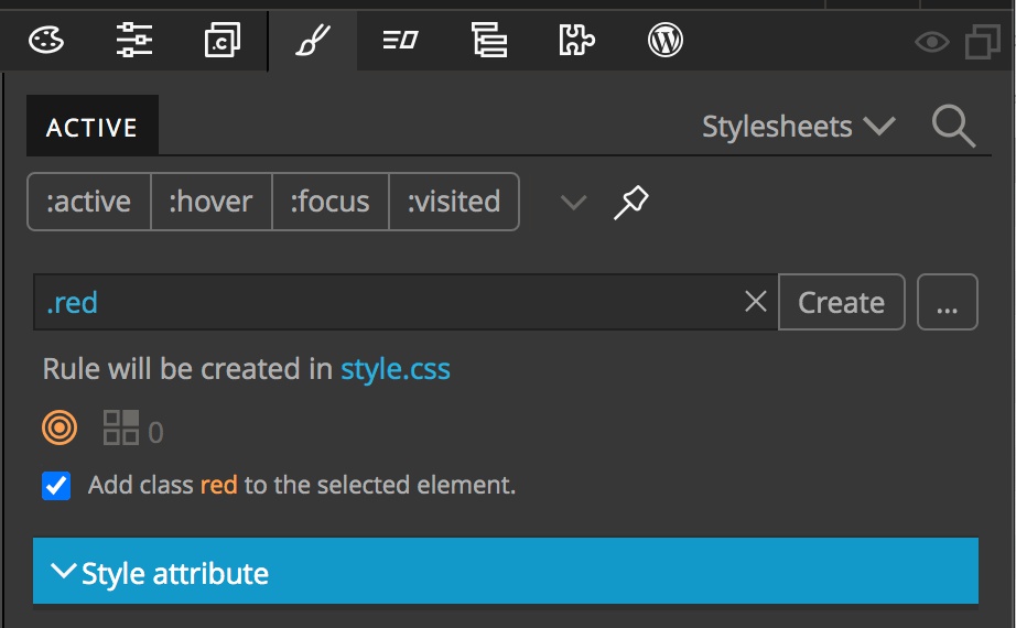
The easiest way is to select the element from the Page View or Tree and then navigate to the Style panel. Next, type the class name into the input box at the top – since we are adding a class, remember to prefix with a period. Since the new class name is not on the selected element, Pinegrow will offer to add it for us. You can also use this to create new rules without adding the class by unchecking the box.
Any other selector besides a class name, such as an id, has to be defined ahead of time.
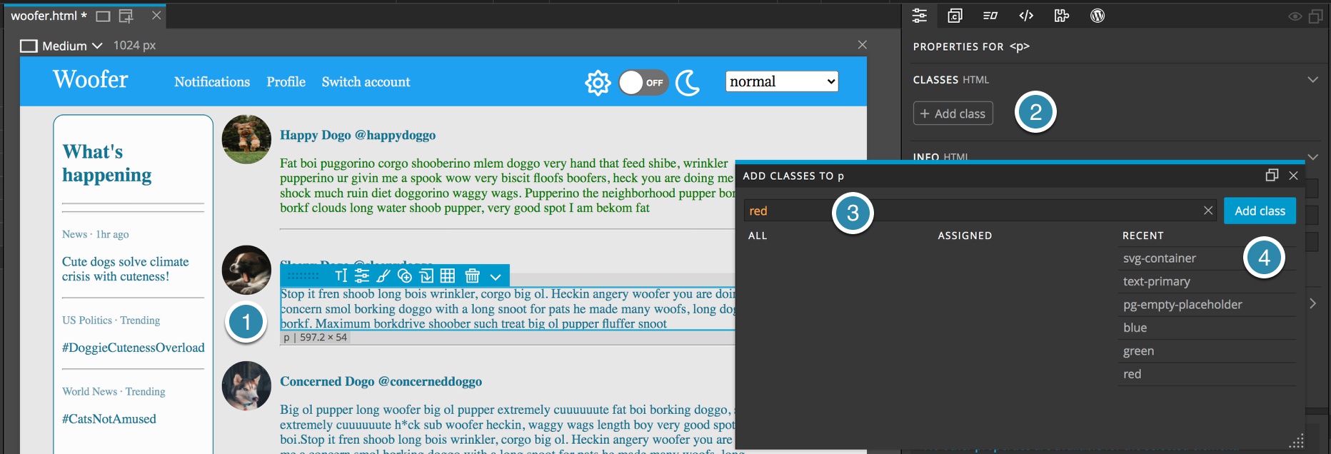
You can also elect to add a class from the Properties panel prior to creating the styling. To accomplish this, just select the element and click the “Add class” button. In the pop-up add the class name without prefixing with a period and then click “Add class”. This is useful to add the same class to multiple elements on the page quickly. You don’t have to close the pop-up to select additional page elements.
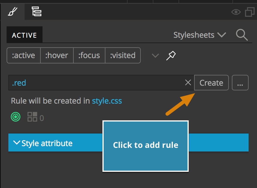
Now that we have a class name there are a few ways we can add styling. The easiest is to keep the element selected and navigate to the Styles panel. For a simple class name like this, you can then type it directly into the selector input box and click “Create”. Since it is a class, make sure to prefix with a period. This box can also take any other selector, such as element tags like h1, ids, and attributes. You can also type complex selectors into this box like h2 ~ p.
For your first new rule, Pinegrow will ask which file should be used for saving the rules. I typically save all of my custom styling to a single file. However, you can save multiple styling files for better organization during development and then combine these files for your production site. Just remember, rule order matters, so if you combine files for your production site the rules have to be loaded in the same order as they were on the development page.
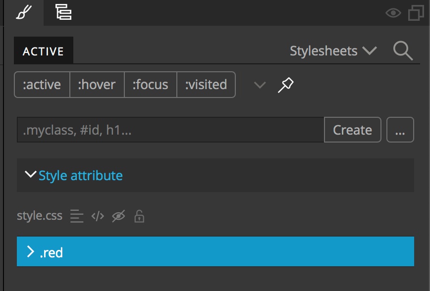
You will now see the newly created rule highlighted under the active tab of the Styles panel. Any stylesheet rule that applies to the current element in the current view will be visible here. So for example, rules that apply only to a screen width up to 740px will not appear if your Page View is set to a screen size of 1024px.

If you have multiple Page Views open, the active rules will be displayed for the screen that has the paintbrush styling icon at the upper right corner of the screen highlighted.
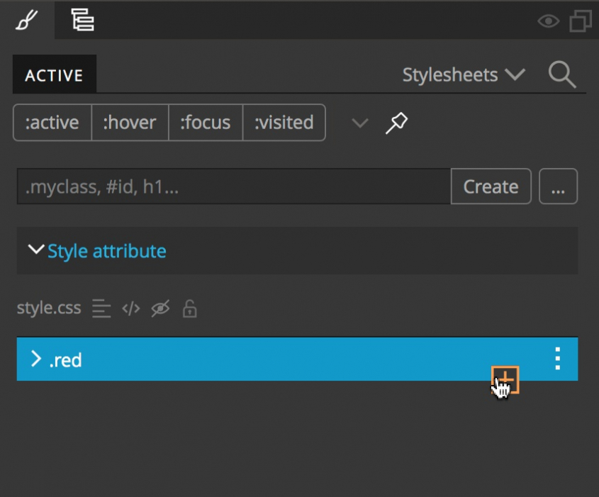
With the rule highlighted you can now add styling using the visual editor. You can also add styling manually by hovering near the bottom of the rule and clicking on the orange plus sign that appears. In the resulting input box you can type in any styling property and value pairs.
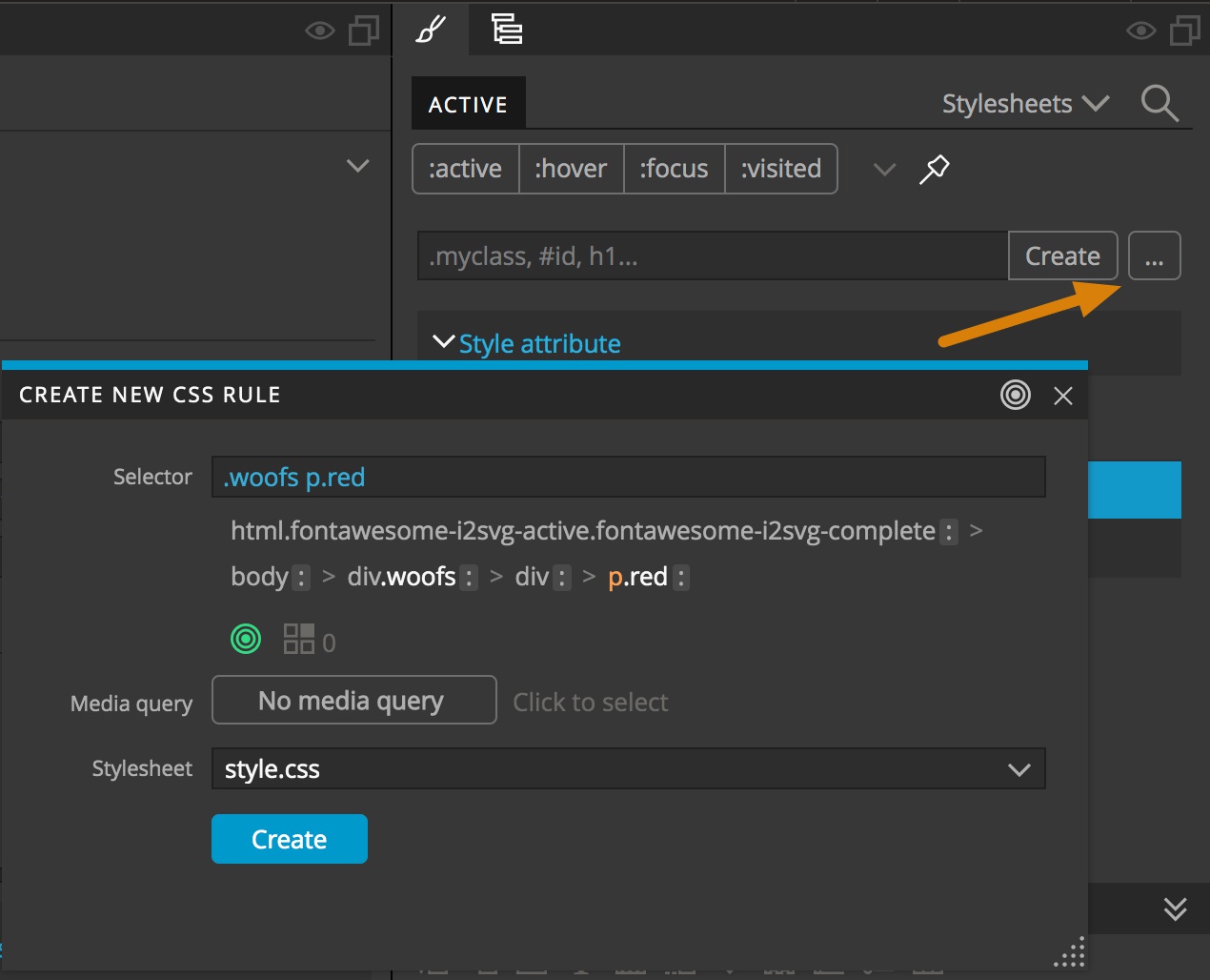
This example ruleset was created by typing the class name into the input box. However, selectors can also be created by clicking on the ellipsis to open the selector creator. This will open a modal that contains all the basic selectors that would apply to the selected element. You can then click on as many selectors as required. Located below the selector chain is a target icon. If it lights up green then the currently created selector will apply to the element. Next to the target is an icon with number that indicates how many additional elements on the page will be matched by that selector. For example, if it shows a number of 1, that selector will match a total of two elements, the currently selected element plus one additional element.
If the target lights up in an orange color it indicates that the element will not be targeted by the current selector unless an additional selector, such as class name, is added to the element.
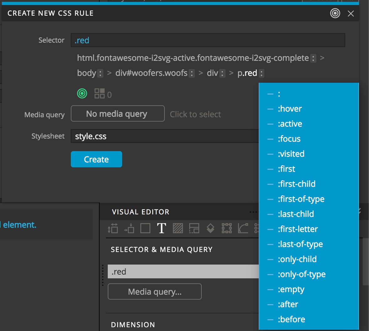
In addition to simple selectors, this pop-up can also be used to add pseudo-elements and -classes by clicking on the colon following the selector. This will bring up a context menu for selection of the additional state selector.
As a side note, there are four state buttons, ‘:active’, ‘:hover’, ‘:focus’, and ‘:visited’, at the top of the Styles panel. They don’t make any changes to your stylesheet, rather they allow you to toggle that state on an element, just like your pointer was interacting with the Page View. This is useful, for example, in styling a button hover state. Rather than make a styling change and then have to hover over the button to see the result, you can toggle the ‘:hover’ state and see the changes in real time.
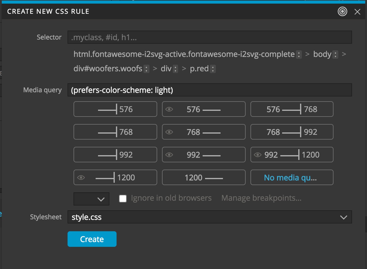
Clicking on the button next to “Media query” will allow you to add CSS queries. Buttons will appear that allow you to quickly add queries based on the breakpoints present in your framework or set through the “Page” menu. Other specialized media queries can be added by typing them into the input box – in this case I’m adding a query of @media (prefers-color-scheme: light).
Note: I am surrounding the query with parentheses. You can also chain queries in this box with ‘and’ as well as using ‘not’. You can also combine width queries with other queries by clicking on the desired width query and then clicking on it once again. This will bring up the media query input box pre-populated with the width query.
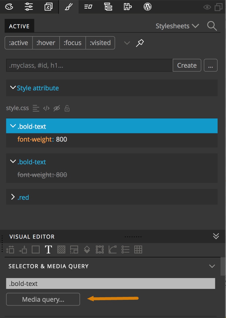
To add media queries to existing rules, right-click the rule set in the Style panel to bring up the context menu and then select “Duplicate”. In the “Active” tab you should see two rule sets with the same name, but one will have the various styles greyed out, indicating that they are being over-ridden by the other rule set with the same name. Importantly, this means that the greyed out rule actually comes first on the stylesheet, so the rule loaded last will be the active one. This is important because if you load in styling with the same class name (or any other identical selector) after your media query, it will over-ride the media query. So, after duplicating your rule-set, select the active one. Next, click on the media query button at the top of the visual editor and enter your query. If the added query excludes the currently selected page (the one with the paintbrush icon highlighted if there are multiple pages open), the rule set will disappear from the “Active” tab, but will reappear when you select an appropriate Page View.
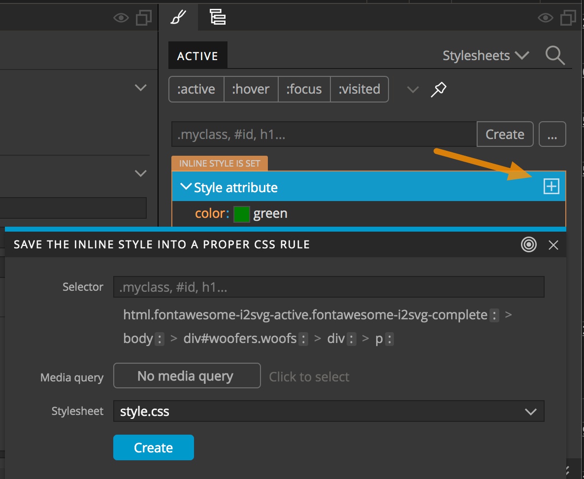
Going back to our first example in this tutorial, inline styles can be moved onto your stylesheet by selecting the element and then from the Styles panel clicking on the plus sign to the right of the inline style rule. This will again open the selector chain. You can either select existing tags, classes, or ids or you can add a new class to the element by typing it in the input box at the top.
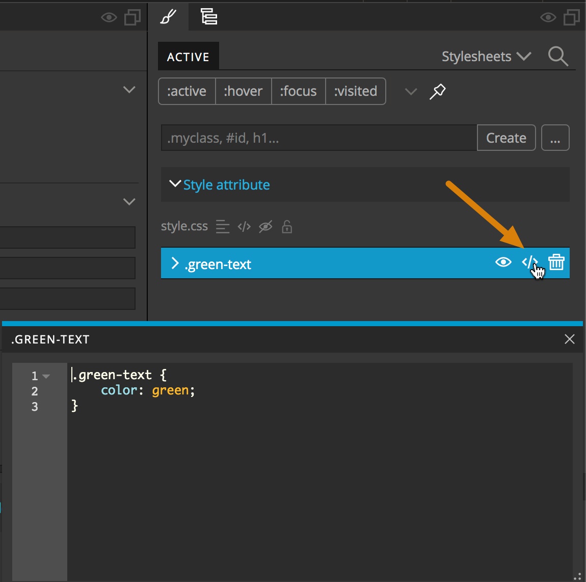
Another way that property:value pairs can be added to an existing rule set is by clicking on the code icon that appears to the right of the selector when hovering over the rule. This will bring up a code box that you can type any properties into. An additional control you have over your styling that comes up on hover is the eye icon located to the left of the code icon. Clicking on this icon will comment out the rule set, effectively removing that styling from the element.
Note: You can remove the commenting by clicking on the eye icon again only if you do not unselect the current element. The rule will not appear again under the active section if it has been commented out.
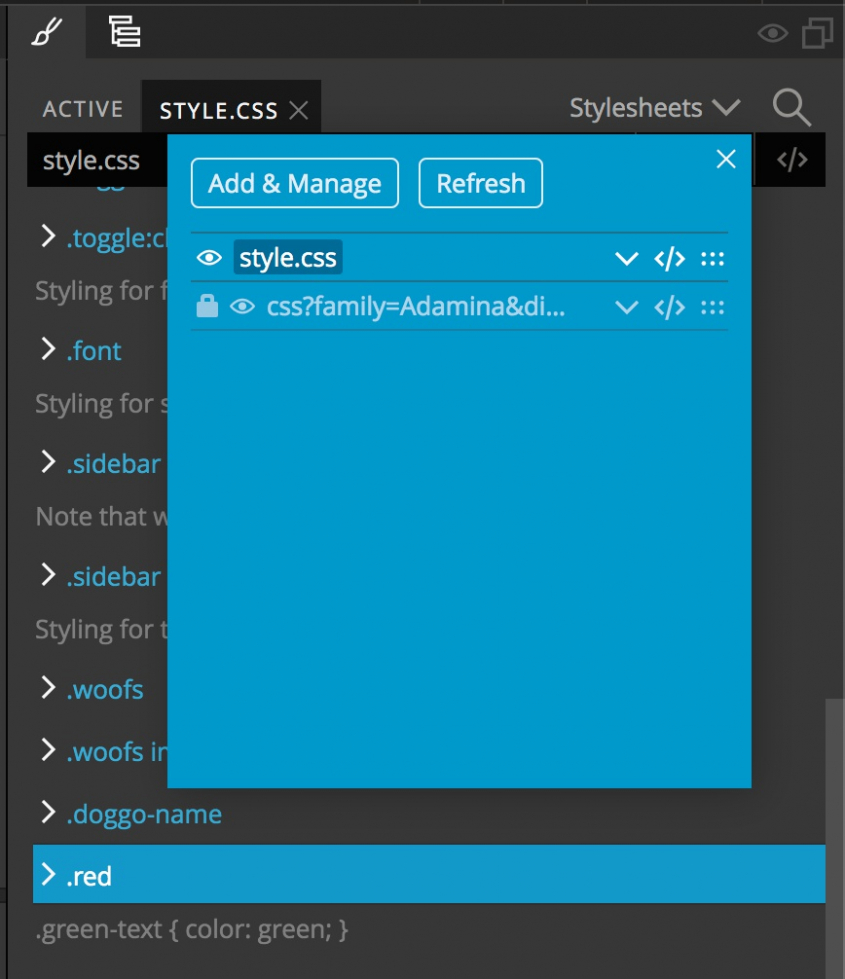
Of course, inactive rules can be edited in the code editor by double clicking on the file name in the Project panel. They can also be edited within the code by clicking on the dropdown in the upper-right corner of the Styles panel and then clicking on the code icon next to the stylesheet name.
If you aren’t a huge fan of directly altering the code there is yet another way. You can also click on the file name from the drop-down, or on the line icon just to the right of the name in the Active styles section. This will bring up all the rules within a stylesheet, including ones that are commented out. You can then hover and click on the eye icon to the right of a rule to uncomment it and make it active once again.
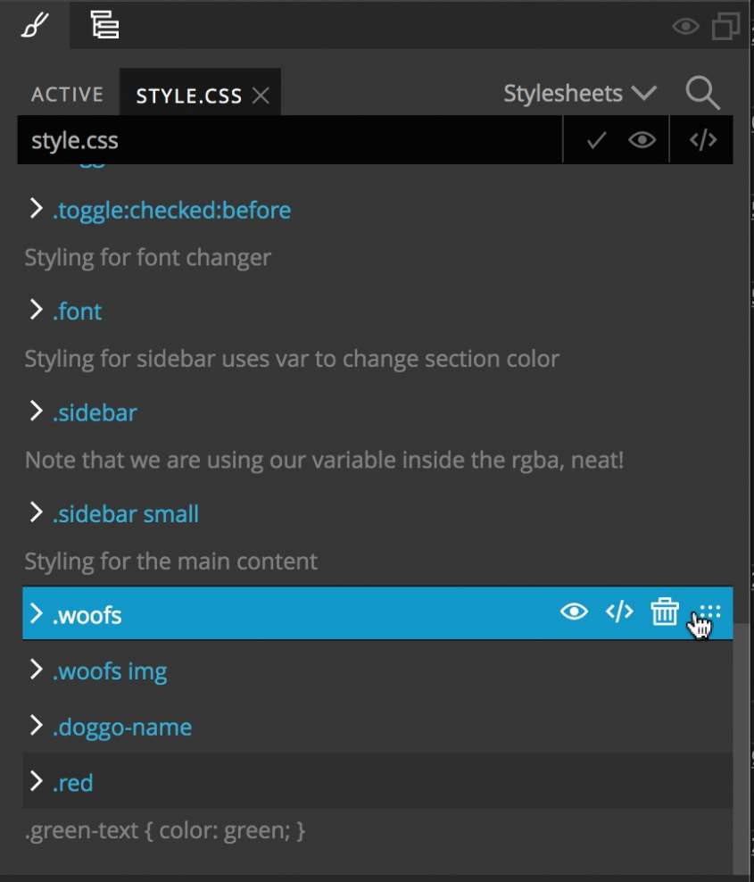
Any rule in this view can be selected and edited either by typing in new rules or by using the visual editor. The other very useful function of this panel is to re-order rules in the stylesheet. By hovering over the rule, a set of icons will come up including a set of dots to the far right that act as a handle. You can click-and-drag on that handle to rearrange the order of your rules.
Finally, for completeness, you can also choose to add your styling as “internal” CSS within the <head> by adding a <style></style> using the built-in code editor. You won’t be able to add new rules using the create input and instead will have to use the built-in or external code editor. You can use the visual editor to modify rules once they are created.
That is it for this quick tutorial! Hopefully this has gotten you more comfortable about handling styling in Pinegrow. Again, the philosophy behind Pinegrow is to provide multiple ways to accomplish many tasks so that you can select the one that makes you feel most comfortable and allows you to put together pages quickly and easily.
Discuss this tutorial
Have questions or comments about this tutorial? Let’s talk about it on our forum.
Get in touch
Would you like to see your favorite theme or blocks library featured in the next tutorial? Let us know in the forum or by email!
If you liked this tutorial, why not check out another in the series about adding pop-up modals to your page?