Pinegrow makes adding and styling pseudo-classes and pseudo-elements quick and easy. This tutorial shows you how.
In addition to standard ID, class, and element selectors, CSS also allows you to style elements using pseudo-classes and pseudo-elements. In this tutorial, we will be looking at how to effectively use the Pinegrow web editor Style panel to this kind of styling to your page elements. Along the way we will also review CSS specificity and rule order. Finally, we will look at how to easily rearrange your stylesheets in Pinegrow.
Let’s get started!
Prefer to read? Scroll past the videos.
This tutorial is available in video and textual form. Watch the video, or continue reading if you prefer to read. Of course, you can also do both!
Also note, the first part of this video reviews CSS specificity and the cascade. If you feel comfortable with these topics, feel free to skip to 9:30 into the video.
CSS Specificity and the cascade
Specificity
To start, let’s very quickly review specificity and the CSS cascade, then what pseudo-classes and pseudo-elements are. If you feel comfortable with this topic, feel free to skip ahead to the next section of the tutorial.
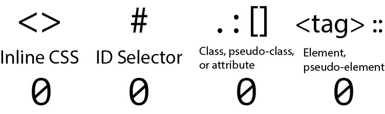
Both the cascade and specificity are used by the browser to determine what styling rules will be applied to an element. In our stylesheet the styling rules are made up of two blocks. The first is the selector and the second, surrounded by the curly braces {}, is the declaration block. The selector is used by the browser to determine what HTML is targeted by the styling rules in the declaration block. Pinegrow enables us to quickly put together the rules in our declaration block using the visual editor, but it also helps us create selectors!
The browser calculates the specificity of a selector by assigning a value to each part to come up with a value with four positions. While this value looks like a four digit number and can generally be read as one, each number is independent. Any single position can have a value greater than 9. In other words, having a number of 10 in the third position doesn’t result in an increase in the second position. Like a normal four digit number it is valued left to right, but a 1 in the second position is higher than any number in the third position. For example, you could have a specificity value of 0 0 14 0. This would have a lower value than 0 1 0 0. So, where do these numbers come from?
The first position comes from having inline styling on the element. For example, <p style="color: red;"></p>. This would have a value of 1 0 0 0, or one thousand. The only way this can be overcome is by adding an !important declaration to your rule set.
The second number comes from the number of ID matches between the selector and the element. For example, #warning { color: red; } would have a value of 0 1 0 0, or one hundred.
The third position counts up the number of classes, attributes, or importantly for this tutorial, pseudo-classes. In this case, .warning { color: red; } would have a value of 0 0 1 0, or ten.
The final position tallies both elements and pseudo-elements. For example, p { color: red; } would have a value of 0 0 0 1, or one.
So, as a very artificial example, let’s add up the the CSS selector button#search-button.button-text {}. First it targets a <button> element giving a specificity of 0 0 0 1. Next, an id of ‘search-button’, giving a cumulative specificity of 0 1 0 1. Finally it targets a class of ‘button-text’, giving the specificity 0 1 1 1. If we were to add the pseudo-class :hover we would have a specificity of 0 1 2 1.
In general, you want to keep your overall specificity high enough to target just the elements you want, but not so high that you can’t overrule it if you find later that you want to change-up part of your page design.
The cascade
So now we a basic understanding of specificity, what about the cascade? In this case, coming in last wins!
The browser loads and evaluates each stylesheet and each rule on the stylesheets sequentially. So, a rule that comes later in the stylesheet will overrule any previous rules with equal specificity. Similarly, rules on the last stylesheet to be loaded will override any with equal specificity on the first to be loaded. This can be a gotcha when combining and minimizing stylesheets for production – make sure to keep them in the same order. This also applies to adding styling to frameworks. You should always make sure that any custom styling is loaded AFTER the framework styling to insure predictable behavior.
If you choose to have a style block on your page – <style></style> – it will be evaluated in the order it is encountered on the page. So, for example, if your style block is in the <head> after you custom stylesheet is loaded, it will overrule any conflicting selectors with equivalent specificity.
Pseudo-classes and pseudo-elements
The pseudo-classes and pseudo-elements are both typically added to existing CSS selectors and impact the specificity as outlined previously. Pseudo-classes act on existing elements that possess a certain state, for example when a form element is empty, while pseudo-elements basically create new elements on the page.
button:hover {
    background: blue;
}
A great example of a pseudo-class is :hover. This pseudo-class adds styling when the cursor is hovering over the particular element. As you can see from the rule above, pseudo-classes are prefixed with a single colon. This rule would cause any button element on the page to have a blue background color when the mouse hovers over them as long as other styling rules don’t have greater specificity, for example:
button.no-hover:hover {
    background: transparent;
}
The first selector would have a specificity of 0 0 1 1, while the second would have a specificity of 0 0 2 1.
.icon-span::before {
    font-family: FontAwesome;
    content: '\f00c';
}
A common example of a pseudo-element is ::before. This allows you, for example, to add an icon or image before an element on the page. This particular rule would add a font awesome checkmark before an element with the class icon-span. While pseudo-elements are technically prefixed with two colons, in most cases a single colon can be used for compatibility with older browsers.
Pinegrow has tools to allow you to construct styling rules with some of the most common pseudo-classes and pseudo-elements, and also tools to visualize how your page will look with those elements triggered.
For this tutorial I have chosen the Foundation 6.6 framework ‘real-estate.html’ template. It has a number of elements that can be used to illustrate pseudo-classes and -elements, plus the Foundation framework is relatively less opinionated than Bootstrap about pseudo-class styling, making the demonstration a little easier.
Selecting a template
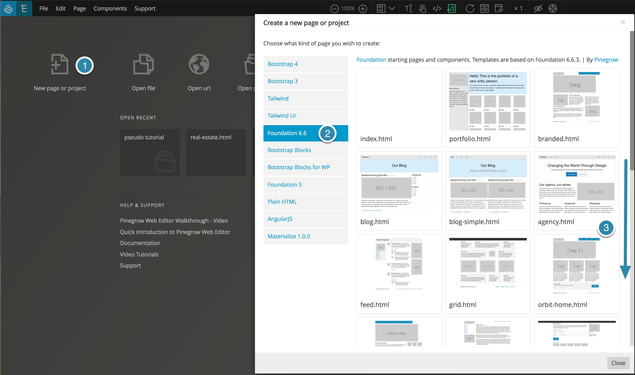
You can choose any page you want, but to follow along with the tutorial create a new page by clicking on the “New page or project” icon on the Pinegrow homepage. You can also choose the “New page…” item from the File menu. Next, select the “Foundation 6.6” framework from the column on the left. Finally, scroll down the page to the bottom to select the ‘real-estate.html’ template. Once your new page has opened, save save it to a new folder. Pinegrow should then ask if you want to open the page as a project – click “Yes”.
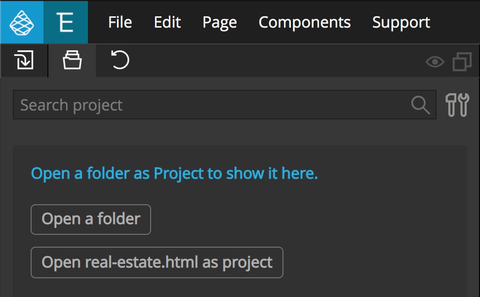
If you don’t get this modal, navigate to the Project panel and select the “Open real-estate.html as project” button.
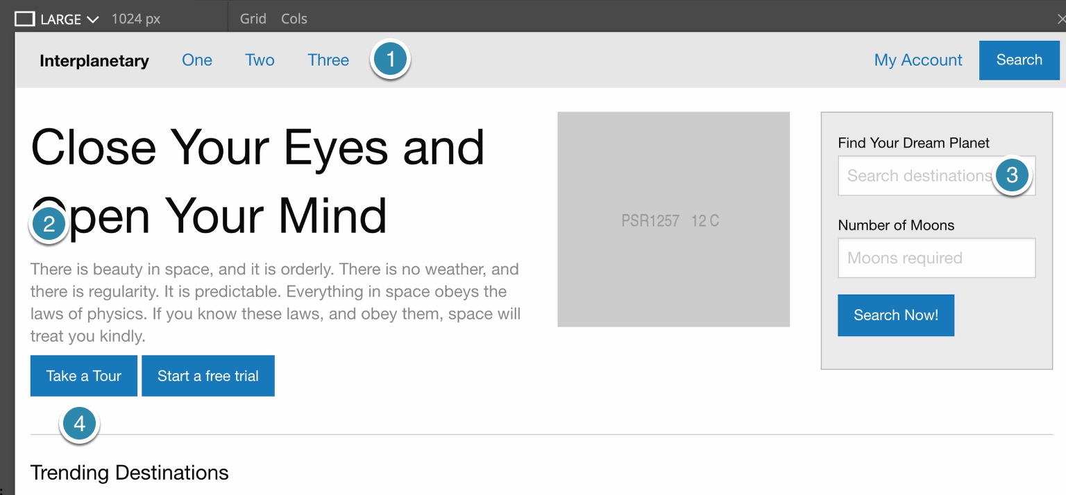
This template has some useful elements. First, at the top there are several navigation elements. Links are a very common element to receive pseudo-class styling. Next, there is a paragraph element that we can use to illustrate a “structural” pseudo-class. Next, there are several buttons that receive some of the same pseudo-classes as links, but are also often the target of pseudo-element styling. Finally, there are two form inputs that will be useful for looking at another pseudo-class.
Navigation pseudo-classes
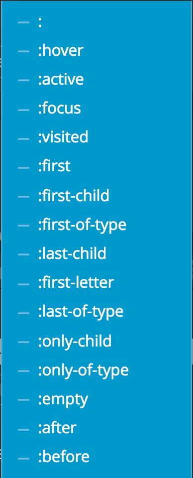
There are five pseudo-classes that are typically added to link elements (<a>) – :link, :visited, :focus, :hover, and :active.
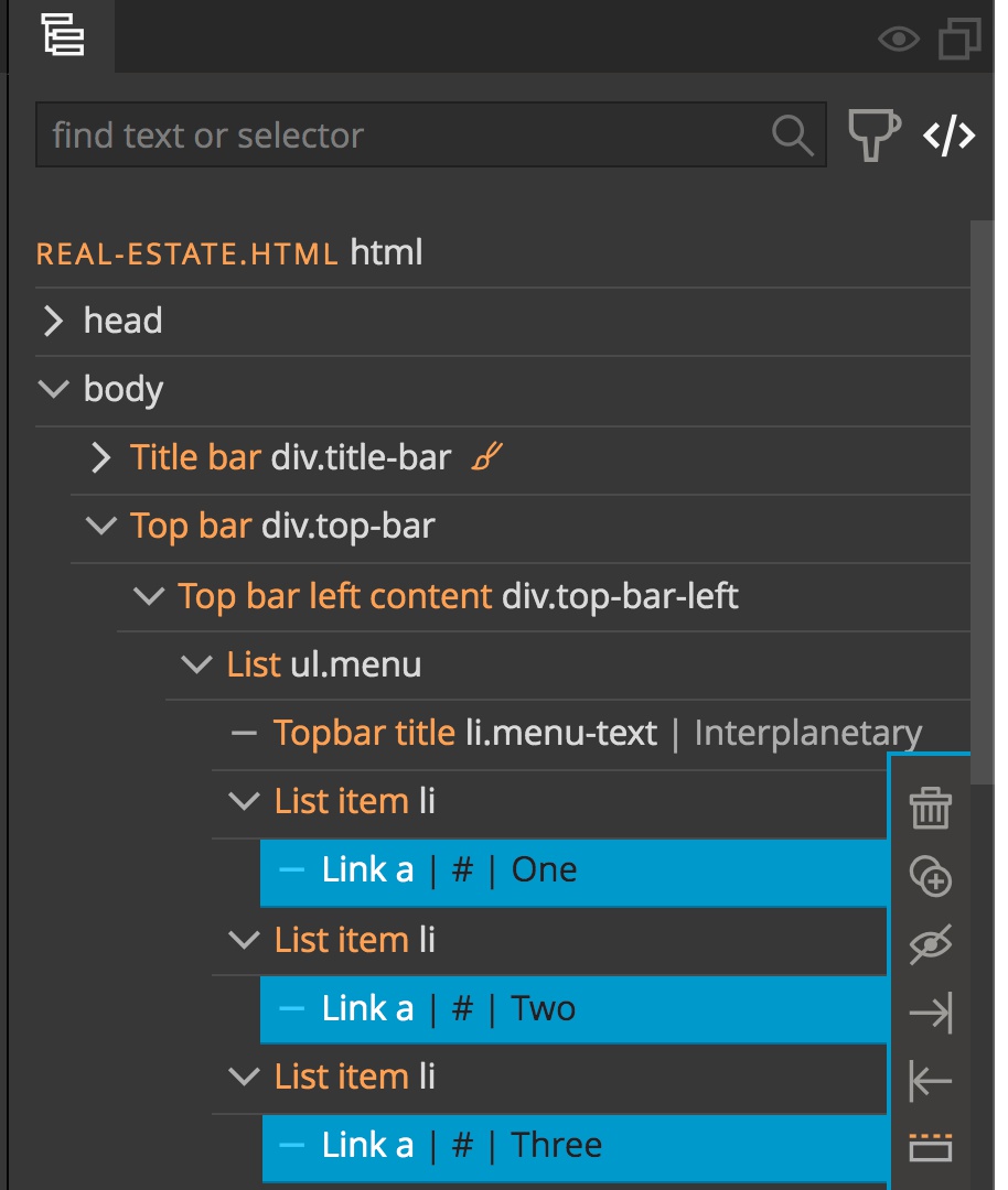
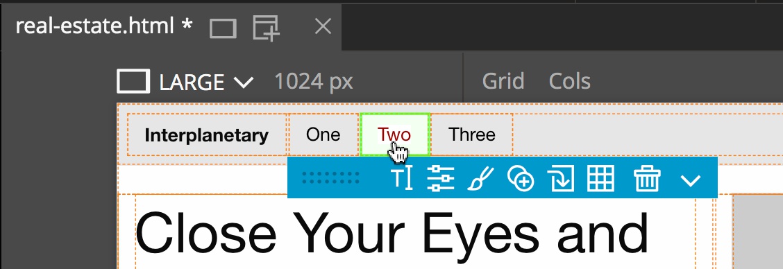
From the template select the three navigation links (<a>) clustered on the left side of the page either in the Page View or the Tree panel. Note that multiple items can be selected by either holding down the CMD or CTRL key, depending on your operating system.
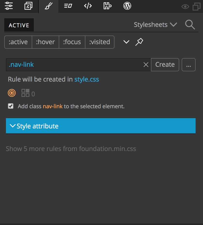
Next, open the Style panel. In this case we only want to style the links within our navigation, so we will give them a class of ‘nav-link’. Add the class name into the text box and make sure to prefix it with a period to indicate it is a class. Pinegrow gives us a little bit of information.
Directly below our new class, Pinegrow indicates that the new rule set will be added to the ‘style.css’ stylesheet. If we click on the file name we can change what sheet this will be saved on. Just below that, the target icon is colored orange to indicate that the newly created selector will successfully target our selected HTML elements if the class name is added to our elements. It would be colored green if the class name was already present on the element. To the left of the target icon is a set of squares with a number. This number identifies how many other elements on the page will be targeted with the current selector. Currently, this number is zero because no elements have our new class name until we hit the “Create” button. Finally, there is a check-box to indicate whether we want the new class name added to the selected elements. So, let’s add our rule and class name to the elements by clicking on the “Create” button.
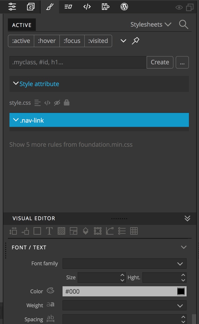
Let’s give the text of the navigation buttons a black color using our new rule. Keeping the new rule highlighted in blue, within the ‘Visual Editor’ section of the Style panel click on the ‘T’ icon at the top to jump to the ‘Font/Text’ section. Then for the color input type ‘#000’ for black and hit return.
Note: we could add a pseudo-class of :link here if we wished, but since we are adding a specific class, it isn’t necessary. However, as we will cover further into this tutorial, we should treat this rule-set as the :link rule set for cascade purposes.
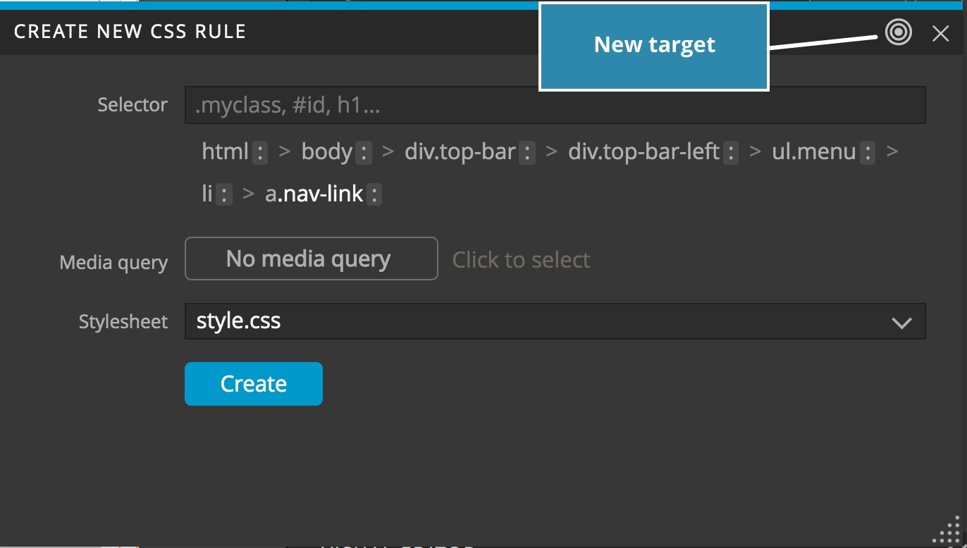
Okay, we now have some base, minimal styling for our navigation link. Next, let’s add the :hover pseudo-class. There are a couple of ways that we can proceed. If we already have one (or more) of the navigation links selected we can simply click on the ellipsis button (“…”) to the right of the “Create” button in the Style panel. If we don’t have these elements selected we can still click on the ellipsis button, but then click on the target icon in the header to designate the element we want to target.
In this case the links are still selected so we get a list of potential selectors for the element. We only want to apply hover styling to our three navigation links, so click on the .nav-link at the end of the list. We can see it added to our selector. We can also see that the green target icon appears, along with an indicator showing that our current selector will match 2 other elements. If we had clicked only on the a proceeding our new class we would still get a green target icon, but it would match 23 other elements on the page, indicating we need to add greater specificity.
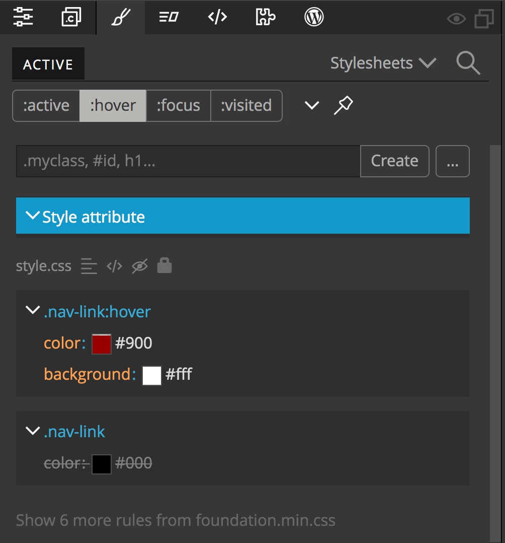
To add the pseudo-class to our selector we can next click on the colon at the very end of the list to get a pop-down menu. From this we can pick the :hover pseudo-class. Note, our target icon has now gone dark. This is because we don’t currently have a hover state on our navigation items, so the selector doesn’t match – as long as the target icon was green prior to selecting the pseudo-class, this is fine. Now, like with any other new rule, click on the “Create” button.
Next, lets go to the visual editor and add some background color and a change to the text color on hover. I’ve elected to change the font color to #900 (dark red) and the background color to #fff (white). If we hover over any of the links, we can see the changes.
This is a simple example with only two styling changes, but what if we had something more complex? Having to keep going to the Page View to hover over our element while making visual tweaks is a little painful! Pinegrow has you covered!
At the top of the style panel there are four pseudo-state buttons. If you have an element selected you can click on one of these buttons and they will simulate that particular pseudo-state. In this case, clicking on the ‘:hover’ button will apply the state, making changes in the Page View and causing the rule set to appear. Note: if you select a different element on the page, the hover state will remain on the original element until you unclick the pseudo-state button.
Pseudo-class cascade
As mentioned previously, there are multiple pseudo-classes that can be added to link elements. It is important to think about what our desired styling outcome should be, because an element can have more than one state. For example, a link can have been previously visited, giving it a pseudo-state of ‘:visited’, but can then be hovered by the user. Do we want the link to change style on hover if it has been previously visited? If so, we have to make sure that our ‘:hover’ rule comes after our ‘:visited’ rule. Remember, rules lower on the stylesheet override ones higher on the sheet.
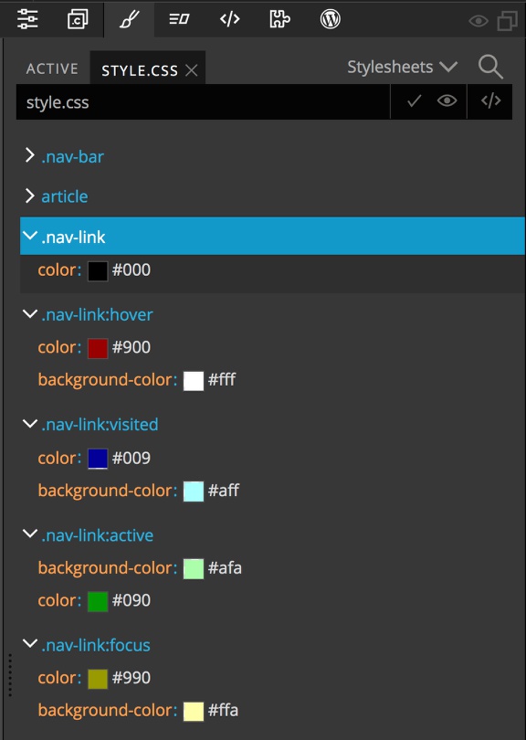
Let’s quickly make rules for the ‘:visited’, ‘:focus’, and ‘:active’ pseudo-classes. For each, we will create the rule by clicking on the ellipse button, selecting the .nav-link class, and then clicking on the colon at the end to select the pseudo-class. We will add styling to each so they are easily distinguished from each other. Clicking on the four horizontal lines next to the ‘style.css’ file name in the Style panel will open our sheet to look at each of the rules. We can now test for the expected behavior by selecting one of our nav links in the Page View or Tree panel and then clicking on the Style panel pseudo-state button for ‘:visited’, then trying to hover over it with our mouse. No good! This is because of the order of the rule sets in the style.css file.
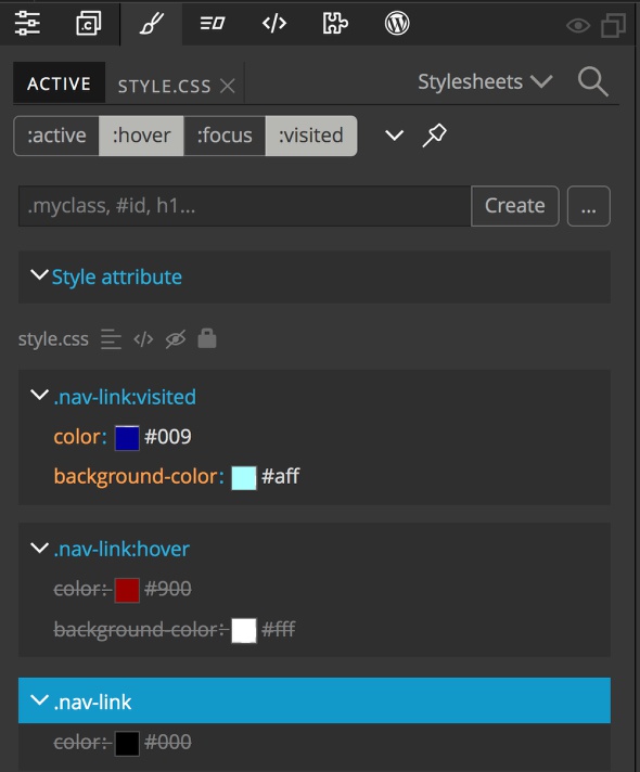
We can also see that if we click both the ‘:visited’ and ‘:hover’ pseudo-class buttons that the hover rules are crossed out in the ‘Active’ tab. How can we change this?
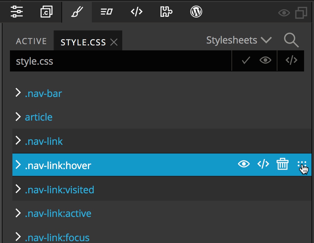
Open the ‘style.css’ rule list again by clicking on the four horizontal lines next to the file name in the Style panel. Next, make sure that all of the rule sets are collapsed by clicking on the caret to the left of the rule set if it is open. Now, when we hover over the right side of a rule set selector we will get a series of icons. The right most icon with 6 dots acts as a handle. If we click-and-hold on this icon we can move the rule set up and down the list to re-order it. While it is up to the designer to decide how the styling should look, the link pseudo-classes are usually ordered, ‘:link’, ‘:visited’, ‘:focus’, ‘:hover’, and ‘:active’. For those Star Wars fans – “Lord Vader’s former handle, Anakin” is a good mnemonic.
One last note before moving away from our link styling. To protect user privacy, most browsers limit the styling changed that can be made for the :visited pseudo-class. From the Mozilla page:
Note: For privacy reasons, browsers strictly limit the styles you can apply using an element selected by this pseudo-class: only color, background-color, border-color, border-bottom-color, border-left-color, border-right-color, border-top-color, outline-color, column-rule-color, fill and stroke.
https://hacks.mozilla.org/2010/03/privacy-related-changes-coming-to-css-vistited/
Other examples
Okay, now that we have seen one example let’s just do a couple others for practice. One great use of pseudo-classes is for drop-caps. Open the Style panel, click on the ellipsis button, and then click on the target icon in the header. Select the paragraph at the left side of the page. This paragraph element already has a class name of ‘.subheader’. We can click on this class name, and then click on the colon to add our pseudo-class. This time we will pick the ‘:first-letter’ pseudo-class and then create the rule. Note: we can see that using the ‘.subheader’ class will result in 6 elements being targeted.
If we wanted to make this more specific we would have to either add a new class or id to help our targeting. Another alternative would be to use pseudo-class chaining. In this case, since it is the first ‘.subheader’ element we could use `.subheader:first-of-type:first-letter`. This can be a bit fragile, so it generally is only used when you can’t alter the page HTML.
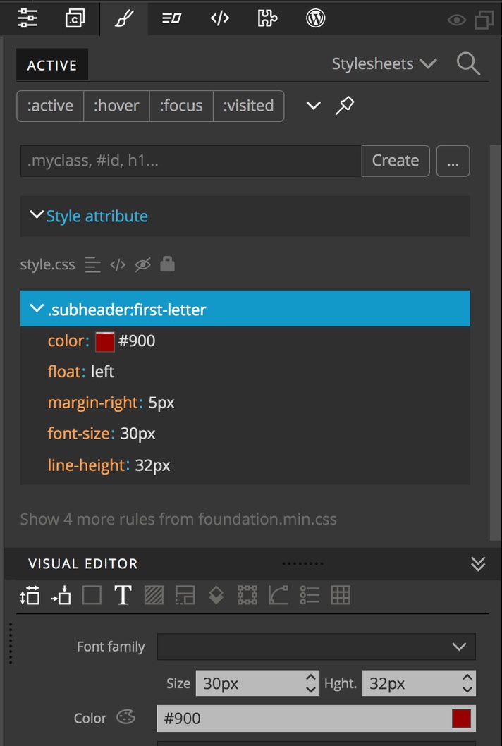
Next we add styling to create the drop-cap using the visual editor:
color: #900;
Float: left;
margin-right: 5px;
font-size: 30px;
line-height: 32px;
Two more quick examples:
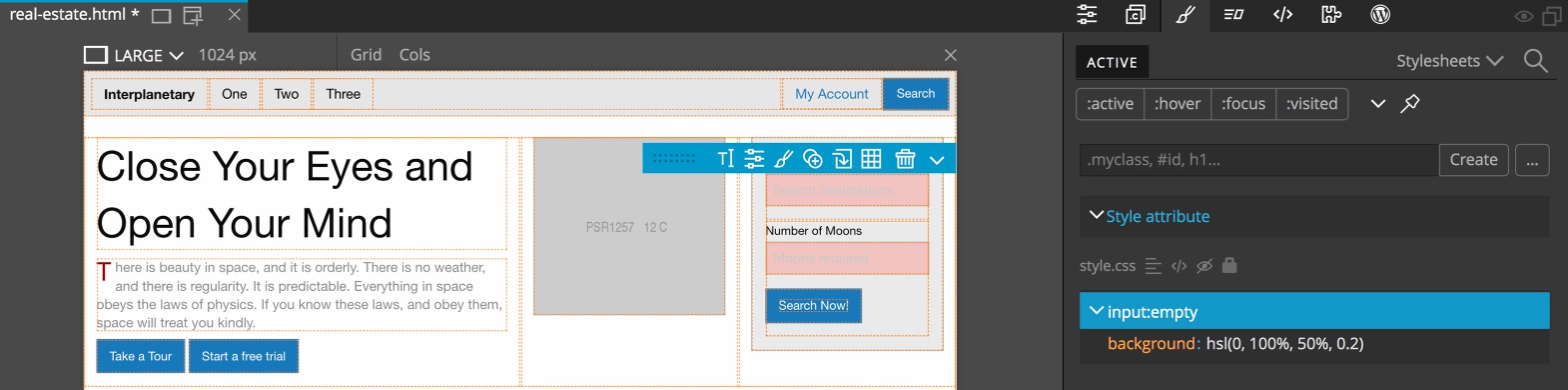
One useful pseudo-class for forms is the ‘:empty’ pseudo-class. This gives the user a better visual indication of any form elements that require an input. For this one use the ellipse button to select the first form input and add the ‘:empty’ pseudo-class. For styling we will add a partially transparent, red background with background: hsl(0, 100%, 50%, 0.2).
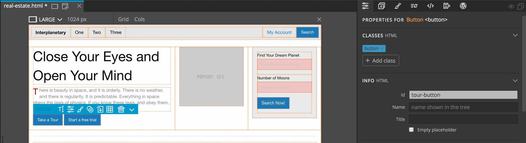
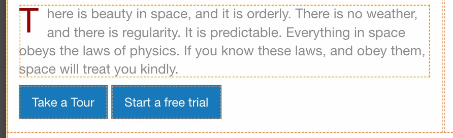
For a final example, let’s use a pseudo-element, the ‘::before’ pseudo-element. We will add a font awesome icon to our tour button. If we highlight the “Take a Tour” button on the left side of the page in either the Page view or Tree panel and then open the Properties panel, we can see that it doesn’t have any specific selector to uniquely identify it, so let’s add an ID of ‘tour-button’.
Next, open the Style panel and click on the ellipsis button and click on our new id as selector and then the colon at the end. From the list select ‘:before’ and create the rule set. Since we want to add a Font Awesome icon, we need to go to the File menu and select “Manage libraries and plugins”. From the resulting modal, activate the ‘Font Awesome 4’ resource. You can choose to add the resource to all pages in the project, or just the current one.
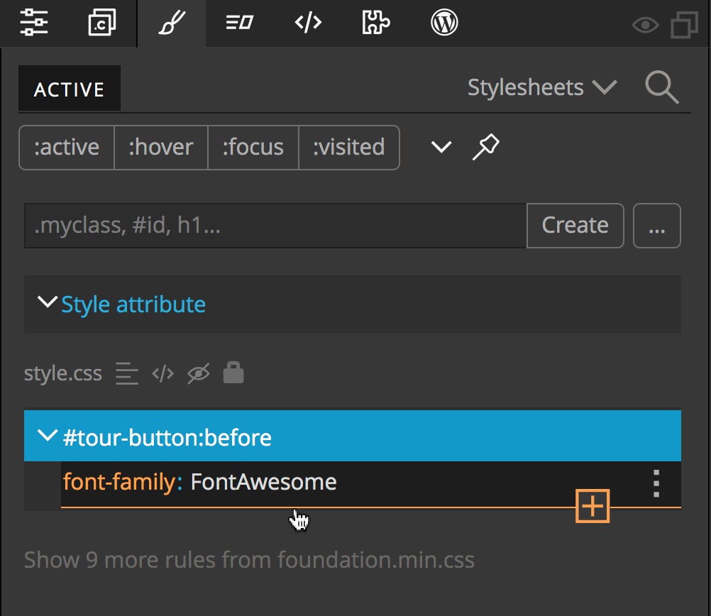
Now, with the #tour-button:before rule set selected in the Style panel, scroll down to the ‘Text/Font’ section and type in ‘FontAwesome” as the font family. For the last part, we need to manually add a new styling rule. Hover below the ‘font-family’ rule and an orange line with a plus sign will appear. Click to add a new rule. When the new rule input comes up type content: '\f01b'. This will cause the corresponding icon to appear before the text on the button. We can then add a little right margin and we are done!

If we had wanted the icon to appear after the text we would have used the ‘:after’ pseudo-element. As I outlined previously, most pseudo-elements can be written with a single pre-fixed colon for backwards compatibility.
This tutorial has only scratched the surface of what you can do with pseudo-classes and pseudo-elements. I encourage you to check out the Mozilla pages for pseudo-classes and pseudo-elements. Hopefully, this tutorial has demonstrated that adding these powerful CSS elements in Pinegrow and inspecting how they impact your design visually is easy!
I hope this tutorial has helped to make Pinegrow quicker and more enjoyable to use. Feel free to ask questions or make comments in our forum or by email.
Until next time, have fun designing with Pinegrow!