Creating an animated accordion – Interactions tutorial
A step-by-step tutorial about creating an animated accordion component with Pinegrow Interactions.
Before we start
What you’ll learn?
By following this tutorial you will learn how to create an animated accordion component with multiple expandable sections.
What you’ll need?
Of course, you can just watch the tutorial to see how Pinegrow Interactions work. But we recommend that you follow along the tutorial, doing all the steps on the provided example page. To do that, you’ll need:
- Pinegrow Web Editor, either a free trial or activated license that includes Pinegrow Interactions.
- Download the example project without interactions. Unzip the file and open it as a project in Pinegrow Web Editor.
- You can also download the finished project as a reference.
If you already have Pinegrow Web Editor, but don’t have the Interactions add-on you can start a trial in Support -> Purchase & Activate under Add-ons: Interactions.
Want to know more about Pinegrow Interactions?
Visit the Pinegrow Interactions Documentation portal to learn more about Interactions, actions, licensing, API and more.
Need help?
Post any questions and feedback about this tutorial to a dedicated Pinegrow Forum topic.
Tutorial Updates (July 1, 2021)
Pinegrow is constantly improving and adding new features. While we try to minimize any impact on code created with past versions, sometimes this isn’t possible. The original tutorial was created with Pinegrow 5.x. Unfortunately, some improvements to how the Interactions plugin works in Pinegrow 6.0 requires the following minimal changes. These changes provide a smoother animation of accordion opening and closing.
HTML changes (No impact to any of the tutorial steps)
The .accordion--header block was updated from the original to add a button. This was neccessary for accessibility with the tab key from a keyboard.
Changes to the Interactions (Does impact the tutorial steps)
- Interaction for
.accordion--content- The transform property,
Y = -20pxshould not be added. This occurs at 4:49 in the video.
- The transform property,
- Interaction for
.accordion--header- In addition to the listed properties also add (Starts at about 5:09 in the video):
overflow = hiddenheight = 0- transform ->
Y = -20px
- Add an additional tween property of:
height = auto
- In addition to the listed properties also add (Starts at about 5:09 in the video):
Note: Transitioning between height = 0 and height = auto is now smoother in GSAP.
Watch the whole tutorial
The tutorial has just one video, total length is around 12 minutes.
We recommend that you watch the whole tutorial and follow along with the provided project.
Alternatively, you can scroll down past the video to watch and read transcripts of individual tutorial parts.
The following section contains the videos and transcripts of the tutorial:
1. Introduction
Hi there, today I’ve come up with another tutorial on how to create Accordions for your website with Pinegrow Web Editor. And by using Pinegrow Interactions, a GreenSock powered visual editor for web interactions.
In this tutorial I’m going to show you how to prepare the layout for the Accordion and later add interaction for opening and closing accordions.
The end result of what we are going to achieve is that we should see clickable headings with plus icons on the right. And when clicking on the headings it should reveal related contents. Clicking again should also close or hide the content. On the right you can also see the plus icon becomes a cross when the accordion is open. We are going to handle all this with Pinegrow Interactions, and you will see how easy it is to implement these interactions without writing a single code.
Now we just need the layout and we’ve already prepared a starter project with the layout built for Accordion. If you wish you can download the starter webpage without the interactions and follow along with this tutorial. The link is provided in the video description.
So let’s get started!
Open the starter project and begin building amazing interactions with Pinegrow Web Editor.
2. Creating the layout
We’ve already prepared the layout for you to jumpstart on this project. But I’m going to describe how the layout is prepared for accordions.
On the starter webpage, you can see the top two texts, first one is title and the second one is some random text. These are just sample text and have no relation to our Accordion block. Blocks below that are accordions and it has a parent block as well. Now let’s open the Tree panel and check that.
You can see there is a section element with .accordion class name, this is the main parent block and all the accordions are placed inside this block. This helps separate all the accordions and also allows you to apply different backgrounds or any CSS styles as needed.
Now our .accordion section has multiple accordions, each has a class name .accordion–item. This is the main accordion block which contains the main contents of the accordion. If you want more accordions, you can just duplicate this block and change the contents.
Inside each .accordion–item block there are 2 main blocks, .accordion–header and .accordion–content. And the header is actually the clickable block which will trigger the content block to reveal and hide.
Just for your clarification, the header block contains the title text and the icon to indicate open or close. And the content blocks will have any content you put in.
So the layout is very basic and there is no CSS applied except the header block. And the header block only has a few necessary CSS only. So you can use this same layout to create accordions for your projects and style as you need.
Ok now let’s add interaction to these layouts and make it work like accordions.
3. Adding interactions
Now let’s add interaction to these layouts and make it work like accordions.
Our content block should be hidden first when the page is loaded and later it should reveal by clicking on the header block.
Let’s go to the Tree panel and select the .accordion–content block on the first accordion.
Go to the Action list and click on Hide at start.
This will hide the block as the page loads but you can see there is a blank space now. So to hide it completely we will apply another interaction.
Go to Action list and click on Interactions, Interactions settings should appear
- On Trigger > go to Page load and select Load – Immediately
- We can leave the target blank, by default it is the selected element
- On Animation > click on Custom animation and Timeline editor should appear
- Now on the Timeline Editor, click on the blank space to create new transition
- Click on the blue transition bar and a popup should appear
- On Edit transition select Set for Type
- On Position enter 0
- Click on Add property > go to Not Animated CSS > select Display
- On Display select None
Now if you refresh the page you’ll see our selected .accordion–content block is now completely hidden. Now let’s add one more thing
- Click on Add property > go to Transform and select Y
- On Y enter -20px
Now our content block is hidden, let’s add interaction to our .accordion–header block.
- On the Tree panel select .accordion–header
- Go to Action list and click on Interactions, Interactions settings should appear
- On Trigger select Click on
- Leave the Target blank, this time there will be multiple targets so we will set them on Timeline editor
- On Animation > select Custom animation and the Timeline editor should appear
- On the left side of the Timeline Editor, click on Selector and select Edit Selector
A popup should appear where we can manually enter any element on the page. We can even select the parent element of the selector. For that we have to use a prefix of caret (^) symbol
- So let’s enter ^.accordion–item | .accordion–content, this means we are targeting the content block of the same parent of the header block that we will be clicking
- Now press Ok
- Now on the right side of the Timeline Editor, click on the blank space to create new transition
- Click on the transition bar and a popup should appear
- On Edit transition select Set for Type
- Click on Add property > go to Not Animated CSS > select Display
- On Display select Block
- Now create new another transition
- Click on the transition bar
- On Edit transition and leave Type as Tween
- On Position enter 0
- On Duration enter 0.2
- Click on Add property > go to Opacity > select Auto Opacity
- On Auto Opacity enter 1
- Again click on Add property > go to Transform and select Y
- On Y enter 0px
Now check on the page, you can test the click interaction by pressing ALT key on the keyboard and clicking on the element. Now press ALT key and click on the first accordion header block. You should see it reveal on the first click and repeat the same animation after the first click.
For that we can enable one option which will reverse the animation on the second click. For that go to the same Interactions setting and click on Advanced Options and enable Alternate Forward/Reverse
Enabling Alternate Forward/Reverse also gives you another option to set Speed-up on reverse option. This let’s you set how fast the animation should run in reverse. I’m leaving it default but you can play with it and set what you prefer.
Now check the interaction again, press ALT key and click on the first accordion header block. Now first click will reveal the content and another click will hide it.
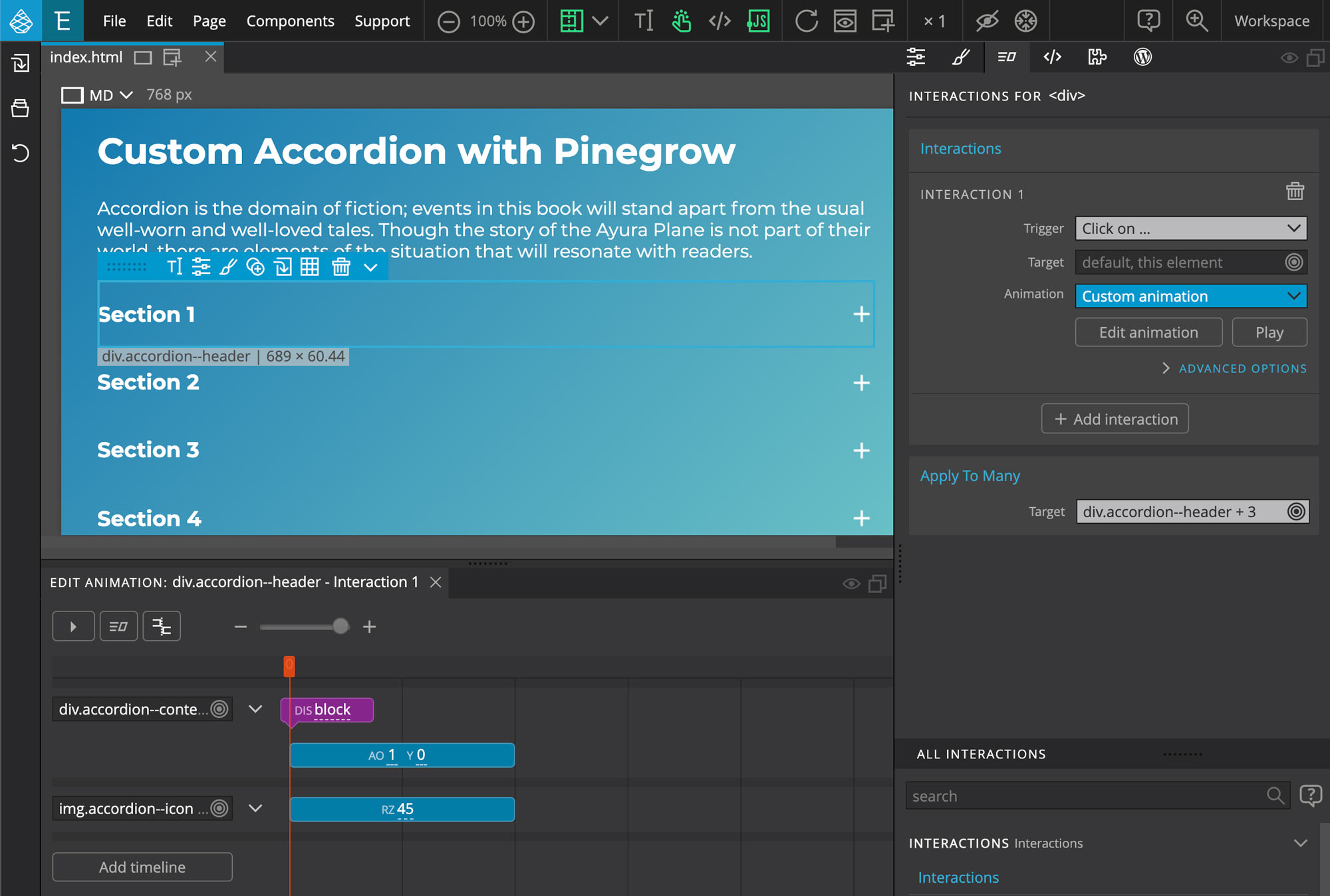
Next we have a + icon on the header block. Let’s animate it and make it look like a cross when the accordion is open.
For that go to the same timeline editor for .accordion–header
- On the left side of the Timeline Editor, click on Add timeline
- On Selector > go to img element > and select .accordion–icon
- Now create new transition
- Click on the transition bar and a popup should appear
- On Edit transition and leave Type as Tween
- On Position enter 0
- On Duration enter 0.2
- Click on Add property > go to Transform and select Rotation Z
- On Rotation Z enter 45
Now ALT + click on the header again and you should see the plus icon change to a cross icon as we click.
We’ve implemented interactions for our accordion but I’ve done it for only one block. Because we can easily implement the same interactions to multiple elements.
Now let’s do that, we’ve our .accordion–header already selected.
- From Actions List select Apply To Many
- Now on the Apply To Many > on Target > click on Edit Selector
- On the popup field enter $.accordion–header and press Ok
Now on the Tree panel select .accordion–content
- From Actions List select Apply To Many
- Now on the Apply To Many > on Target > click on Edit Selector
- On the popup field enter $.accordion–content and press Ok
Now save and refresh the page and you should see all the accordion contents are hidden. And you can click on any accordion header which will open respective accordion content.
This concludes our tutorial for creating Accordions with Pinegrow Interactions. I hope the video was helpful.
If you’ve any questions please feel free to contact us via email or through the Pinegrow forum.
We will be coming up with more videos related to Pinegrow Interactions and How to videos for creating more interactive animations. So keep watching and following.
Thank you for your time and we will see you in the next video.