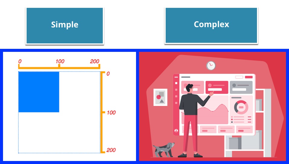
Scalable Vector Graphics (SVG) are a light-weight way to display vector images that can be displayed at any resolution and manipulated by both CSS and JavaScript methods.

This tutorial is a little more theoretical than some in this series. Both the Bootstrap 4 and Tailwind Blocks in Pinegrow utilize inline Scalable Vector Graphic (SVG) images. Unlike many types of images, SVG do not use pixels and instead use a series of vectors to create images. This means that they are highly responsive. They can scale up or down on the page without losing resolution. SVG are great to use when you have images made up of geometric forms with crisp lines.
Pinegrow has great support for SVG and in this tutorial we will cover the basic terminology of SVG, how to manipulate them in Pinegrow, and some of the pros and cons of inline SVG versus an embedded SVG file.
Let’s get started!
Prefer to read? Scroll past the videos.
This tutorial is available in video and textual form. Watch the three videos or continue reading if you prefer. Of course, you can also do both!
Video 1 – Basic SVG Terminology
Video 2 – Using SVG images in Pinegrow
Video 2 – Using SVG images in Pinegrow
SVG terminology
There are two really important concepts to understand when using SVG. Again, SVG are graphics composed of a series of geometric shapes, including points, lines, and polygons. They can be very simple, like a rectangle or an axis on a chart, or really complex like the graphics seen in the Bootstrap 4 Blocks “Agency” template. Whether simple or complex however, both are drawn on a canvas that essentially is infinite in size.
The first important concept is that when we place an SVG onto our webpage we are defining how much of that infinite canvas we are seeing – this includes both the overall area of the canvas we are seeing, but also the location of that area. So, we can choose to view only a small 100px by 100px region of the canvas located in the very center, or a larger 1000px by 1000px region located at the upper left. This allows, for example, the creation of files containing multiple SVG images tiled in a grid. A single image can then be selected within that file by just changing the region of the canvas being displayed. The area of the canvas that we are viewing is defined by the viewBox attribute.
The second important concept for working with SVG images is that the size of the slice of canvas that we select – whether it is 100px or 1000px wide – can be scaled up or down into a region of the screen defined by a viewport. So, the same size viewport could be used for both slices without a loss of resolution.
Let’s examine the viewport first.
The SVG viewport
Setting the SVG viewport is essentially the same as setting the height and width of most any element on the page. You can set it either inline using the width and height style properties, or more preferably by using those same properties as attributes on the SVG element. Within the Pinegrow Properties panel there are input boxes that allow you to set both. In this example, I have set both the width and height to 200. The SVG viewport attributes can take unitless values that will use the same units as the parent element or the browser, which are usually ‘px’ by default. Importantly for responsiveness, they can also take responsive measurements like %, vw, vh, and em, just to name a few. This allows the region of the page they take up to scale. I should also point out that the viewport is scaled in relation to the parent element in most cases. So if you put you SVG element into a Bootstrap column that takes up half the page width, setting an SVG width of 100% means it will take up the entire width of the column, or 50% of the page.
The SVG viewBox attribute
The viewBox attribute receives four values. These values can either be separated by commas or spaces. The first two values are the x,y coordinates on the canvas where the viewport upper, left corner should be located. They can either be positive or negative values. The next value is the number of units of width the viewport should display. The final value is the number of units of height that the viewport should display. Both the height and width have to be positive integers. Note: this number of units will fill however much screen space you have allocated. This can be a little hard to understand when you are first starting to use SVG, so let’s look at some simple examples.
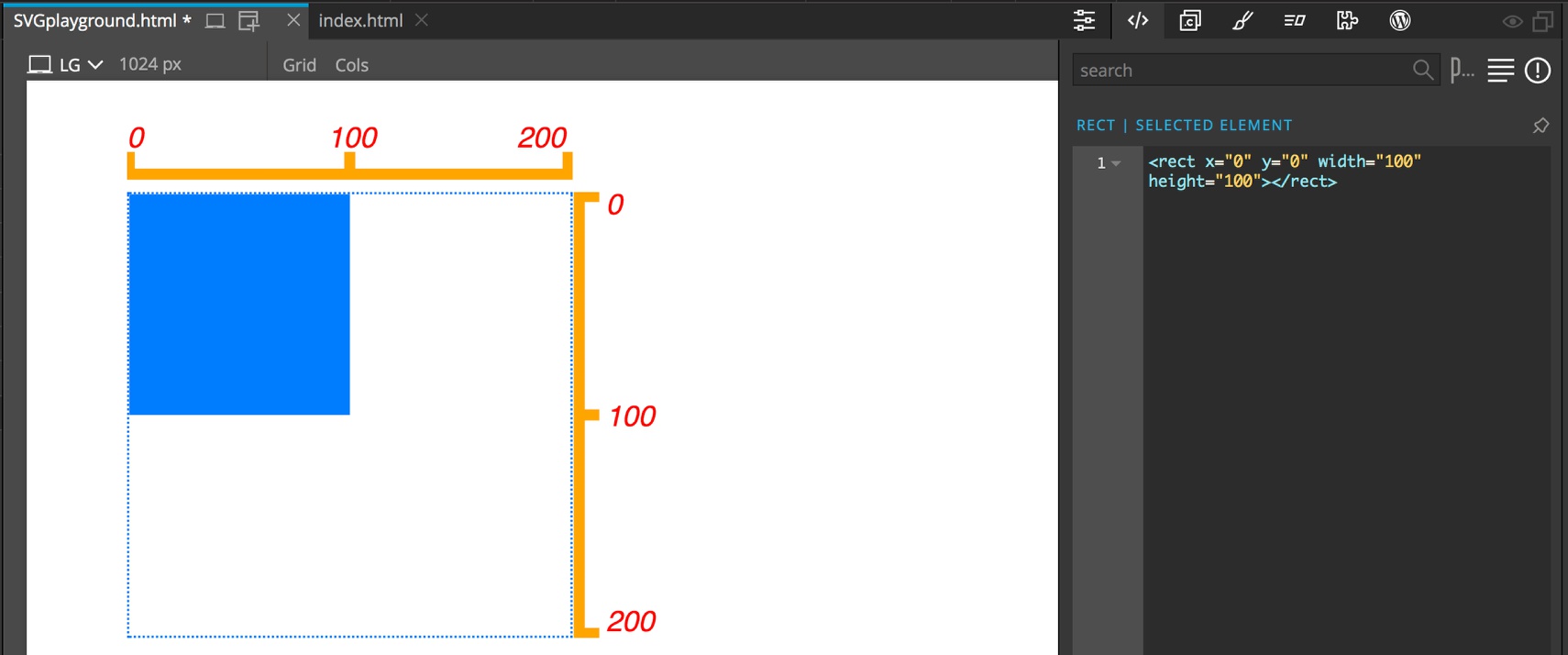
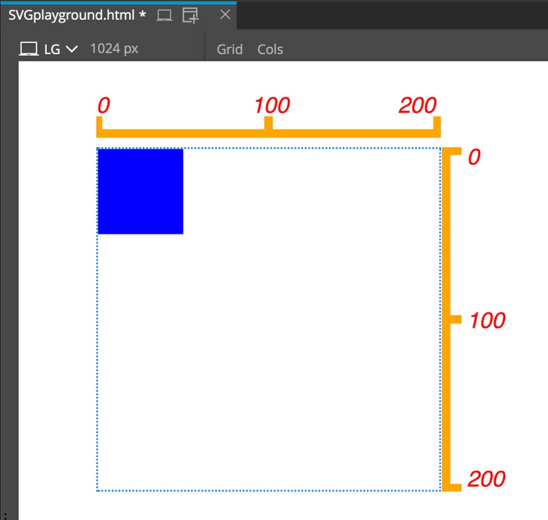
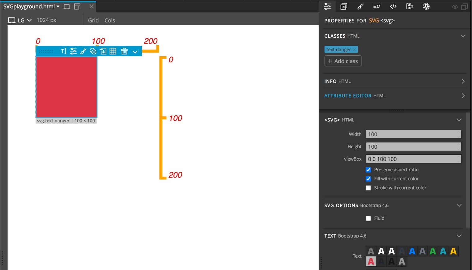
In this first example I have a blue square drawn by the SVG command:
<rect x="0" y="0" width="100" height="100"></rect>
In this tutorial I won’t go through drawing with SVG commands in detail, but this is basically giving a command to start drawing at the canvas x,y co-ordinates of (0,0) and make a rectangle 100 units wide and 100 units high. For the y-axis, the numbers go up the farther down the page you go, as depicted by the drawing above.
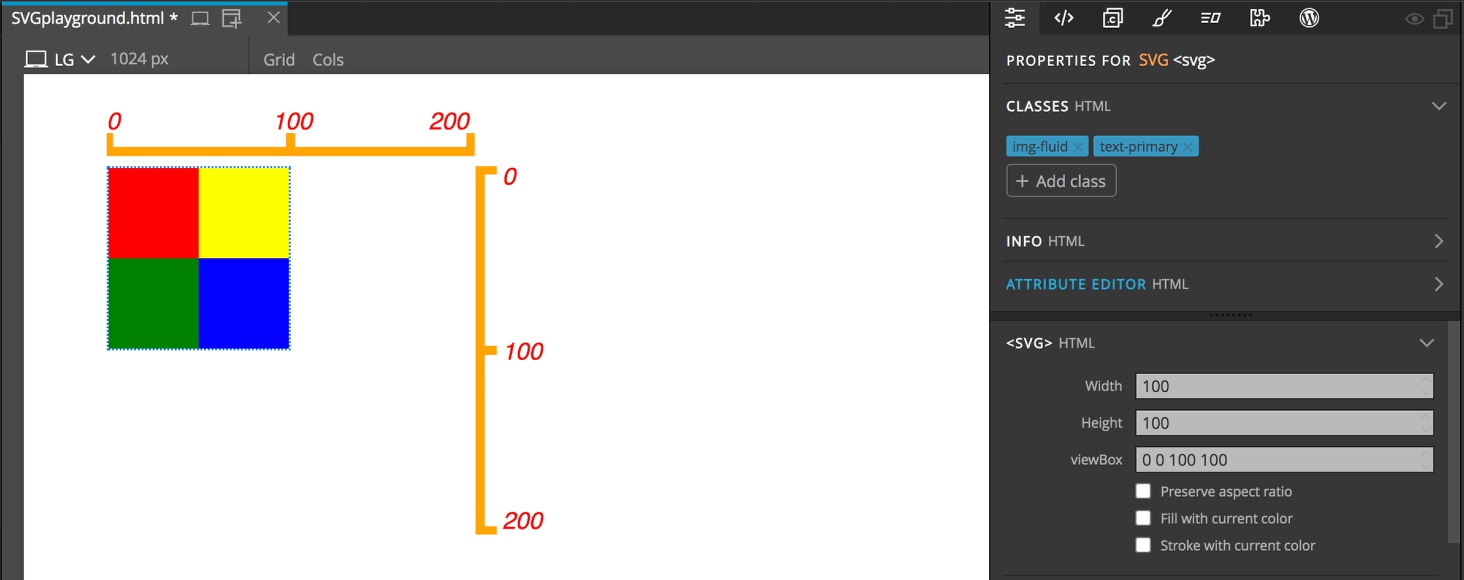
As above, my viewport is set to a height of 200 and a width of 200. Now if we look at the viewBox input it is 0 0 200 200. So this means start display the canvas at (0,0). Then display 200 units to the right along the x-axis, and 200 units down along the y-axis. In the first picture in this section showing the blue rectangle I outlined the SVG viewBox with a dotted blue line. The square itself is only 100 units high and 100 units wide, so it takes up half the viewBox in each direction, starting in the upper-left corner.
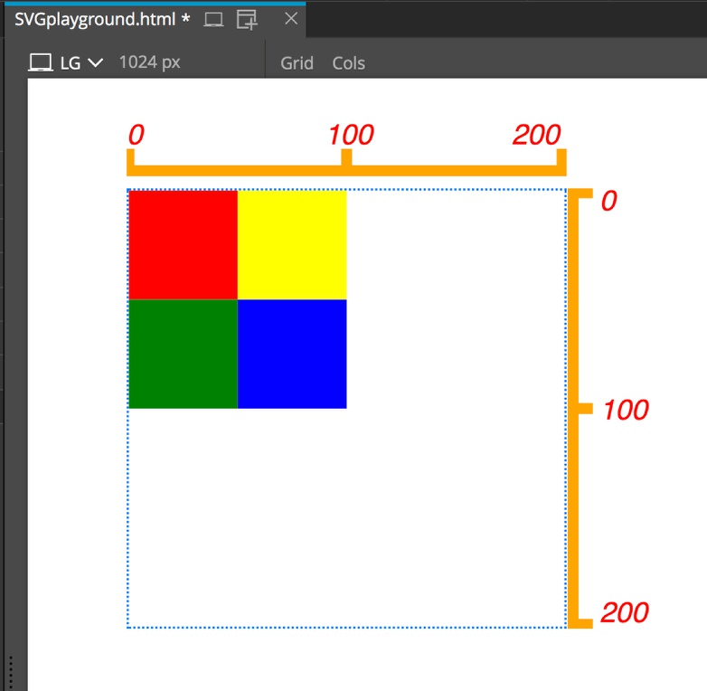
Here is where it gets a little tricky and to illustrate we will switch to a multi-color square. Now if we change the viewBox to 50 50 200 200 we can only see the little blue square in the lower right corner.
That is because the squares are still being drawn starting at (0,0) on the canvas, but we aren’t starting our display until (50,50)! The viewBox moves what region of the canvas we are looking at, not the image on the canvas itself. You can think about it like a cut-out in our web page to a layer below. If we move that cut-out, we will see something different.
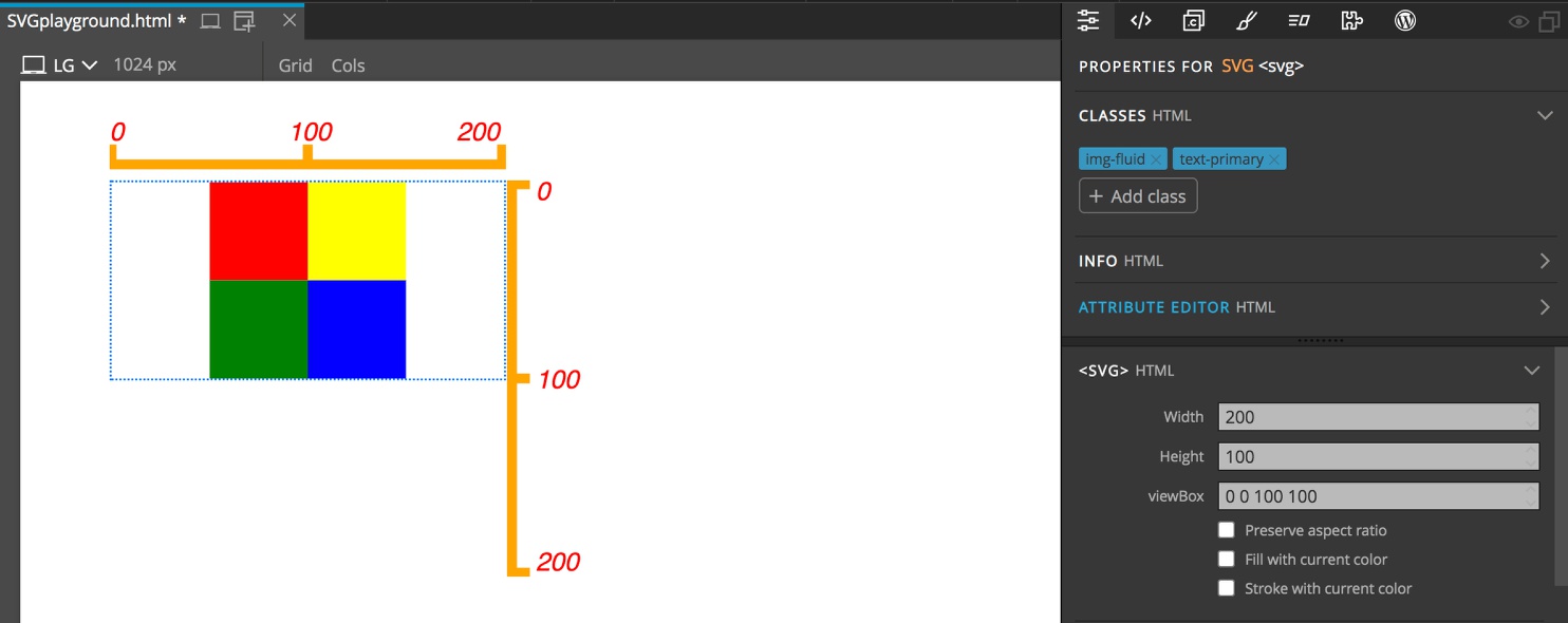
Okay, what happens if we change the third or fourth values? Let’s try 0 0 100 100.
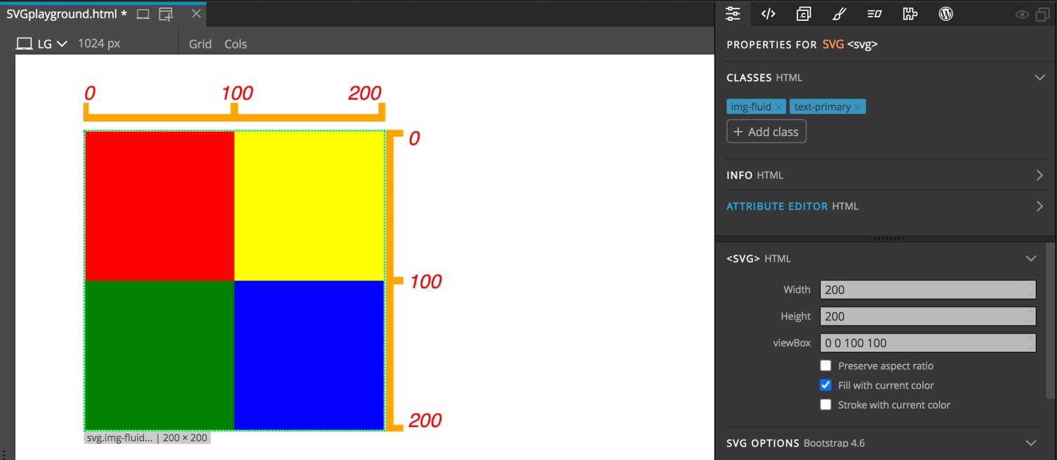
Now our multi-color squares take up the entirety of the viewBox. Note that if you look at the dimensions below our SVG it is listed as “200 x 200”. That is because we did not change the viewport size. It is still set to 200px by 200px. Setting the viewBox to 100 units width and height instructs the browser to “stretch” our 100 unit by 100 unit image to 200px by 200px! So basically, one pixel in our original image becomes 2px wide by 2px high. If this were a raster image (fancy name for one made up of pixels) the browser would have to figure out how to fill in the extra area. That isn’t the case with SVG, it is drawn on the fly with vectors, so no pixelation!

This also works with “shrinking” our images. If we say that we want to map 500 units of canvas to 200px of viewport, SVG will oblige.
Most of the time we will want to set our viewBox to the dimensions of our SVG image – in fact many of the SVG drawing programs will output this viewBox for us. To resize the image we will instead want to change the viewport size. If we have a responsive page, this means that the width:height ratio of our viewport could become different that the ratio of our SVG image. If the SVG scaled both the width and height independently it could result in a squished or stretched image. The SVG defaults take care of this for us by preserving the aspect ratio and sizing the SVG to take up the smallest dimension. We will come back to how we can change this at the end of our tutorial.
Working with SVG images in Pinegrow
As we have already seen, when an SVG element is selected in Pinegrow, we can change the viewport dimensions and the viewBox from within the Properties panel. Depending on whether we are using plain HTML, Bootstrap 4, or Tailwind in our project, there are additional ways to change the look of our SVG.
Adding new SVG images
In addition to drawing our own SVG images, there are a number of resources on the web: Scale, Logoipsum, and SVGRepo, just to list a few. You can either download the SVG images directly into a folder in your project, or download them and then open in a code editor to use the SVG image inline – we will explore the advantages and disadvantages or each approach.
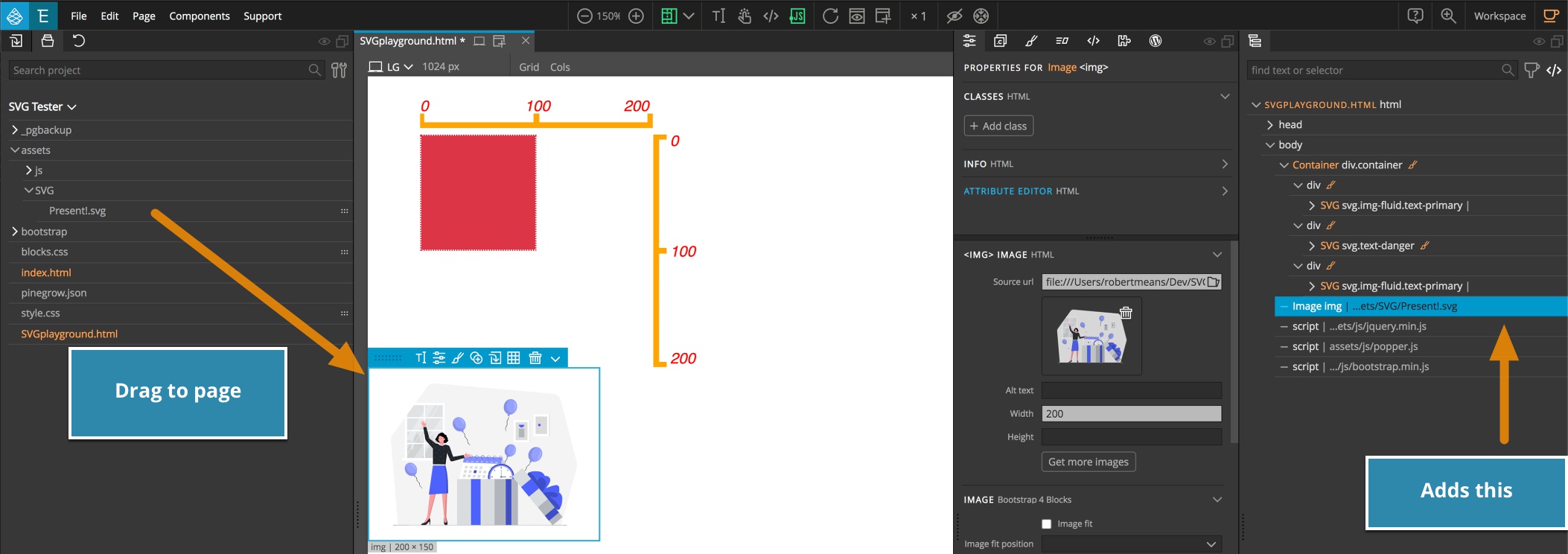
No matter the framework being used, SVG files can be dragged from the Project panel onto the page. This will add them onto the page within an <img> tag with the file name as src.
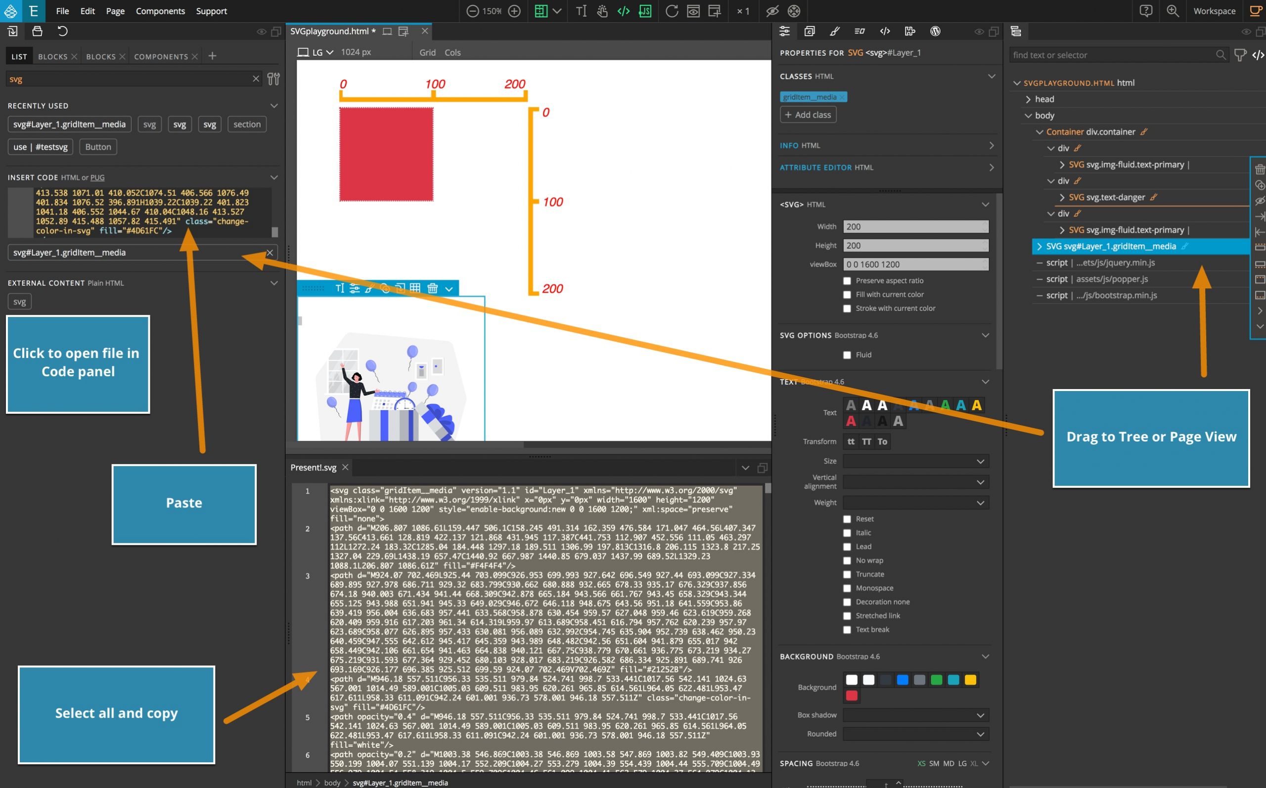
For using inline SVG images, you can either drag an <svg> element from the Library panel and then add the code for your image using the Pinegrow code editor, or paste your image code to the Code box in the Library panel and drag it to the Page View or Tree panel.
Inline versus embedded
SVG files added by embedding using the <img> element behave essentially like any other image file. Their size is controlled by normal width and height CSS properties or image attributes. The SVG will maintain its aspect ratio. You don’t have to worry about either the viewport or the viewBox. So why use inline SVG images?
One of the big advantages of using inline SVG is that you can then modify it using CSS.
Don’t like the color? You can change it.
Want to animate it with CSS animations, Pinegrow Interactions or other JavaScript manipulation? No problem.
Want to add a hover effect? Just use CSS.
These are things that can’t easily be done with embedded SVG. If you look at the size of SVG as compared with most images, they are also relatively small. Even though they will block any render until they load in, the small size means they load fairly quickly. The ‘Agency’ template in both the Tailwind and Bootstrap 4 blocks contains approximately 28 inline SVG images. The overall page size if served with ‘GZIP’ compression is only around 150KB. Best of all, it only requires one HTTP request to get all of the images as opposed to the 28 requests (plus the page request) that would be required using HTTP/1.1. Each of these request dialogues between the browser and server require a large number of millisecond for the handshake and negotiation before data transfer, lengthening your page load time. The newer HTTP/2 has parallelization of requests, but is still not fully embraced by the entire internet.
So what disadvantage are there to inlining your SVG? As outlined, they do block page load, so if you have really large file it probably would be a better idea to embed it. The other potential disadvantage is that it does make your code look a little messy. Sometimes SVG images can be quite a number of lines worth of code, but luckily, we have code folding! The final disadvantage is that inlining your SVG instead of embedding means they can’t be cached. So, returning visitors to your site will end up using bandwidth to download the images again. This is a judgement call regarding how many times the visitor will be returning to the same pages. One perceived disadvantage of inlining your SVG is that if you use the same images in multiple places the browser will have to download the code multiple times. This actually isn’t true. SVG can be ‘defined’ in one section of code and then reused throughout the same page.
Overall, in most cases there isn’t a real downside to inlining your SVG, but in the end it is a personal choice.
Changing the SVG colors
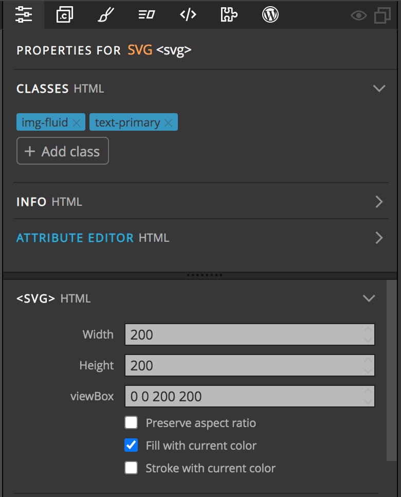
With inlined SVG you can use CSS to easily change colors within the SVG. There are a couple of ways to do this. When selecting an SVG in Pinegrow there are two checkboxes in the Properties panel , ‘Fill with current color’ and ‘Stroke with current color’. For both frameworks you can click on either of these boxes and then select a font color from the respective Properties panels. When working with a plain HTML page or with other frameworks you’ll need to change the font color either from the Styles panel (inline or with CSS) or from the framework specific Properties panel. The fill option will fill in some areas of the SVG with the text color, the stroke option will use that color for some of the lines in the SVG. This is highly dependent on how the SVG was designed.
You can also select different portions of the SVG from the Tree panel and use the same two checkbox options to add color.
As with other DOM elements, the main SVG and all of the components can be given both class names and ids. This allows for targeting of either the whole of the SVG or portions to change color on hover or have click/touch actions.
SVG sizing
When using SVG in either Bootstrap 4 or Tailwind it is important to add a class to cause them to obey the dimensions of the parent element. In the case of Bootstrap 4 this is the img-fluid class. For Tailwind it is max-w-full. In both cases this will add a CSS rule of max-width: 100%;. You can add the same thing in plain HTML or other framework using either inline styling or a custom class.
SVG Use
One of the criticisms of inline SVG images is that they can’t be cached. While this is true, they can be loaded once and reused on the same page. This can be accomplished through the <use/> tag. There is also another set of tags <defs></defs> that allows you to define an SVG image anywhere on the page, but only display it using a <use/> tag. This is useful for large SVG images below the fold. That way, the transfer of data doesn’t block the page display, but by the time the users scrolls to the image it will have loaded – a little like lazy loading of images.
To reuse an SVG image (or part of an image – for example in a file made up of a grid of SVG icons) you just need to add an id to the portions you wish to use, for example:
<svg viewBox='0 0 100 100' xmlns='http://www.w3.org/2000/svg' width="100" height="100">
    <rect id="example-rect" x="0" y="0" width="100" height="100"></rect>
</svg>
Now to use this you would define your SVG element, but instead of putting a set of commands inside, you add in the <use/> with a href attribute with a value equal to the id of the element.
<svg viewbox="20 20 100 100" height="200" width="200">
   <use href="#example-rect" fill="red"/>
</svg>
Reusing an SVG this way allows you to pass in attribute values to change the dimensions and colors of the referenced image. However, only x, y, width, height and href will override values set on the original image. So, if I had set a fill value on the ‘#example-rect’ I would not be able to change the fill color in the SVG being displayed with <use />. One way around this is to use CSS variables within the original SVG.
<div class="svg-container">
  <svg viewBox='0 0 100 100' xmlns='http://www.w3.org/2000/svg' width="100" height="100">
  <style>
    div.svg-container {
      --stroke: red;
      --fill: blue
    }
  </style>
    <rect id="example-rect" x="0" y="0" width="100" height="100" style="stroke:var(--stroke);fill:var(--fill);"/>
  </svg>
</div>
Then when you use the SVG later in your HTML you can either style the div that is wrapping the SVG, if there are a number of different elements within the SVG , or the element itself by adding a class.
<div class="svg-div">
    <svg viewbox="20 20 100 100" height="200" width="200">
        <use class="direct" href="#example-rect"/>
    </svg>
</div>
So in this example we could define the --stroke and —fill variables with CSS styling targeting either .svg-div or .direct.
If you have a very complex SVG image that you want to reuse, you can wrap the entire image with <g></g> tags with an id assigned.
As mentioned above, the <defs> element can store SVG images for use elsewhere on the page. To store an element, you just wrap the entire set of SVG commands with the element. For example:
<svg viewBox="0 0 10 10" xmlns="http://www.w3.org/2000/svg"
     xmlns:xlink="http://www.w3.org/1999/xlink">
  <!-- Some graphical objects to use -->
  <defs>
    <rect id="rect1" x="0" y="0" width="100" height="100"></rect>
  </defs>
</svg>
This will cause the SVG to not display where it is being loaded, but only where you add the <use/> tag – in this case with a href="#rect1". Importantly, You can define your complex SVG at the end of your page body where it won’t block page render, but use it farther up the page.
Note: We haven’t talked about namespaces (here is a link to more info) in SVG, yet. If we inline an SVG image and serve it as a normal HTML page, modern browsers don’t need to be instructed how to handle that data. For older browsers, embedded SVG, or pages served as XML, we need to tell the browser that it should use XML to interpret the code. In the above example, the main namespace is defined by the
xmlnsattribute. This is typical for any SVG. In this case however, we are adding a second namespace using the attributexmlns:xlink. This tells the browser that it needs to use a different specification for any XML links like<use/>. This is slowly being phased out.
Using Pinegrow Interactions with inline SVG
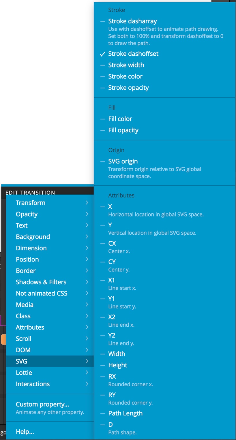
One advantage of inline SVG is that they can easily be manipulated by JavaScript, opening the door to using Pinegrow Interactions. If we look at the Interactions Transition property menu, we can see a number of SVG properties that we can manipulate.
The attributes in the last section allow us to directly manipulate SVG commands for drawing and displaying shape. For example, we can see both Width and Height which will allow us to animate our viewport.
There are also properties for changing fill color dynamically as well as stroke width and color. My favorites, however, are the Stroke dasharray and Stroke dashoffset properties. These properties allow you to add dashes into a variety of SVG vectors. By using a tween to animate the dashoffset from 100% to 0 you can animate the drawing of your SVG.
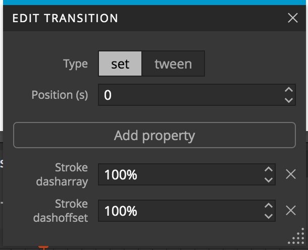
In this example, I first added an interaction to the Pinegrow logo. For trigger I selected ‘Page & Window’ -> ‘Load – Immediately/When created”. I left the target empty and added a custom animation. On the time line I added a transition with a type of ‘set’ and added two properties – ‘SVG’ -> ‘Stroke dasharray’ and ‘SVG -> ‘Stroke dashoffset’. I set both of these to 100%. Additionally, I added a ‘Hide at Start’ interaction. With some complex SVG, setting the stroke properties to 100% sometimes won’t completely hide all of the paths. Hiding at start will make sure your SVG isn’t seen until the animation starts.

Next, I selected the button element and added an interaction. For trigger I selected ‘click on …’. Then for target I selected the logo SVG by clicking on ‘edit selector’. My logo SVG has an id of PGlogo, so for selector I typed $#PGlogo. The dollar sign allows the selection of anything on the page, and the hash indicates the ‘PGlogo’ is an id.
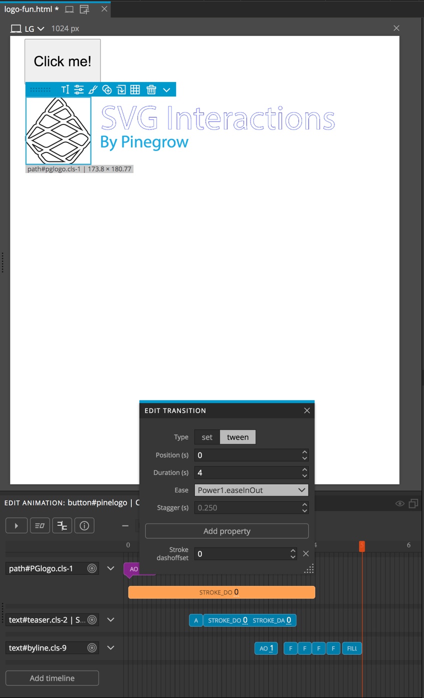
On the timeline I then added a new transition with a type of ‘set’ and a property of ‘Auto opacity’ set to ‘1’. This will allow our SVG to display. Then I added a new tween transition with a duration of 4 – this controls the drawing speed. You can select any ease you would like, but I picked ‘Power1.easeInOut’. Then I added a property of ‘SVG’ -> ‘stroke dashoffset’. For the value I added 0, which makes all of the paths in my SVG solid.
I have also added two other animations to my SVG using Interactions. You can download the project and look at how I accomplished this on your own. Mostly, just experiment and have fun!
Getting into the technical weeds
The last section of this tutorial deals with some aspects of SVG that are usually left as default. Feel free to read on or skip to the very end for links to our forum.
SVG preserveAspectRatio attribute
One last core part of using SVG is the attribute ‘preserveAspectRatio’. Basically, this allows us to control both the position and dimensions of the image when the viewport is stretched or shrunk. By default, browsers will maintain the same width:height ratio of the SVG, even when the viewport would stretch or shrink different amounts on the x-axis versus the y-axis. It will set both the number of displayed height and width units equal to the higher of the two. To simplify and illustrate this, we will set the viewBox to 0 0 100 100 and our height and width both to 100. This will cause our multi-colored square to occupy a 100px by 100px space. Now to see the impact of preserveAspectRatio, we will change the width of the viewport to 200. This basically simulates the users making the browser page wider if we had the width set to a relative unit like %.
So, even though we doubled the viewport width, the SVG image maintained the same aspect ratio. To maintain the ratio the browser mapped the height and width to the smaller of the two viewport values, 100 units, through the default preserveAspectRatio of xMidYMid meet. Huh, what the heck does that mean?!?
The preserveAspectRatio attribute takes two (sort of three) different values.
SVG alignment
The first, ‘align’, is a combination of two values and defines how you want the image placed on the x-axis and the y-axis. Each axis can take a placement designation of ‘Min’, ‘Mid’, or ‘Max’ for a total of nine values spanning xMinYMin to xMaxYMax.
Note – while capitalization of the attribute name is not important, this attribute value is actually an XML attribute meaning the capitalization of the value is VERY important. The ‘x’ is lowercase, the ‘Y’ is uppercase, and the placement designation is uppercase.
In our example above, the square was moved to the middle of the 200 unit wide viewport, outlined with the blue dotted border. If we were to change our preserveAspectRatio to xMinYMin the square would be all the way to the left side of the viewport while still being completely visible. Changing it to xMaxYMax would place it all the way to the right side of the viewport. Since the height of the square fits within the 100 unit viewport, the y-axis value doesn’t matter. The square will display the same with xMinYMin and xMinYMax.
SVG overflow
The second preserveAspectRatio value, ‘meet|slice’, determines whether the browser allows overflow. The default meet means that the browser will scale the image, maintaining the aspect ratio and resizing for the narrower of the two viewport values. In our example above, it scaled the square to completely fit the 100 unit height of the viewport, leaving the width smaller than the 200 unit width of the viewport.
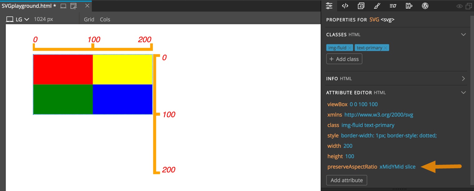
The other value, slice, instructs the browser to maintain the aspect ratio of the image, but instead of stopping at the smaller value, use the larger value. By default, any part of the image not within the viewport will not be displayed. In this example, since the alignment of the preserveAspectRatio is set to xMidYMid, we see the middle of the four-color square. Setting it to xMidYMin would display the top two squares, while YMax would display the bottom two. In this case, since the width doesn’t exceed the viewport, changing the x-axis placement has no effect.
One other note, using the overflow CSS styling property can over-ride the default of not displaying parts of the image that are outside the viewport. If you want, you can also allow your SVG to be stretched or squished by setting the preserveAspectRatio to none.
Summary
That is it for this tutorial. Hopefully you feel a little more comfortable with SVG images, when to use them, and how to manipulate them in Pinegrow. Like many other aspects of HTML and CSS, there will be a range of opinions about whether to use SVG inline, embedded, or through other JavaScript injection methods, hopefully this tutorial gives some compelling reasons why using inline SVG has some distinct advantages.
Discuss this tutorial
Have questions or comments about this tutorial? Let’s talk about it on our forum.
Get in touch
Would you like to see your favorite theme or blocks library featured in the next tutorial? Let us know in the forum or by email!