Using media queries and CSS functions to create a responsive design in Pinegrow
Your website needs to look good on a variety of screen sizes. Pinegrow makes responsive design easy with a variety of different tools.
People are increasingly using a variety of devices to surf the internet. It is important that your designs are showing up correctly on phones, tablets, laptops, and desktops. In this tutorial we are going to examine how easy it is to set-up and use media queries in Pinegrow. Along the way we will also look at some other elements that contribute to both responsiveness and accessibility.
Let’s get started!
Prefer to read? Scroll past the video.
This tutorial is available in video and textual form. Watch the video, or continue reading if you prefer to read. Of course, you can also do both!
First, let’s look at what we will be creating.
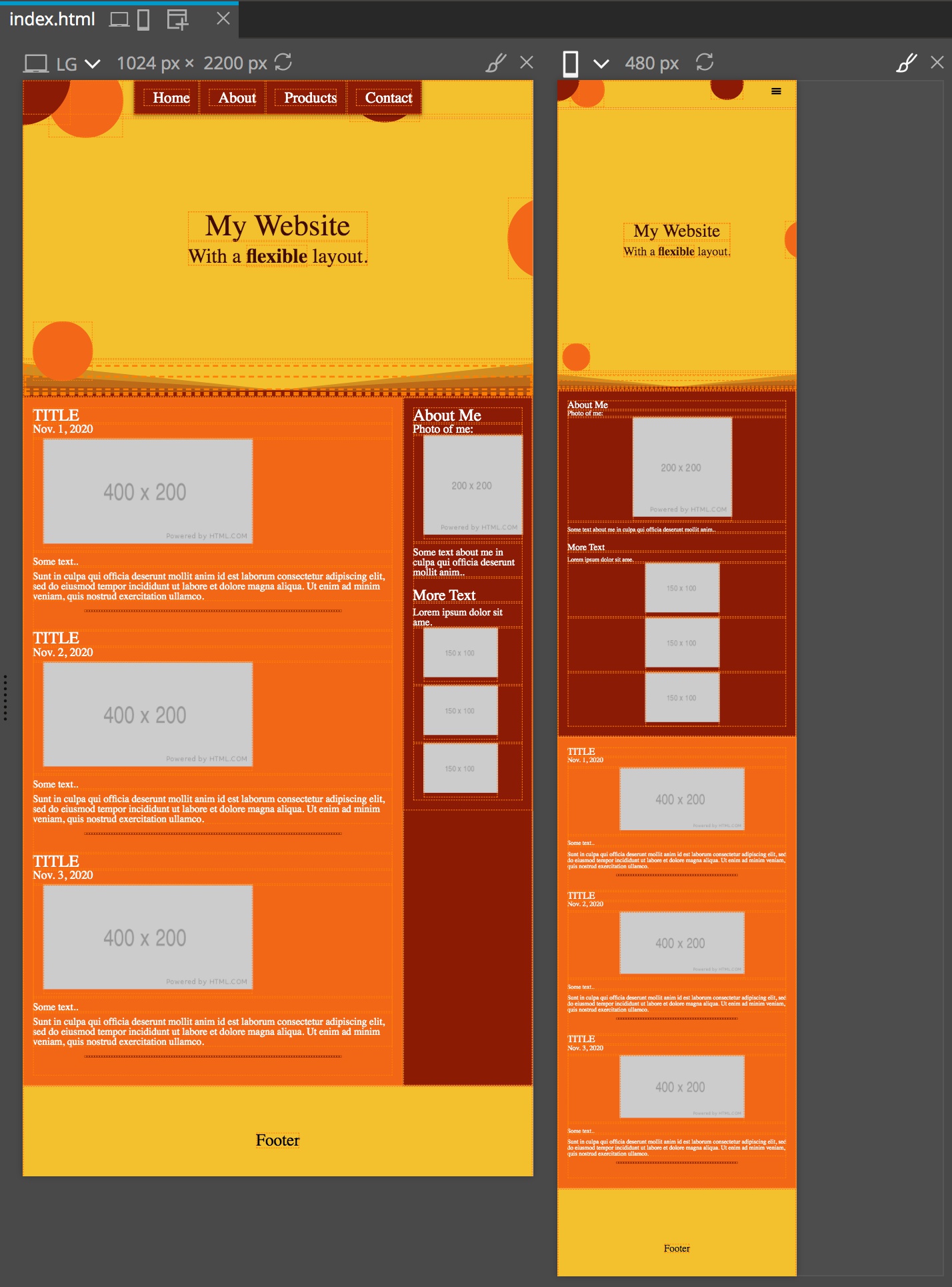
On a large screen we are going to have our menu links lined up next to each other. When the screen size drops down we want to convert over to a conventional hamburger menu. For our main content we will have a sidebar on large screens for our “About Me” information. The rest of our content will be displayed on the remainder of the screen. On smaller screens , once again, we will have the content stack with the “About Me” section stacking on top of the remainder of the content. Overall, the changes we are making here are minimal, but should give you a good handle on how to work with media queries in Pinegrow.
Download the project
To speed things up I am starting with a non-responsive page – you can download the starting template and finished project. If you open the starting template you can see that the page looks almost the same on a mobile-sized (480px wide) window and medium-sized (1024px wide) window in the Pinegrow Page View.
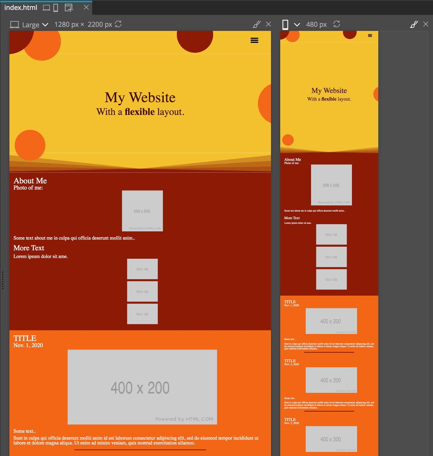
When I put this page together I designed it for the smaller screen first – this is called mobile first design and accomplishes multiple things, but for the purposes of this tutorial the important thing is it generally reduces the amount of required media queries.
Selecting breakpoints
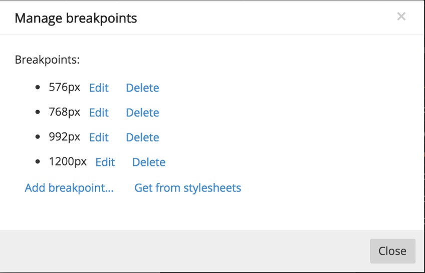
There is no “correct” way to select breakpoints and there are many philosophies about how breakpoints should be used. However a good starting point is to use something close to the breakpoints that the major frameworks use. We can easily use Pinegrow to take a look. Go ahead and open up a new Bootstrap page and the go to the page menu and select “Manage breakpoints…” This brings up a modal with the stock Bootstrap breakpoints of 576px, 768px, 992px, and 1200px.
f you do the same with a Tailwind page you will see similar breakpoints of 640px, 768px, 1024px, and 1280px. These roughly correspond to:
- mobile portrait: < 640px
- mobile landscape: 640px – 767px
- tablet portrait: 768px – 1023px
- tablet landscape: 1023px – 1279px
- laptop and desktop: > 1279px
There is some back-and-forth in the design community of the best unit for setting breakpoints. As you can see, the major frameworks use “px”. However, this assumes that all the users of the website have their browsers set-up identically with the base font size being “16px”. However, visually impaired people often increase the base font size. This can mean that your design will “break” if you use fixed pixel breakpoints, changing page flow after the increased font size has already disrupted the ability of the content to fit the particular screen. One way around this is to use “em” units to set the breakpoints. If the user has not changed the base font size then 1em = 16px. If they have changed it than that same em unit will equal what ever they have set it at.
As a side note – if you choose to use em units and are hung-up on how big something is going to be in pixels you can set a font size on the body to make it easier.
body {
    font-size: 62.5%; /* font-size 1em = 10px */
}
p {
    font-size: 1.2em; /* 1.2em = 12px */
}
Okay, so what should we do with our project? I prefer using em. Luckily, Pinegrow isn’t opinionated about this! With our base template page open, go to the page menu and select “Manage breakpoints…”.
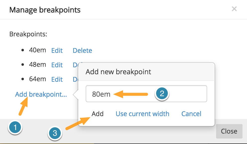
Then add the following by clicking on the “Add breakpoint…” link, typing them into the input box, and clicking “Add”:
- 40em
- 48em
- 64em
- 80em This corresponds to the same 640px, 768px, 1024px, and 1280px of the Tailwind framework.
Making your text responsive
Traditionally, designers would use each of the breakpoints that we just defined to change the size of the displayed text at each breakpoint. That is a perfectly valid way to define text sizes, but we can also make the text far more responsive in modern browsers. One way is to set a calculated base font size for the entire page based on the screen size. We will set it on the “html” element of the page in this case, but you could add it to the “body” element as well. Note: In the starter template I’ve already completed this step.
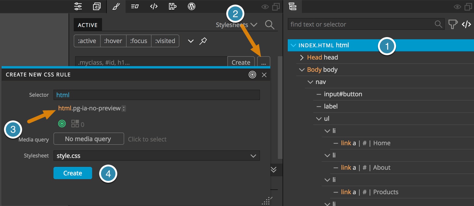
- From the Tree panel, select the top “html” element.
- Open the Styles panel and click on the ellipsis button.
- Click on the html selector in the breadcrumbs
- Click “Create.
Now, with your new rule selected scroll down to the “Font/Text” section of the visual editor. Within the Size input type: “calc(0.5em + 2.5vmin)”.
So, what does this mean?
First, we are using “calc()” which, as expected, can calculate a value from some inputs. In this case we are supplying two.
The “0.5em” value will be half of whatever value the user has set the base font size. On a base browser that is half of 16px, or 8px. The “2.5vmin” means that the browser will take the smaller of the vw or vh and multiply it by 0.025 (2.5%). For a small screen like a phone this will be around 320px = 325*0.025 = 8px. This will give a base font-size of 16px. As you move up in size the font-size will become progressively larger.
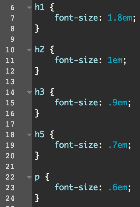
Now at this point you just need to set the sizes for each heading you will use and the base paragraph. While you could use the Styles panel to set each, I just edited the stylesheet code directly. I might be setting these sizes a little small, but you get the idea.
Using calc() to make other elements responsive
Within the header I have a number of circles that change size and position depending on the screen size. Like with the font-size, I’m making use of both “calc()” and the size of the viewport to accomplish this. Let’s take a look at one of the bubbles.
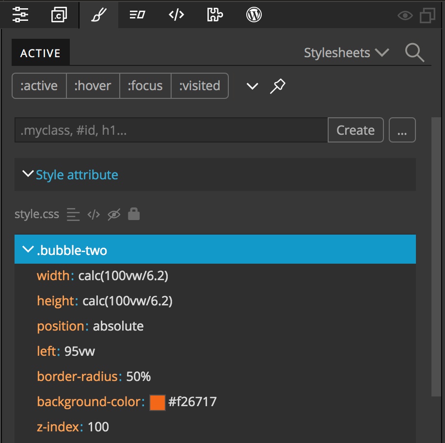
I want the bubble to be round, so I’m setting the “width” and “height” properties to the same value. In both cases I’m using a calculation to set the size to be a percentage of the width of the viewport. The percentage I selected is random – I just picked what looked good to me, in this case “6.2”. Therre is a good argument here to use “vmin” instead and I will leave it to you to experiment.
For positioning I’m using “left: 95vw”. This will put the element partially out of the viewport. “Wait, wait – you can use ‘right: 5vw’ to accomplish this!” I hear you saying. True, but one of the funny things about CSS is that if you position with the “right” or “bottom” properties you can get overflow. The “left” and “top” properties don’t trigger this, so you aren’t as likely to get horizontal overflow and odd scroll bars.
Using flex box and media queries – the menu
Now we have come to the first responsive element that uses the breakpoints we set. We want to have the menu change from a clickable hamburger to a menu that has the links displayed at all times when we are on a phone in Landscape mode and above.
So, what does this involve? Right now, the list of menu links only displays when we click on the hamburger.
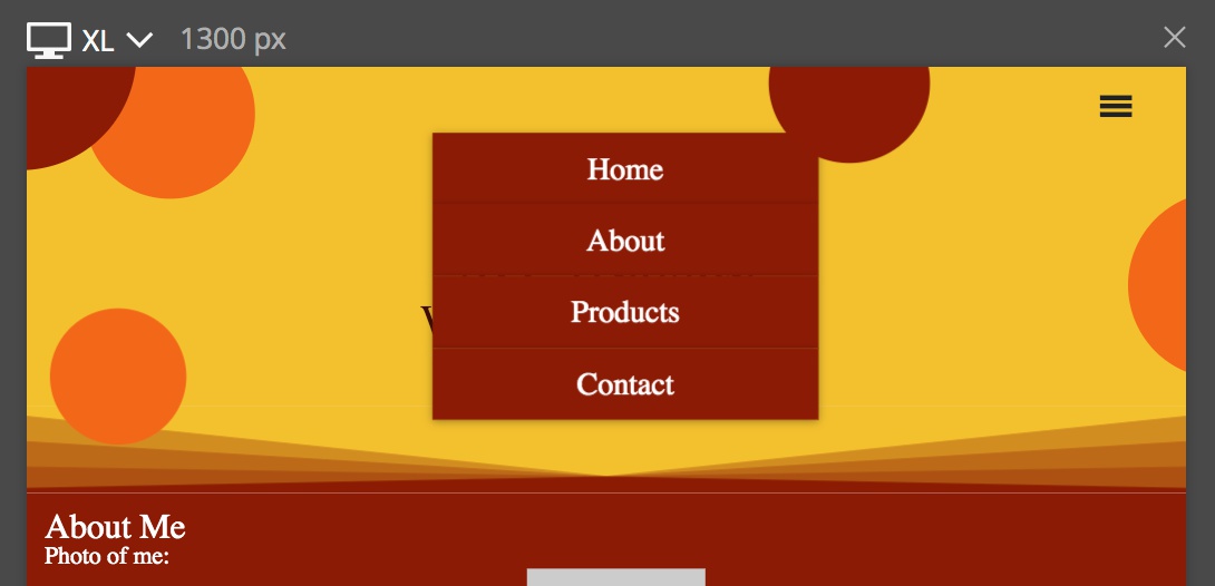
Instead, we want the hamburger icon to disappear, the menu items to always be visible, and the links to be centered and next to each other at the top of the screen. Let’s walk through each.
First, let’s make the hamburger disappear at larger screen sizes. If you look at the CSS styling, you can see that the hamburger is added through the label. We need to set this to “display: none”. First, make sure that your Page View is either displaying a page larger than 640px (40em) or if you have multiple pages that the paintbrush in the upper corner of the larger than 640px page is selected. This will ensure that our new rule will be displayed in the Styles panel. Remember, only “active” rules will be displayed and we are making a rule that will only be active at larger screen sizes.
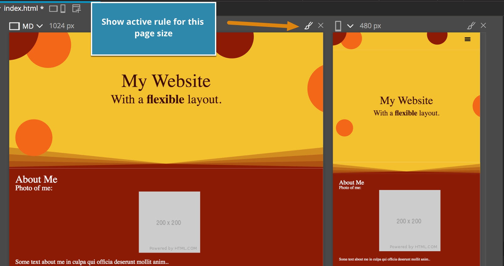
- From the Page View or Tree panel select the label element
- From the Style panel click the ellipses button and then select the “nav” and “label” breadcrumbs from the selector builder.
- Click the “No media query” button.
- Click on the “40em and up” button.
- Click the “Create” button.
Okay, a slight diversion to explain about the Pinegrow media query selector.
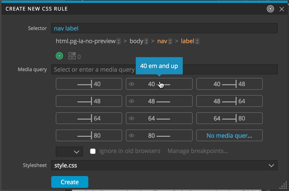
There are three columns of buttons you can click, along with a button to remove any media query in the lower right. The first column will add a media query for applying the rules to any viewport that is smaller than the listed size. So for the top-most button, any viewport that has a max-width smaller then 40em. The middle column of buttons will add a media query the has a minimum size of the listed breakpoint. The final column of buttons gives a media query that will limit the rule to being applied only when the viewport size is larger than the first breakpoint, but smaller than the second breakpoint.
In mobile-first design, we generally never use the left column of buttons. We design first for the smallest screen and then add media query rules as the screen gets bigger. The media query we added will add styling whenever the screen is bigger than our mobile: portrait breakpoint. We have now targeted the hamburger icon on screens larger than base mobile screen.
With our new rule selected we can go to the Visual Editor and select “display: none”.
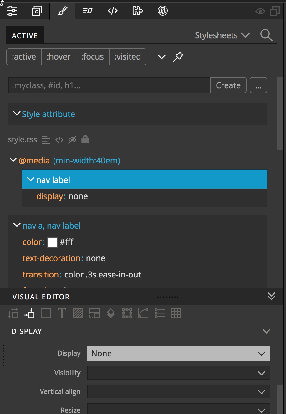
Next, we need to display and position our menu block. Our menu items are contained within an unordered list.
- Select the “ul” element from the Tree panel.
- Open the Style panel and click the ellipsis button.
- Pick the “nav” and “ul” elements from the selector breadcrumbs.
- Click on the “No media query” button.
- Select the center “40 em and up” button.
- Click “Create”.
Using the Visual builder add the following rules:
width: 100%
position: static
z-index: 500
display: flex
justify-content: center
Okay, menu displayed and hamburger hidden on large screens!
Next, we need to add another rule to make everything line up. With the label hidden the header has gotten slightly smaller, so I’ll create another rule to increase the size.
- Select the nav element from the Tree panel.
- Open the Styles panel and click the ellipsis button.
- Click on the nav element in the selector breadcrumbs.
- Click on the “No media query” button.
- Select the 40em and up button.
- Click “Create”.
Okay, once again we have a rule that targets screens with a min-width of 40em.
With the rule selected add a min-height of 2.25em in the Visual Editor.
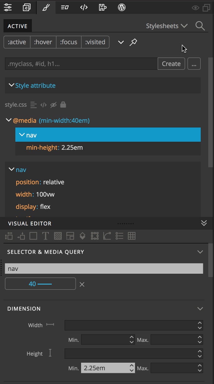
Using flex and media queries for section order
Next, we want the “About Me” section to show up as a side bar on larger screen sizes. To do this we will take advantage of CSS flexbox styling. We want the sidebar to take up 25% of the screen width and the main content to take up 75%. We also want the sidebar to stack on the right side of the main content.
- Select the div containing the side content from either the Page View or the Tree panel. It has a class name of “.side”.
- Open the styles panel and click on the ellipsis button.
- Select the “.side” class in the selector breadcrumbs.
- Click on the “No media query” button.
- Select the 40em and up button.
- Click on “Create”.
- Scroll down to the “Flex Child” section in the Visual Editor.
- Add a flex-basis of “0px”.
- Add a flex-grow of “1”.
- Add an order of “2”.
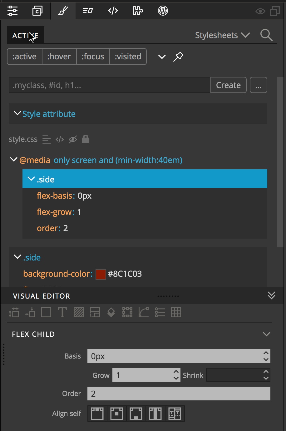
If we look at our large screen we can see that the side bar content is located below the main content now. Let’s style our main content so that it loads to the side.
- Select the div containing the main content from either the Page View or the Tree panel. It has a class name of “.main”.
- Open the styles panel and click on the ellipsis button.
- Select the “.main” class in the selector breadcrumbs.
- Click on the “No media query” button.
- Select the 40em and up button.
- Click on “Create”.
- Scroll down to the “Flex Child” section in the Visual Editor.
- Add a flex-basis of “0px”.
- Add a flex-grow of “3”.
- Scroll to the background section and select a background color of “#f26715”.
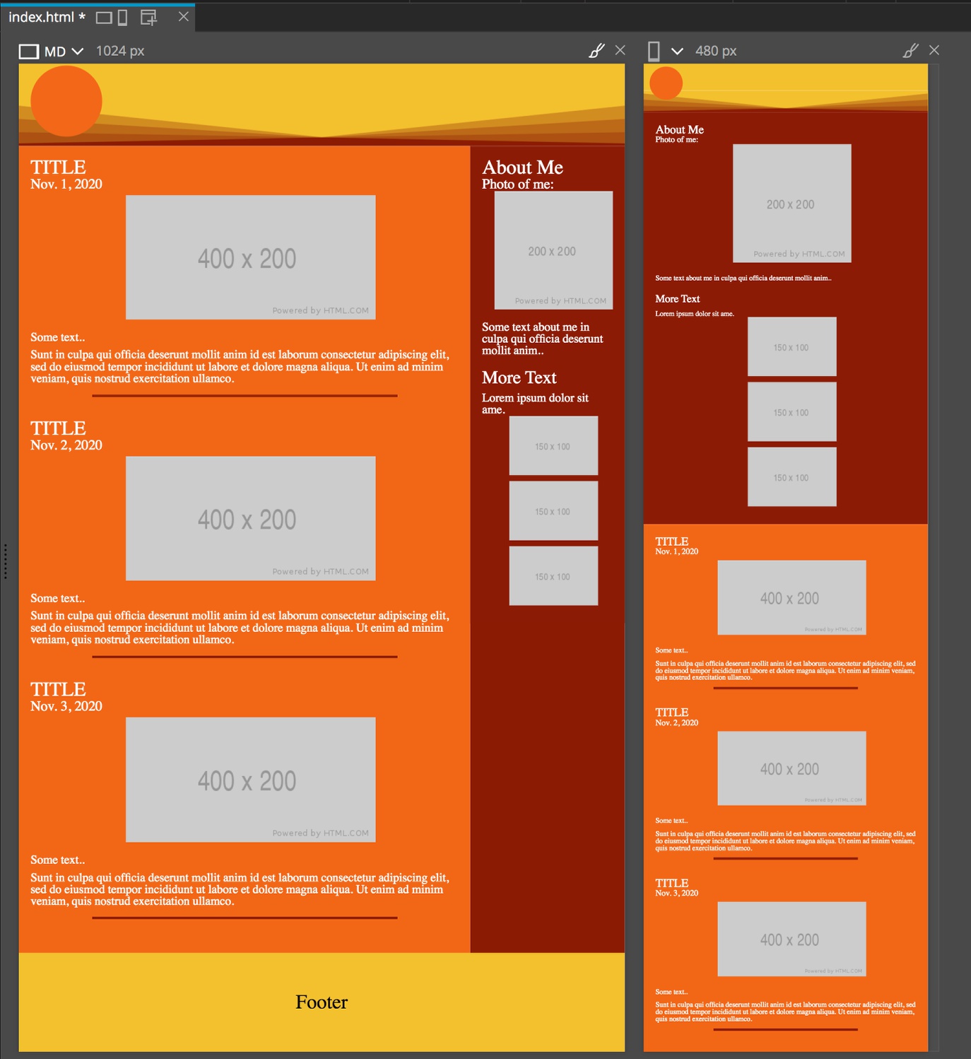
The background-color rule was added to make sure that the entire section maintains the same background even if it is bigger than the content. The styling could likely be reconfigured to make it unnecessary.
So that is it! If you want to take a look at the final project you can download it here. This example is a little artificial. On a real site we would likely use a few more media queries to get our design looking just how we want it. However, I hope this tutorial has shown you how much can be done simply by taking advantage of the CSS calc() function. We can have a responsive design that doesn’t override any accessibility alterations made by the user.
Discuss this tutorial
Have questions or comments about this tutorial? Let’s talk about it on our forum.
Get in touch
Would you like to see your favorite theme or blocks library featured in the next tutorial? Let us know in the forum or by email!