Pinegrow makes adding a JavaScript library into our projects easy! Here is an example of using the “iziModal” library to add modals to a plain HTML project.
We will be continuing from our last tutorial where we learned how to add modals to a Bootstrap 4 project. In this case, we will be adding modals to a plain HTML project.
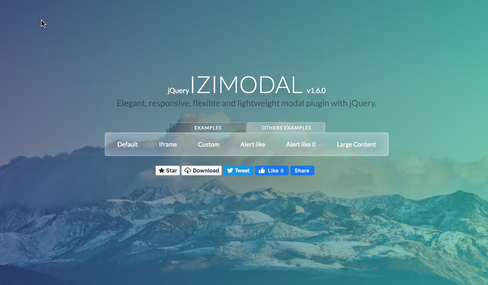
This will require a little bit more hands-on programming since we don’t have a framework providing all of the background code. We will be using a really nice JavaScript library called ‘iziModal’ that has some good built-in features, but is fairly light-weight at 132kb minified.
Let’s get started!
Prefer to read? Scroll past the video.
This tutorial is available in video and textual form. Watch the two videos, or continue reading if you prefer to read. Of course, you can also do both!
Note: The video includes setting the project page up and using iziModal. If you want to skip the optional project set-up, fast-forward the video to the 6 minute mark.
1. Create or open a project
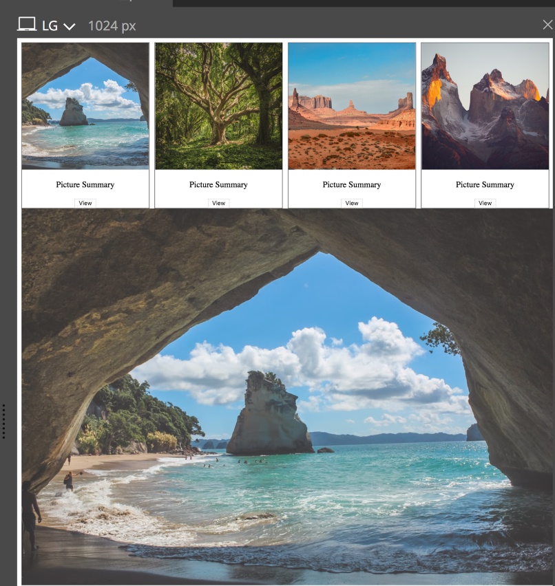
For the purposes of this tutorial I’m going to first put together a quick gallery page. Obviously you won’t have to do this to add modals to your own project, but I think it nicely illustrates how easy it is to put together a page in Pinegrow.
Note: These first steps are just for the purposes of the tutorial. You can skip to step 3 to implement iziModals in your own project.
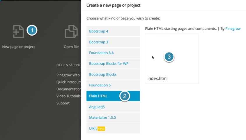
Open a new HTML page and save it as a project by first clicking on the “New page or project” button, then selecting “Plain HTML” as the project type and the “index.html” template.
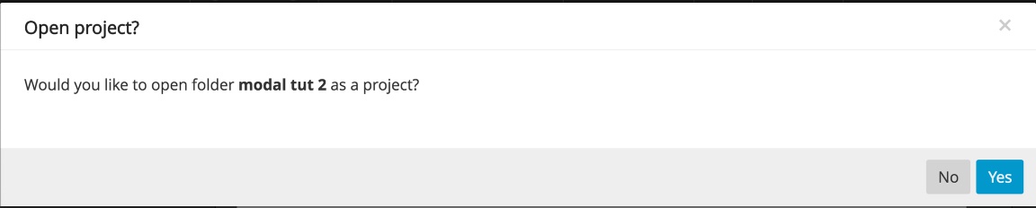
Save the project and click “Yes” on the resulting pop-up.
2. Create a quick gallery page
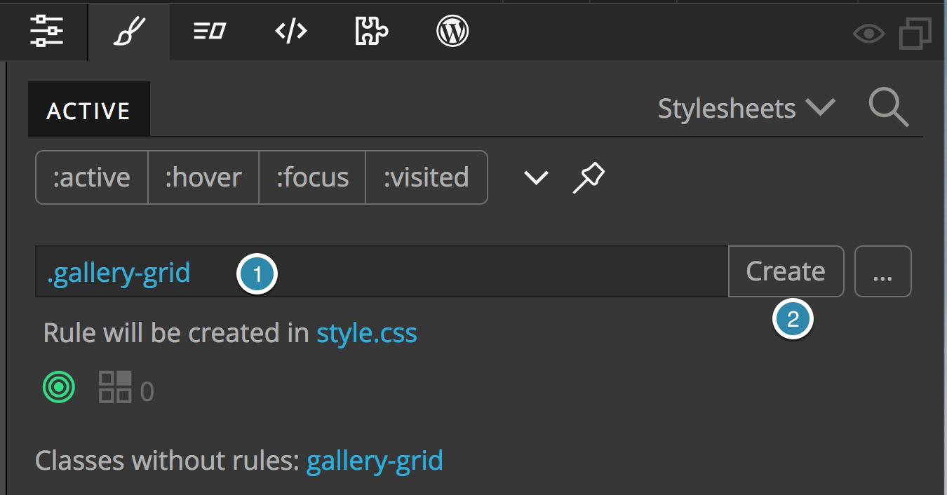
Drag a div to the page and create and add a new class from the Style panel called gallery-grid.
With our new rule selected, scroll down to the “Position and display” section by clicking on the second icon from the left. Change the display to “Grid”.
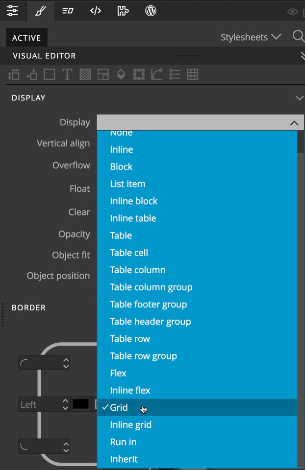
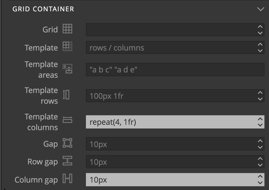
Next, scroll down to the “Grid Container” section by clicking on the last icon at the top of the visual editor. Set the “Template columns” to “repeat(4, 1fr)” and the “Column gap” to “10px”.
Next, drag a new div into our existing on-page div. Create a new class and ruleset called “.gallery-item”. Use the visual editor to add a 1px wide, solid, black border. Additionally, set the text-align to center.
To create our card, drag an img element inside our “gallery-item” div. Give it a class of “.thumb-styling” and set the width to “100%” and the height to “auto”.
Finally, add a p element for the picture title and a button for opening our modal in the same div. Add some text to the button like “view”.
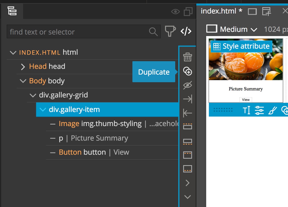
Now duplicate the gallery-item div three times for a total of four image cards by clicking on the duplicate icon (two circles with a plus) in the tree with the ‘div.gallery-grid’ selected.
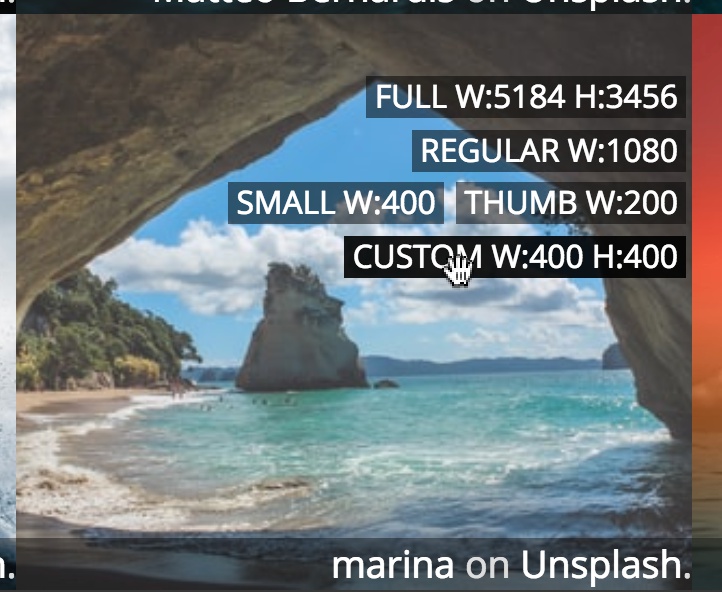
Next, I’m going to grab images from each card from Unsplash using the built-in tool. Select one of the image elements. Then, under the “Page” menu select “Get free stock photos from Unsplash…”
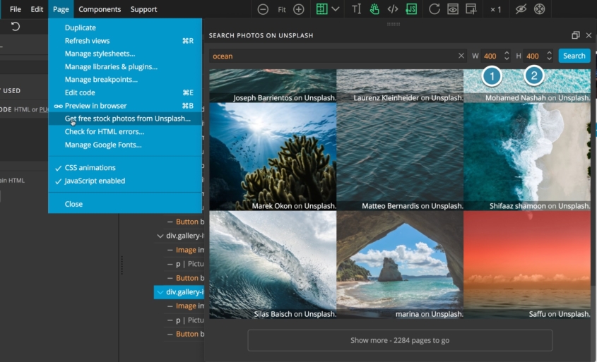
I want all the resulting images to be the same size and square when shown as a thumbnail , so I’m going to specify a width and height for my images of 400 x 400. This will give a link to the image cropped to that size.
3. Add in our libraries
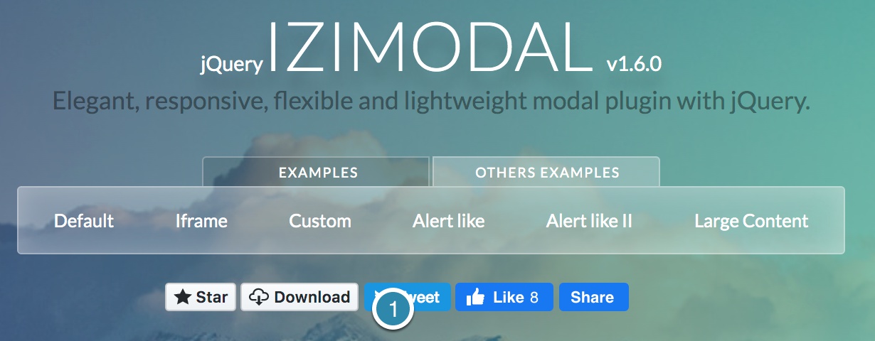
Next, we need to add in the iziModal library and styling – navigate to https://izimodal.marcelodolza.com/ and click on the download button.
Save the archive and unpack it.
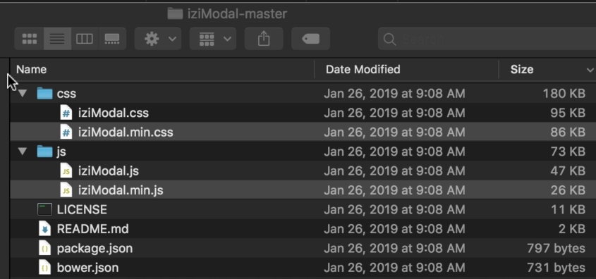
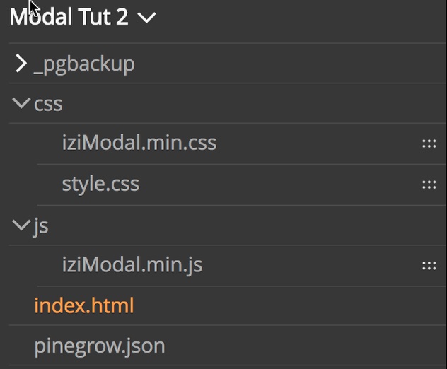
From the css folder, copy the “iziModal.min.css” file into your project css folder.
From the js folder copy the “iziModal.min.js” file into your project. I’m going to make a new folder in my project named “js” to hold the file.
In Pinegrow, refresh your project view in the Project tab by right-clicking on the project name.
Drag the iziModal.min.css file to the page view to attach it.
For the iziModal library to work it also needs jQuery. We will add that on the page before the izimodal.min.js, otherwise we will get an error.
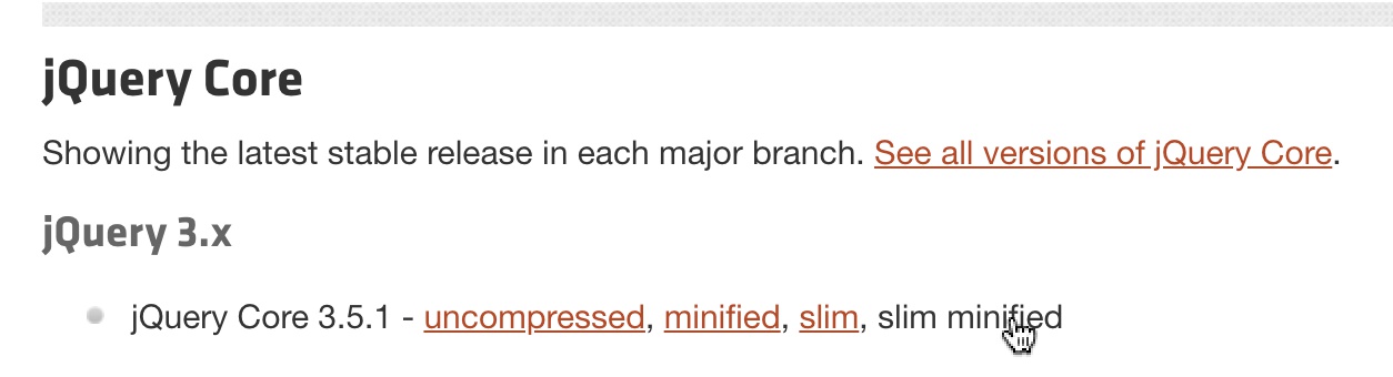
We’ll add it as a CDN, rather than hosting the jQuery in our own project Navigate to https://code.jquery.com/ and click on the jQuery 3.x slim, minified link.
Copy the code from the modal by clicking the button on the right.
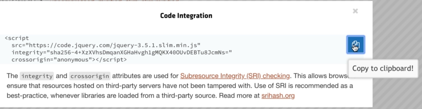
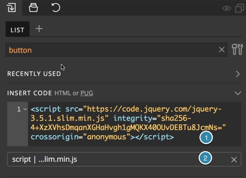
Back in the Pinegrow Library panel, first paste the copied code into the code box at the top. Second, drag the resulting element to the page.
Finally, drag the iziModal.min.js to the page view. Your page should now have two scripts at the bottom. Again, jQuery needs to be loaded and appear on the page before the iziModal.js file.
4. Adding a Modal and trigger
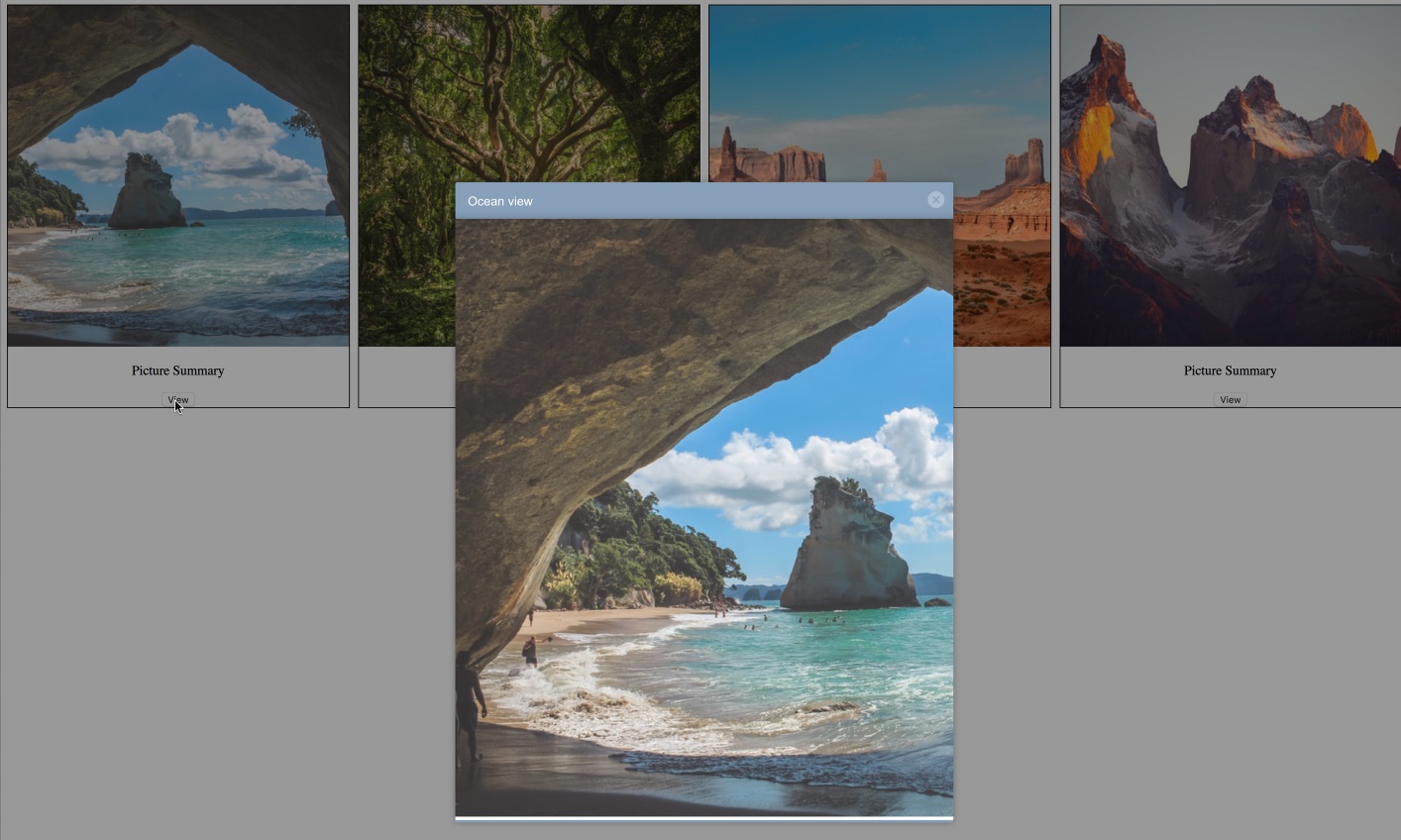
Like with Bootstrap modals, the two things that we need to add to the page are a modal to be displayed and a trigger. As with the last tutorial, we will use the modal to display a large view of our image.
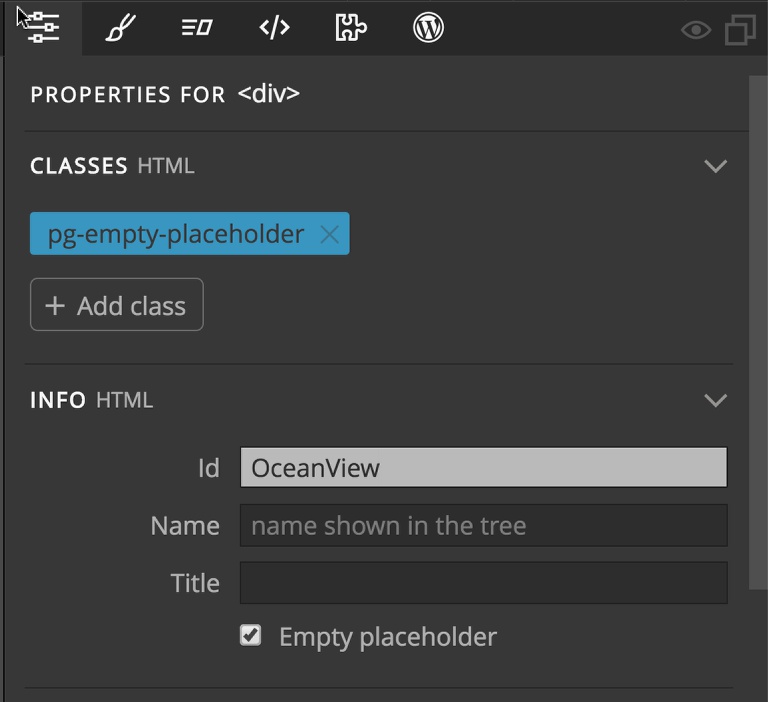
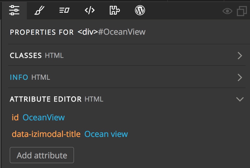
Drag a div to the end of the page after the “gallery-grid” div. Give the div a unique id – I’ll use “OceanView”. Open the Attributes panel and scroll down to the Info section. Add “OceanView” into the Id box.
Next add an image tag inside the div. I’ll populate the image element with the same photo that I selected for my first card, but at the larger size.
Again, I’ll use the Pinegrow Unsplash image tool from “Page” -> “Get free stock images from Unsplash…”. This time select the “Regular” size link.
We could do any other styling that we want or add any other elements inside the div. In this case, I’m going to use the close button and title features of iziModal, so I don’t need to add these.
To tell iziModal that our new div is a modal, we have to write a small amount of code.There are a couple of ways that we could do this. We could simple use the “Insert Code” box from the “Elements” panel, or create a stand alone page for all our code. I’m going to go that route.
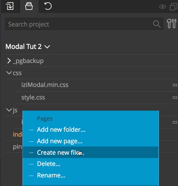
In the project window create a new file in our js folder. In the Projects tab, right-click on the js folder and select “Create a new file…” I’m creating a file named “modal.js” Drag the file to the page to attach it.
Double click on the file in the Project panel to open the code editor, or open the file in an external editor.Add the following code to the page:
$(document).ready( function () {
    $('#OceanView').iziModal();
});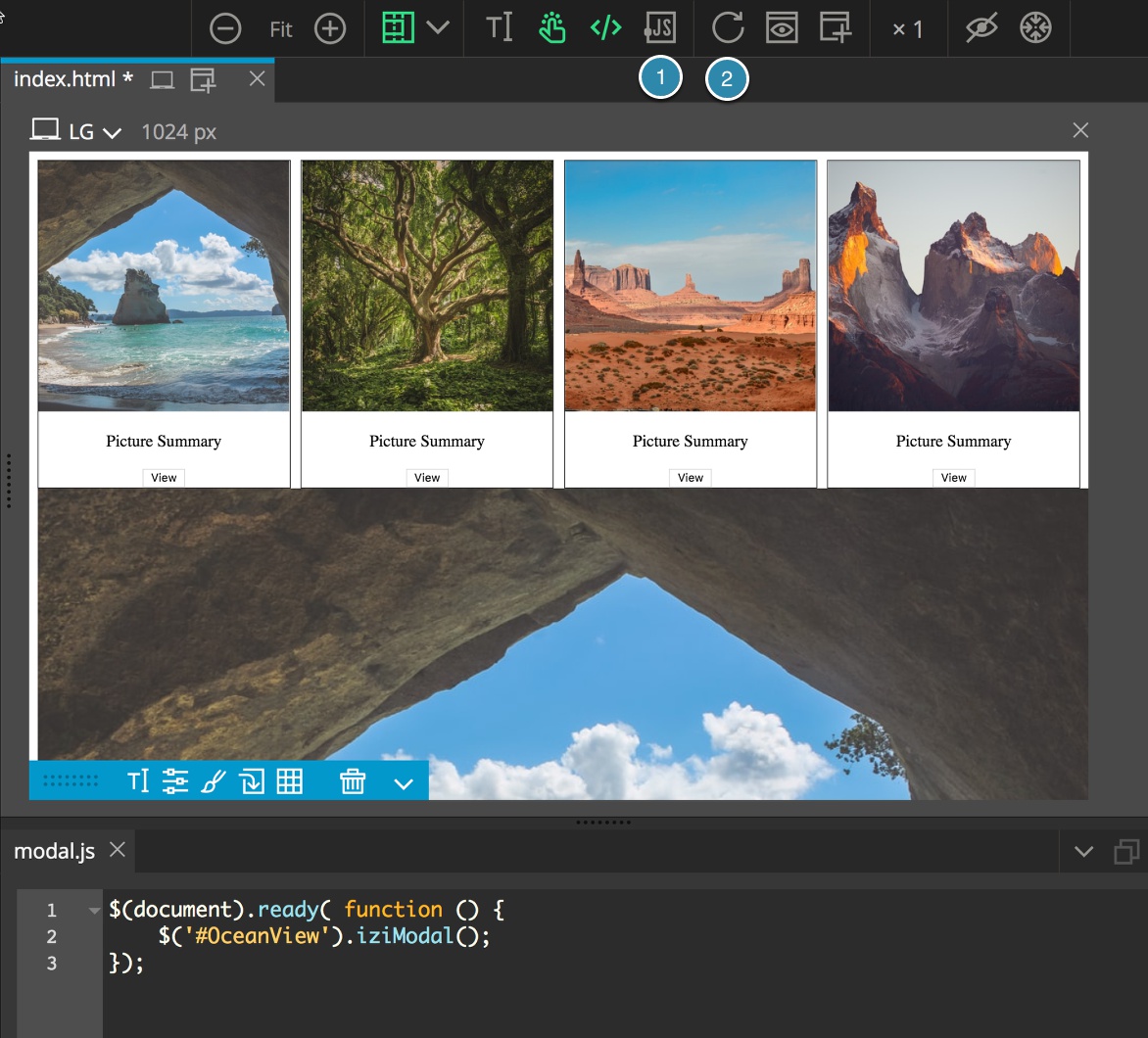
This will initialize our modal. Now, if you make JavaScript active on the page by clicking the JS icon above the Page view the modal will disappear! To get it back for additional styling, just turn JS off by clicking the icon. You may need to hit the refresh icon next to the JS icon.
To use the built in iziModal title and close button we need to add an attribute to the modal div. Either turn JS off and select the div in the page view, or select the div in the tree.
In the Properties panel, scroll down to the “Attribute Editor”.
Click on the “Add attribute” button. For a title, add the attribute “data-izimodal-title” with any value you would like. I’ll add “Ocean view”.
Next, we need to add a trigger. There are two different ways to accomplish this.
The first way is to add attributes to an existing button or link.
Select the button for the first card in the tree or page view. Once again open the Attribute Editor in the Properties panel. Add the attribute ‘data-izimodal-open’ with a value equal to the unique identifier of your modal. In this case, the OceanView id, so ‘#OceanView”.
If we open a preview of our page we can see it now works! Note, if we simulate a click on the page view we won’t see the title bar appear.
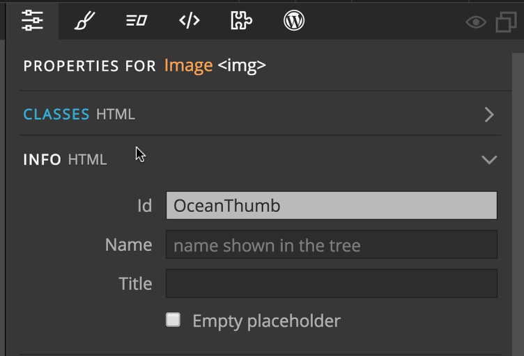
The second way that we can open the modal is by setting a click listener on the element that we want to use. This allows us to use elements on the page other than a button or link.
Let’s set the thumbnail image up to show the modal. Select the thumbnail photo and give it a unique ID. In the Properties panel under info I’m going to give it an ID of OceanThumb.
Reopen the new JS file we made earlier either in the built-in or external code editor.Add the following within the document ready function.
$('#OceanThumb').on('click', function (event) {
    $('#OceanView').iziModal('open');
});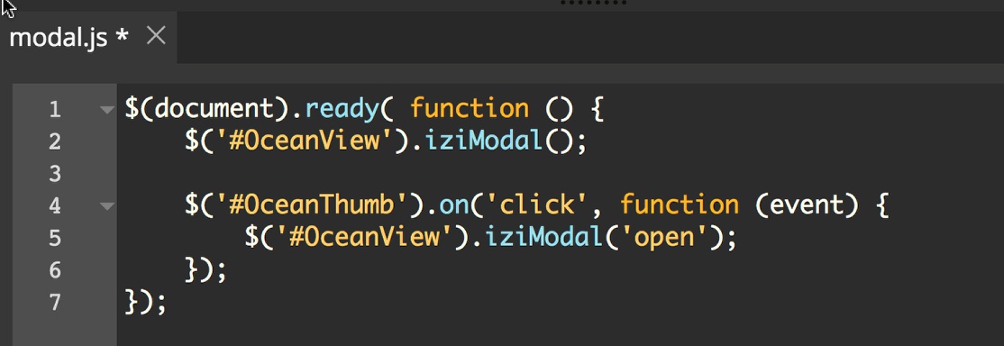
If we open up the page in a preview we can now click on the picture to open the modal!
The iziModal has a number of additional features for including icons, subtitles or changing the opening and closing animations. I encourage you to check out the documentation.
Remember, we can add anything we like to our modal using the tools we already have in Pinegrow. Feel free to add additional text, images, or even buttons to open additional modals!
Discuss this tutorial
Have questions or comments about this tutorial? Let’s talk about it on our forum.
Get in touch
Would you like to see your favorite theme or blocks library featured in the next tutorial? Let us know in the forum or by email!