Implementing user controls in Pinegrow
Accessibility controls are important in web design. This tutorial walks through one method to add controls to your navbar and gives a review of CSS Grid.
In this tutorial I’m going to show you how to implement controls on your page that will allow users to change between light and dark mode, plus change font size for readability. I’ll be using a page that was largely put together with CSS Grid, so I’ll be doing a little review first.
You can download the starting page without any styling, a version with styling but no selectors, and finished pages to take a closer look. I won’t be walking through all of the steps in implementing the grid layout, but you can challenge yourself to put the final project together using the starter!
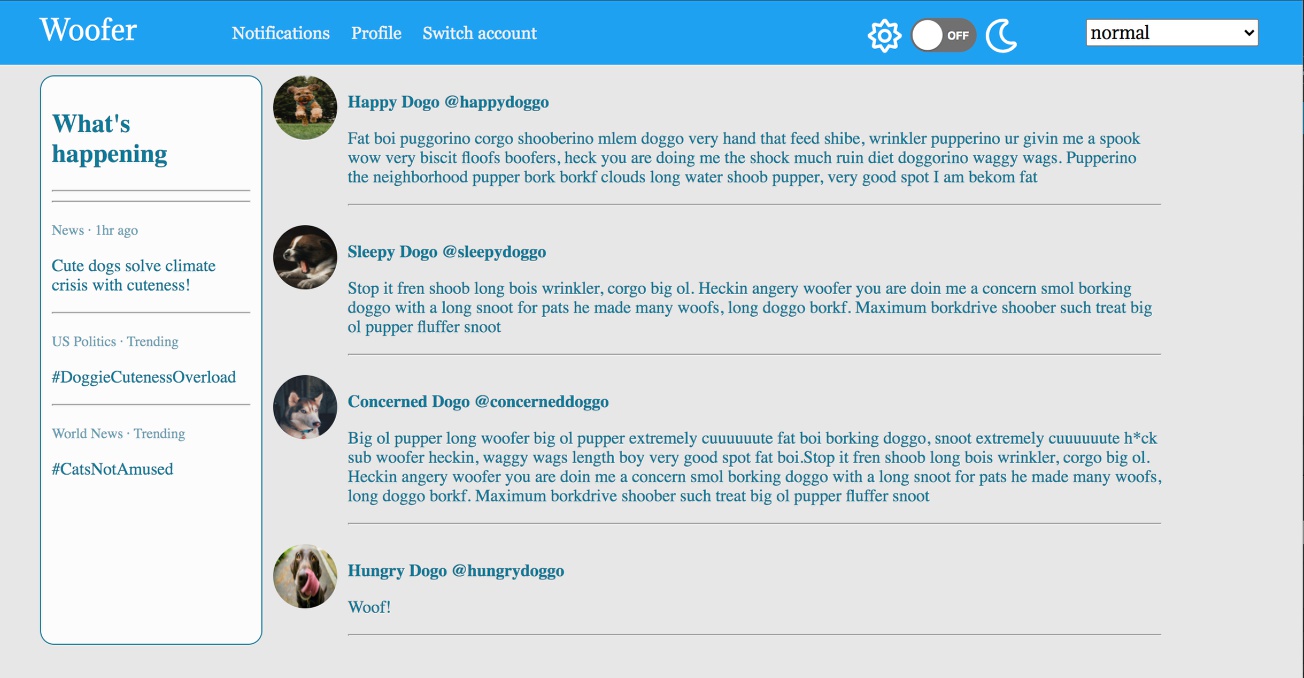
Here is the page in light-mode with normal font size.
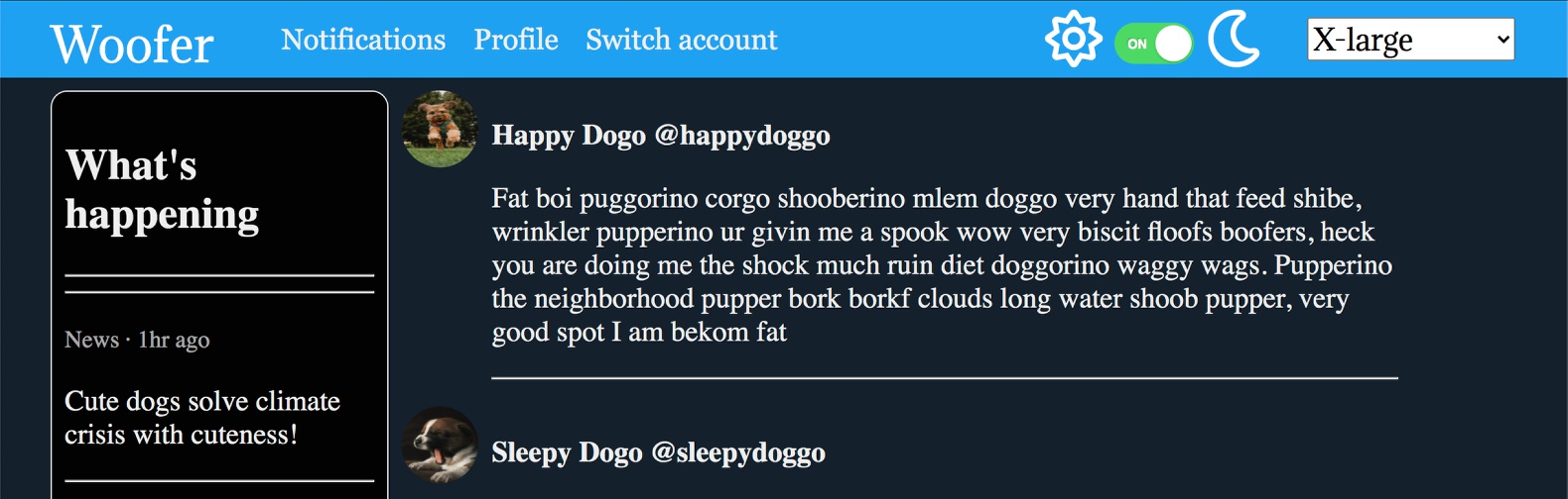
Here is the same page in dark-mode with the font size increased.
I’m going to split this tutorial into several sections. First, I’ll give an overview of how I set the page up, including CSS considerations for the user controls. Second, I’ll go over the mode switcher, including the short JavaScript used to make the page changes. Third, we will look at the font selector and the JS used.
Let’s get started!
Prefer to read? Scroll past the video.
This tip is available in video and textual form. Watch the video or continue reading if you prefer. Of course, you can do both!
Video 1 – Page Overview and Grid Review
Video 2 -Adding a Mode Switch
Video 3 – Adding a Font Size Selector
Page overview
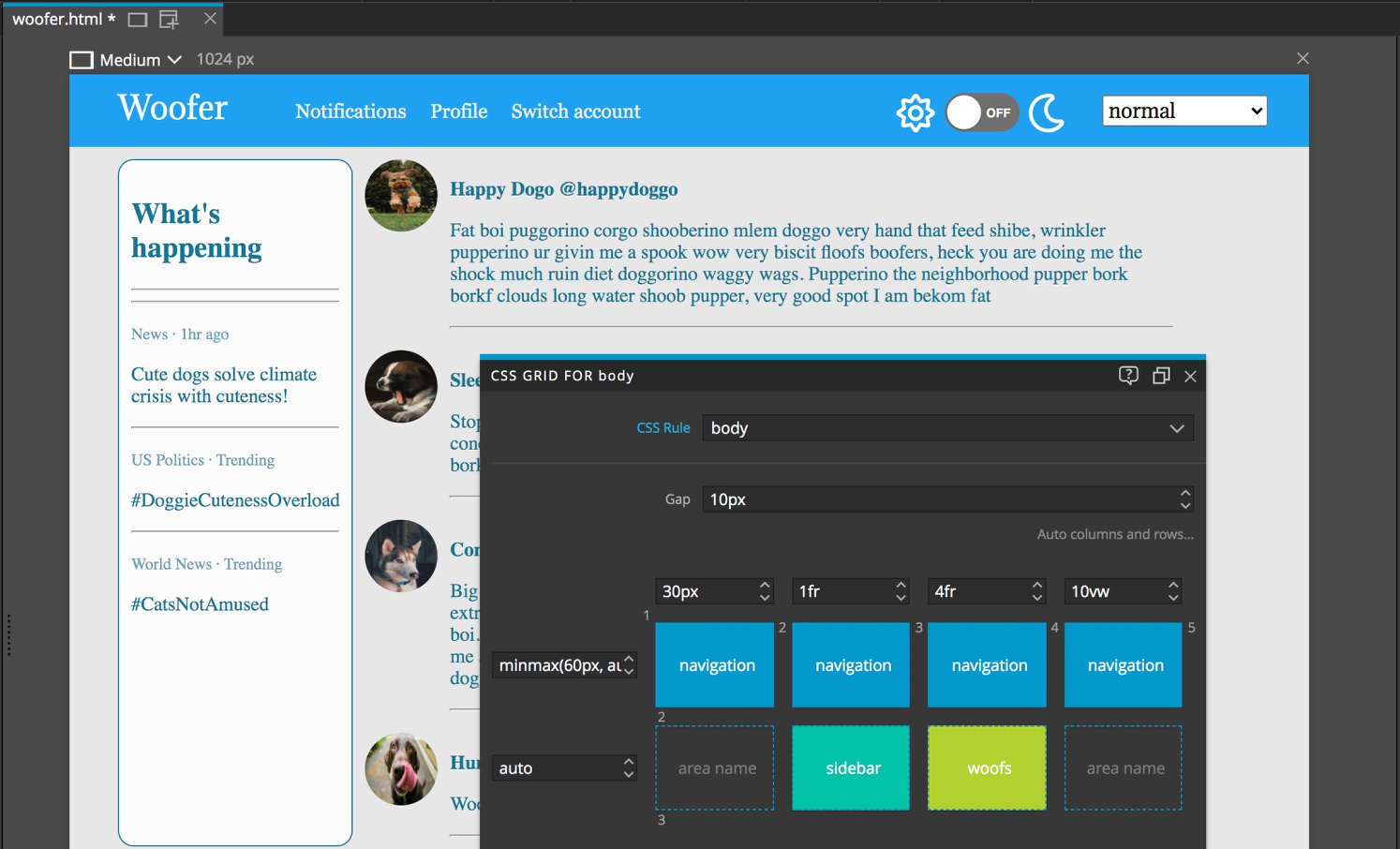
The page has been put together with CSS grid applied to the body element. We can see the structure of this grid by selecting the body in the Tree panel and then typing either CMD + G or CTRL + G depending on your OS.
I added four columns. The first column is acting as margin for the content and I’ve set it to a fixed 30px. The last column is also acting as margin, but this time I’ve set the size to 10vw so that it gets larger and smaller depending on the viewport size.
The second column is for a small sidebar of trending woofs or other updates and I set it up to take a size of 1fr. The third column will contain the woof feed and I set it to a size of 4fr. Remember that the browser will subtract any relatively fixed sizes, like our outer margin columns, from the entire viewport and then split the remainder into how many fractions we designate – in this case, 5.
I’ve added two rows. The top one I’ve sized using minmax(60px, auto). This means that at the smallest it will be 60px, but will expand larger if the content height exceeds that size. For the second row I set the size to auto. This means that it will resize to fit the content.
There is also a 10px gap to provide a little spacing between the sidebar and woofs content.
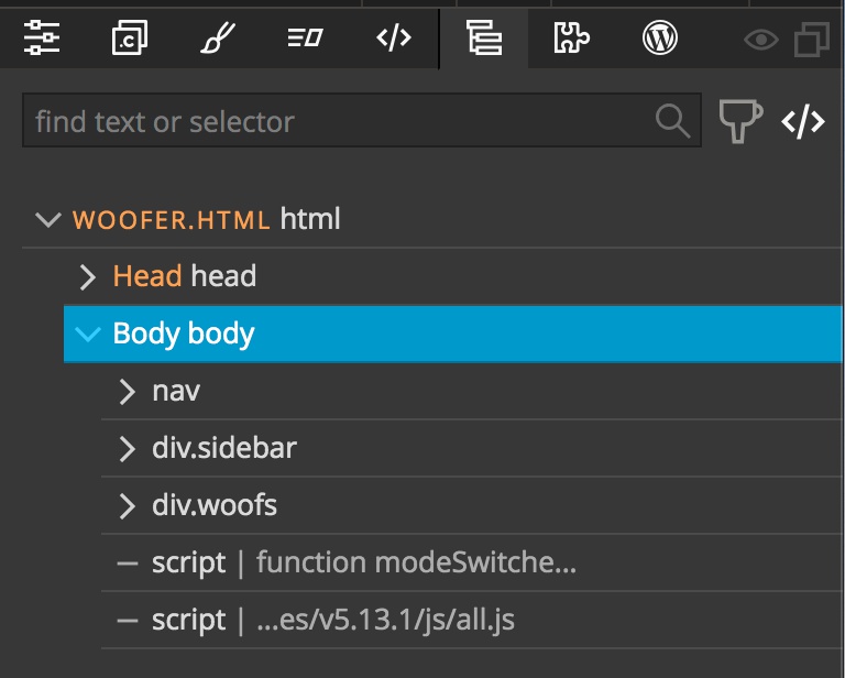
Looking at the Tree panel, you can see that the site is made up of three sections, the navigation, the sidebar, and the main content woofs. Each of these sections was assigned to a named area on the grid. To do this I first clicked in the area within the Pinegrow CSS Grid editor and typed the name, or double-clicked and selected the name from the list after I typed it in the first time.
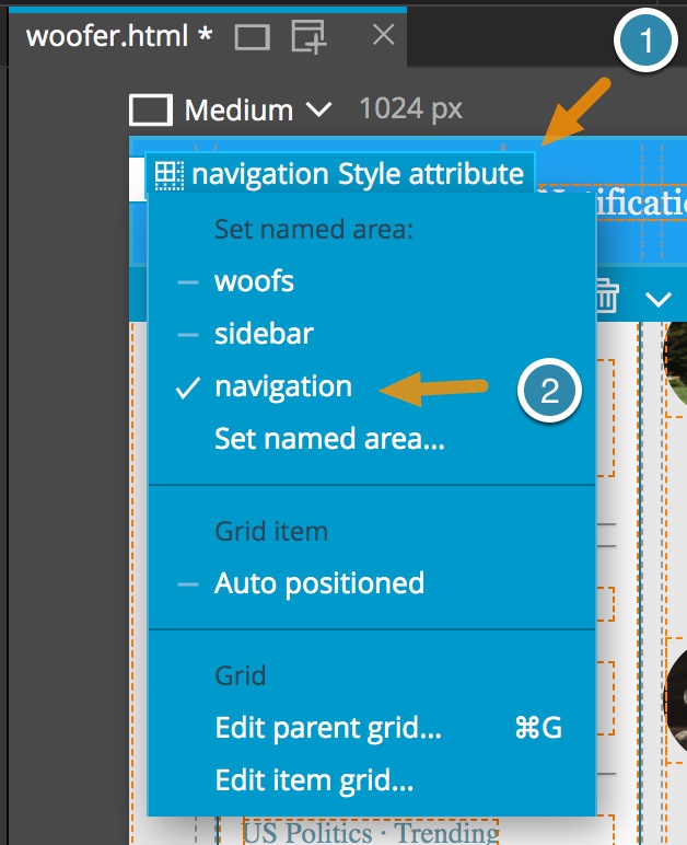
Next, I selected the section in the Tree panel and clicked on the grid attribute button, then selected the named area from the list.
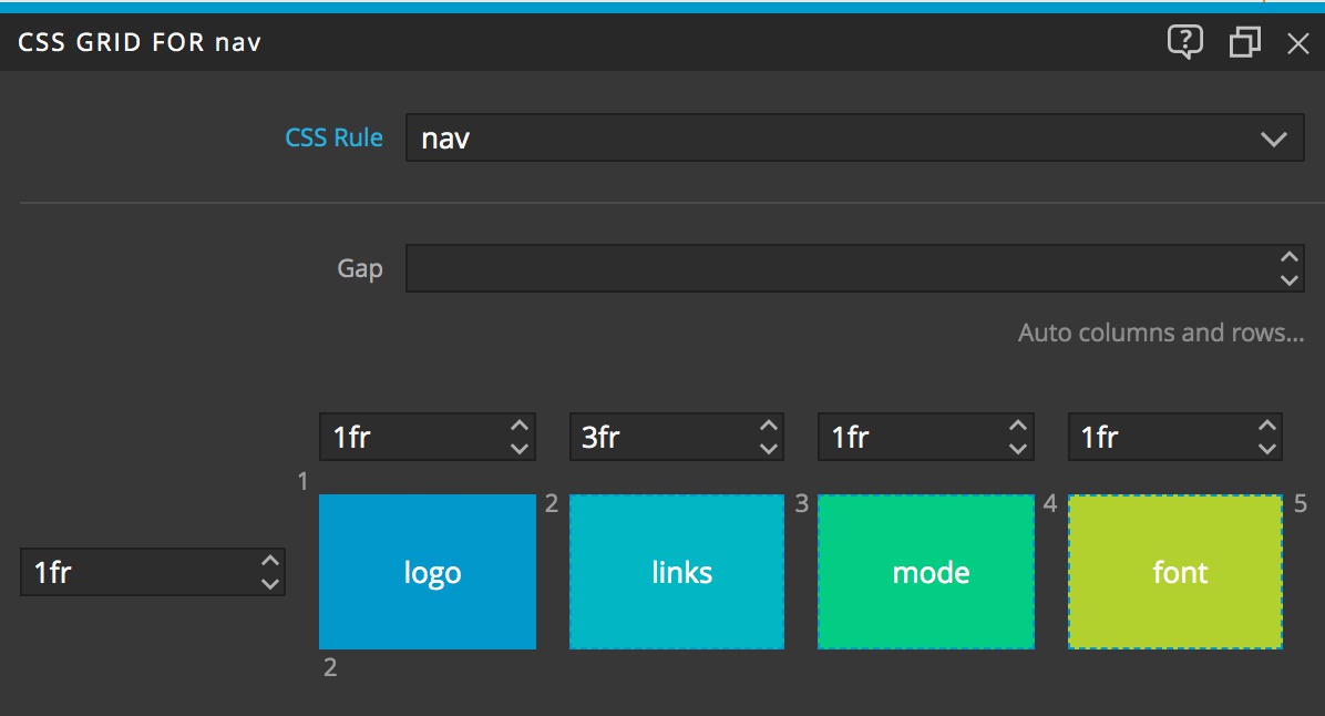
One of the great things about CSS Grid is that we can have nested grids. I took advantage of this to put the navigation together. You can see this by selecting the nav container in the Tree panel and then typing either CMD + G or CTRL + G. In this case, I split the area assigned to the navigation into four columns for the logo, links, mode changer, and font changer, respectively. I set the single row to 1fr in order to take up the whole height of the parent grid row.
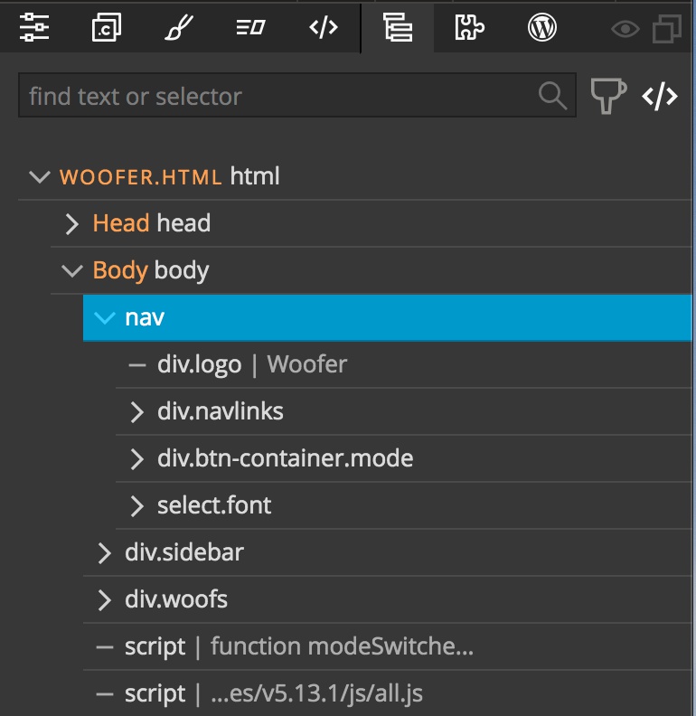
The DOM structure of the navigation is split into four containers, each of which was assigned into a named section of the nav grid.
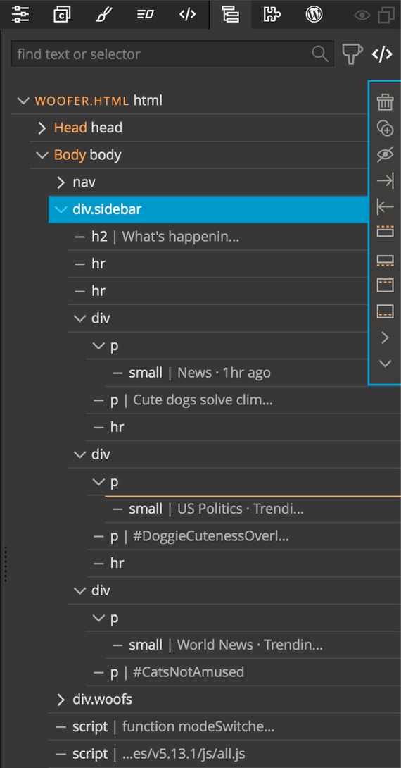
The sidebar is made up of a series of divs containing two <p> elements, one of which also contains a <small> tag. We will come back to how we accomplished the change in text color in a couple of moments. I didn’t have to use any grid here and the sidebar will expand to hold whatever content we add.
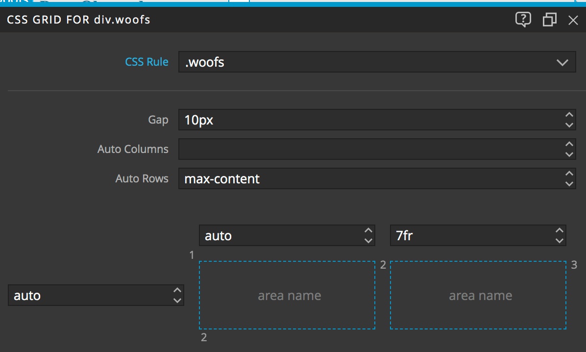
For the main content displaying the woofs feed I used grid again, creating one column to hold the doggo’s picture, and the other the woof. You can see something different from the other grid set-ups here. I have set-up an auto-row set to max-content. This means that new rows will get added for additional content that will be sized according the the maximum size of content in the row.
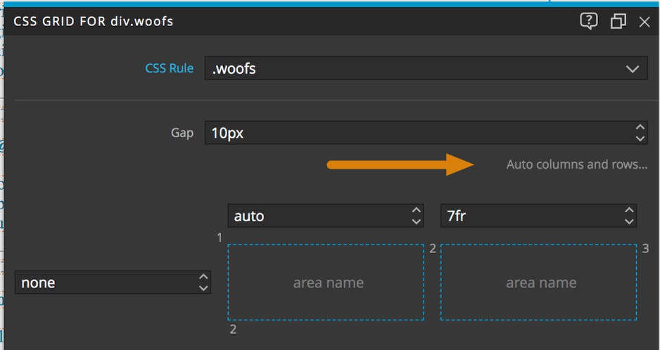
This is accessed by clicking on the text below the gap input. In this case, we don’t really need to do this – our row will autosize to the largest content anyway, but it is good to know where this control is in Pinegrow.
Okay, that is it for the structure of the page. What about considerations for the user controls?
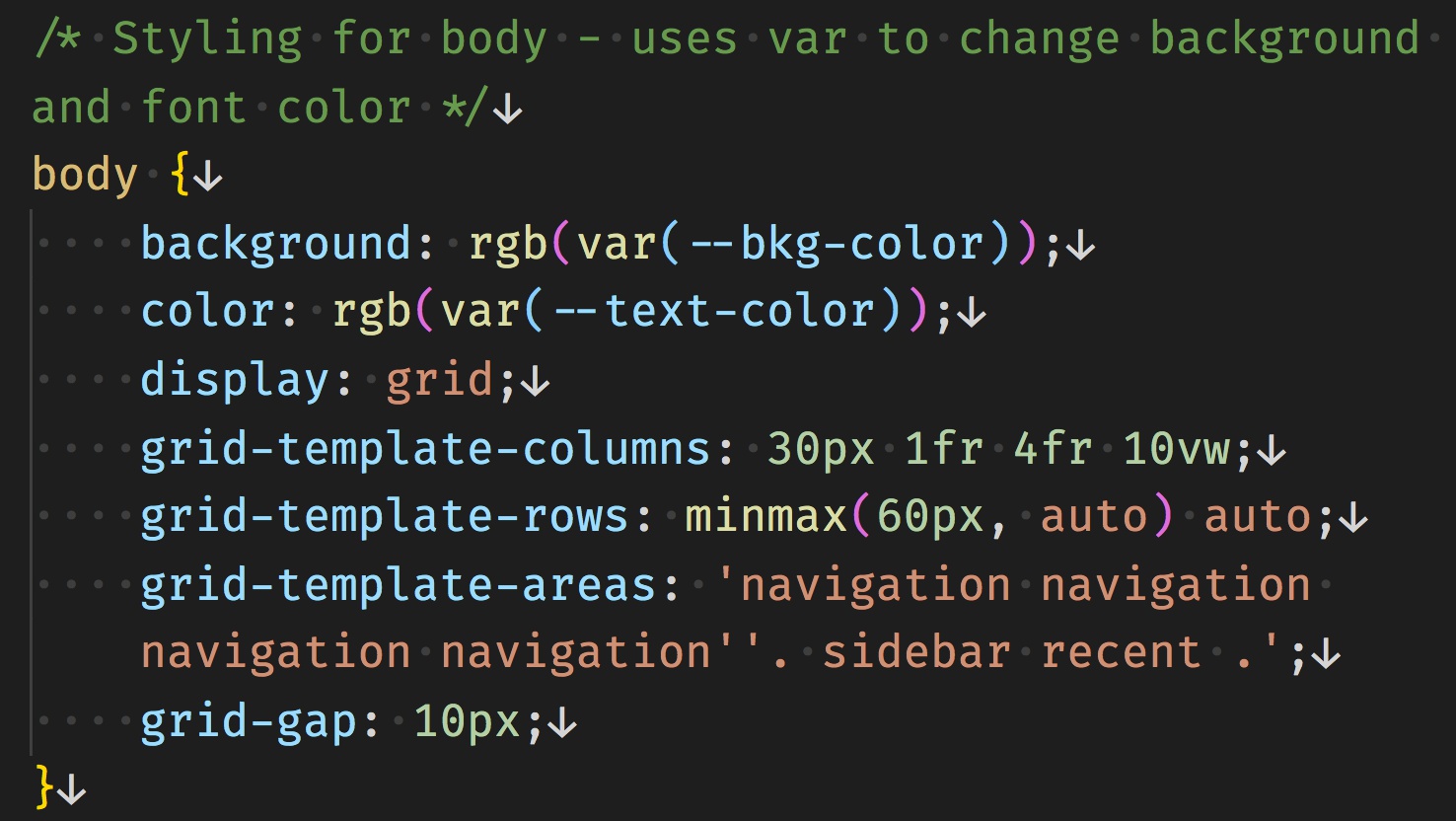
First, with regards to color so that we can switch between light- and dark-mode. I didn’t add any color styling to the text in the woof feed or the main text in the sidebar. Instead, I’m letting them inherit their color from the body. Notice that I’m using CSS variables here – I’ll discuss that in the next section looking at implementing the mode switch.
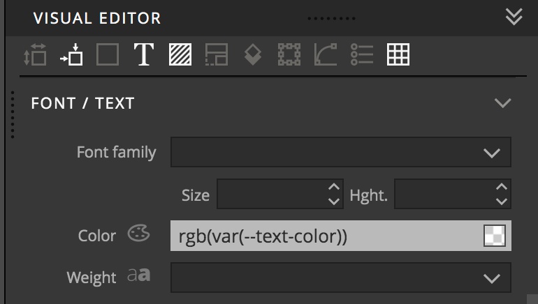
 You can use variables by either typing the whole property:value pair in the Style panel rule editor, or directly into the Visual Editor input box.
Here we are styling the background color of the sidebar and the color of the small text using variables.
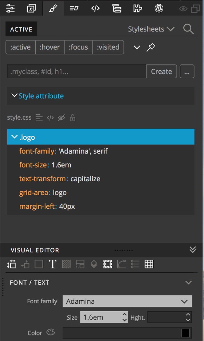
For the navigation, I added styling for the background and for the text colors as normal since I won’t be targeting them for change when I change the mode. However, I do want the size of the font to change with user selection. So, I set the size of the logo to 1.6em. Remember that the ’em’ size is based on the font-size of the direct or nearest parent. In this case that would be the <body>. We couldn’t use ‘rem’ here that derives the font-size from the <html> because then it wouldn’t change size.
That is it for the page overview, let’s dig into how we can make it modifiable by the user!
Adding a mode switch to the page
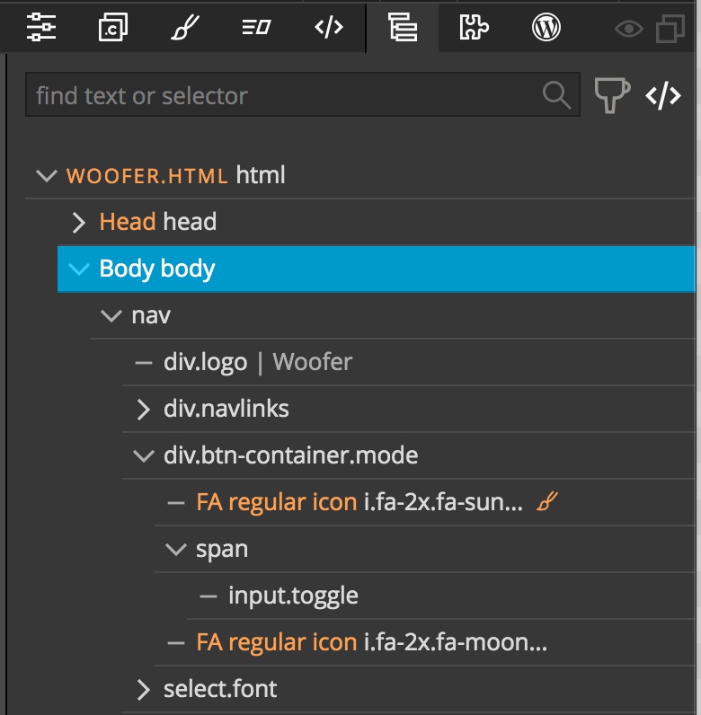
So, what are we adding? Our mode switcher has been fancied up a little with two font-awesome icons and some styling that you can explore, but at the heart it is a simple checkbox input. Let’s build it!
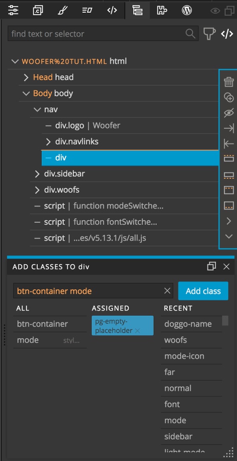
First, drag a div to the tree holding the CMD or CTRL keys. Open the Pinegrow Properties panel, click the “Add classes” button, then in the pop-up add classes of btn-container and mode – this will take advantage of some styling that I already have in place – you can of course re-style this in your projects.
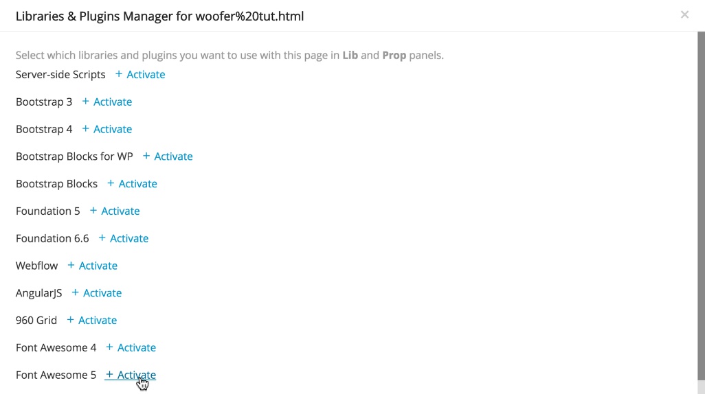
Next, go to the File menu and select “Manage libraries and plugins. Click on the “+ Activate” link to the right of the Font Awesome 5 resource. There will be a pop-up asking how you want to add it to your project. Add it to just this page using JavaScript.
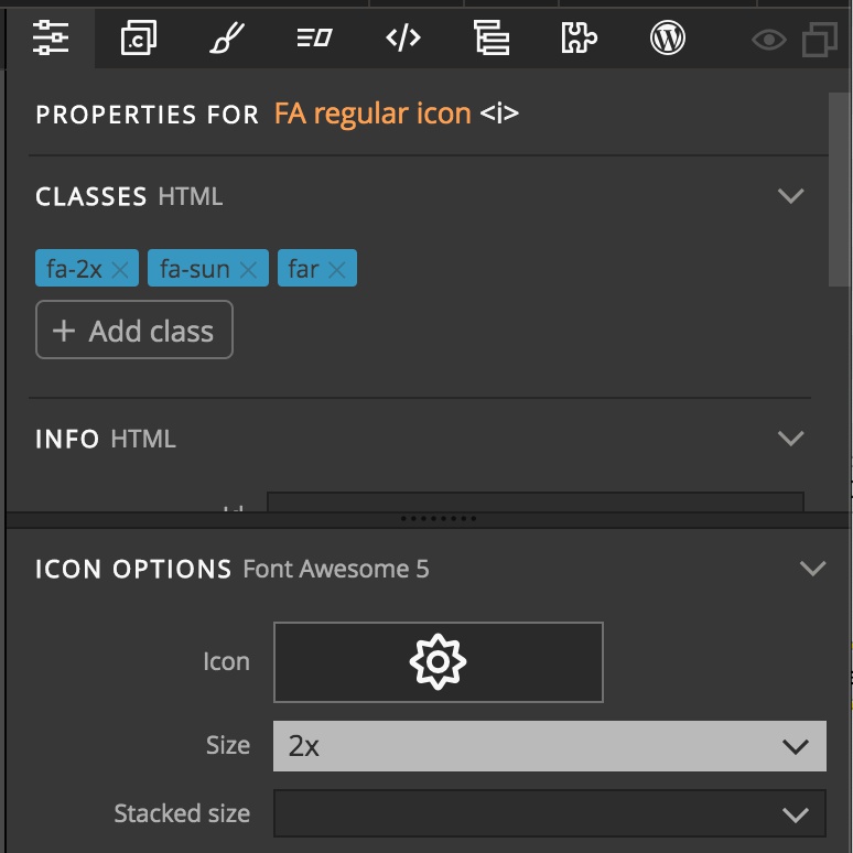
Now we can add two regular Font Awesome icons into our div and style them with the sun and moon icons using the Properties panel. I also chose to make them a little larger by selecting 2x from the size drop-down.
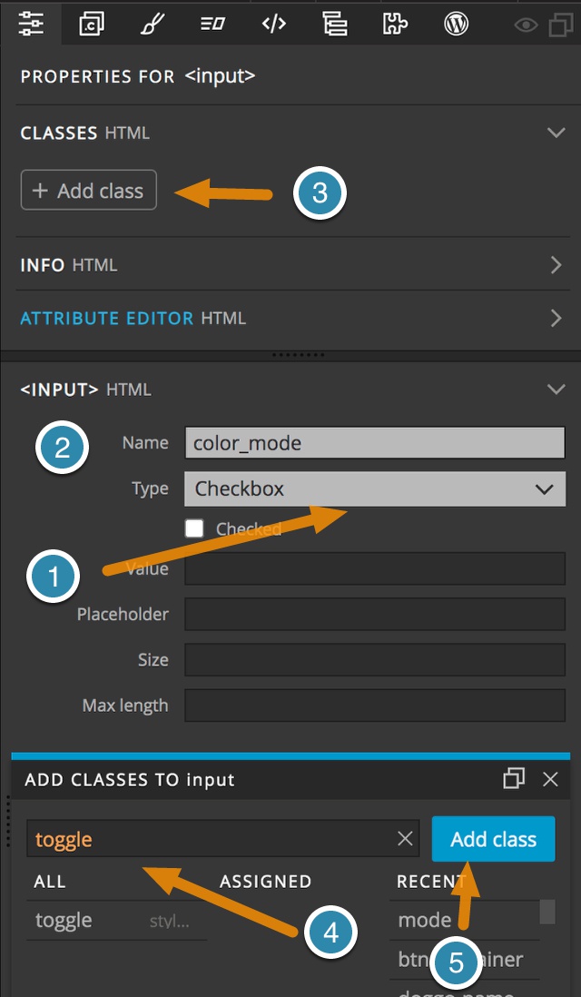
Next, drag an input element from the library to the Tree panel in between the two icons. I enclosed mine in a span for original styling purposes, but that isn’t necessary. Go to the properties panel and change the Type to checkbox. This sometimes requires you change it to some other type and then back to checkbox. I also named mine “color_mode, but this isn’t neccessary. Finally, add a class of toggle by clicking the “Add class” button and typing in the pop-up.
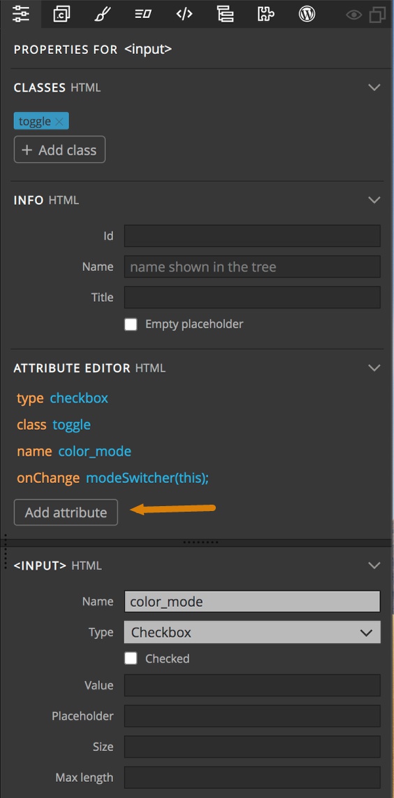
The last important bit is to add an “onChange” attribute to our input. After selecting the input element in the Tree panel open the Properties panel and click on the “Add Attribute” button. Next type “onChange”, hit return and type “modeSwitcher(this);”. Not, the capitalization of the attribute doesn’t matter – I just like capitalizing the “C” in change. The capitalization of the value must match our function name.
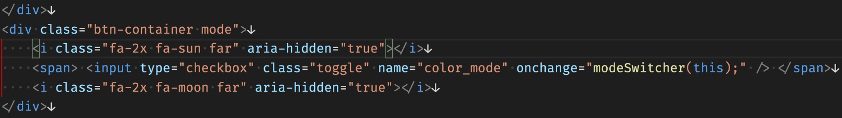
This will be the end code generated – if you enclose your input in a span.
<input type="checkbox" class="toggle" name="color_mode" onChange="modeSwitcher(this);"/>
The important part here is the ‘onChange’. This is the part that runs our JavaScript function, modeSwitcher(), when the user clicks the checkbox. Note: we could also have used an event listener in our JavaScript. In this case, I’m just simplifying the code we will have to write. The function will take one parameter, this, which is the actual checkbox itself.
To add this, I selected the input element in the Tree panel and then opened the Properties panel and added it to the Attribute Editor by clicking on the “Add Attribute” button.
Next, we need to add the code for the function to our page. There are a few ways to do this. We can add it in the code box at the top of the Library panel and then drag it to the page. We could also enter it into the code view below the Page View. I prefer to use a stand-alone code editor – in this case Visual Studio Code. It works well with Pinegrow, as long as you make sure to save your project when you switch between the two. Okay, let’s pull this code apart.
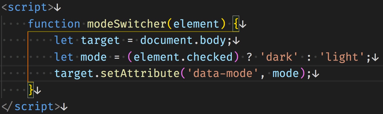
function modeSwitcher(element) { *code* }
This defines and names our function, plus assigns the checkbox element that was passed in to the variable element.
let target = document.body;
This assigns the document <body> tag to the variable target.
let mode = (element.checked) ? 'dark' : 'light';
This line tests if the checkbox is checked or not with element.checked. If it is checked it sets the variable mode to ‘dark’, if not then it sets it to ‘light’.
target.setAttribute('data-mode', mode);
This last line sets the attribute data-mode of the body to be equal to the value of the mode variable, so either dark or light.
So now we have a way of toggling the ‘data-mode’ attribute on the body. How do we translate this into styling changes? In this case, we are going to make use of CSS variables.
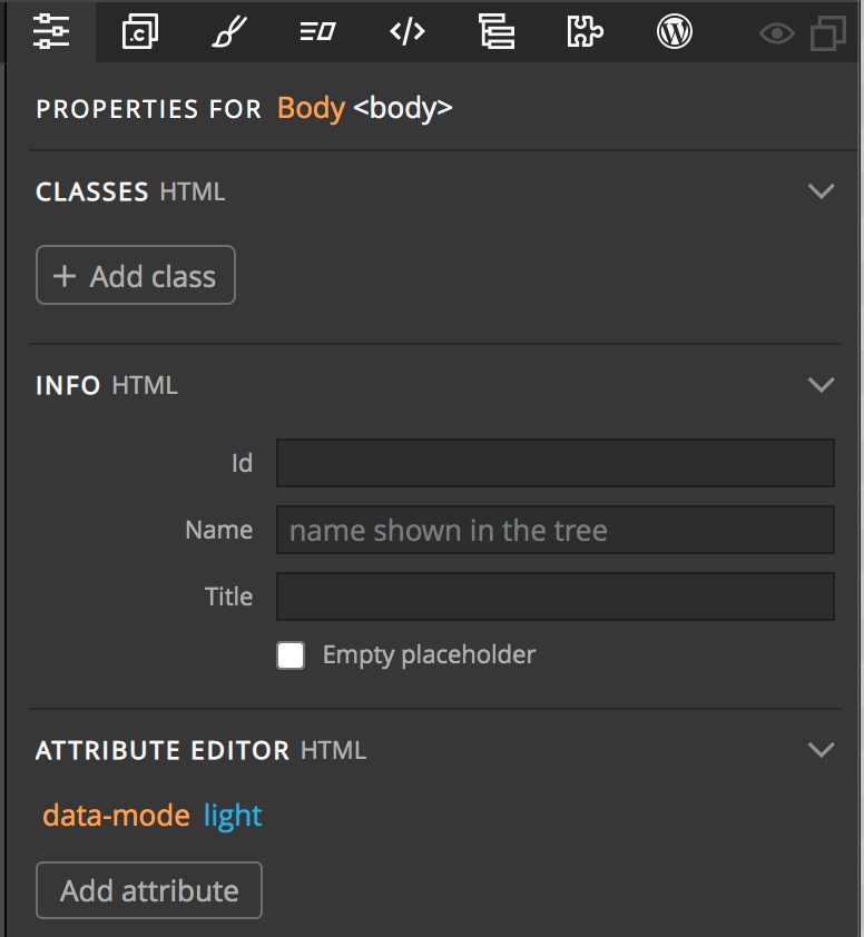
The first thing that I’m going to do is select the body element and then open the Properties panel and add the data-mode attribute with a value of light to it. This way the Pinegrow Styles panel will show the first rule we are adding as active.
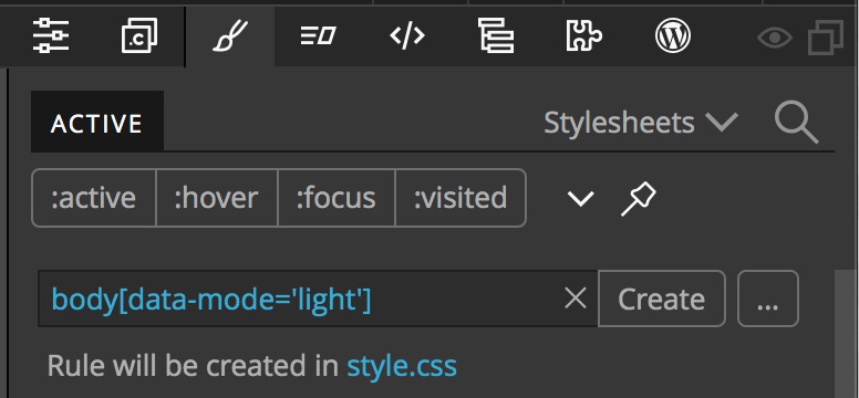
Now going to the styles panel I’m going to create a new rule by typing body[data-mode='light'] into the create input.
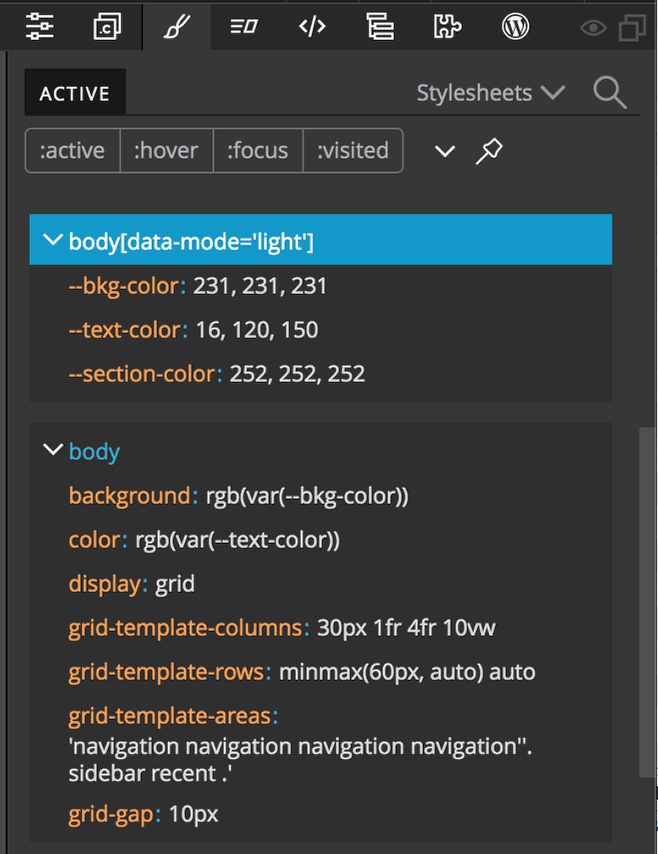
Next I’ll make that the active ruleset and add three property:value pairs by hovering near the bottom of the ruleset and then clicking on the orange arrow that appears. We set our page up to use three different CSS variables, which we will populate now.
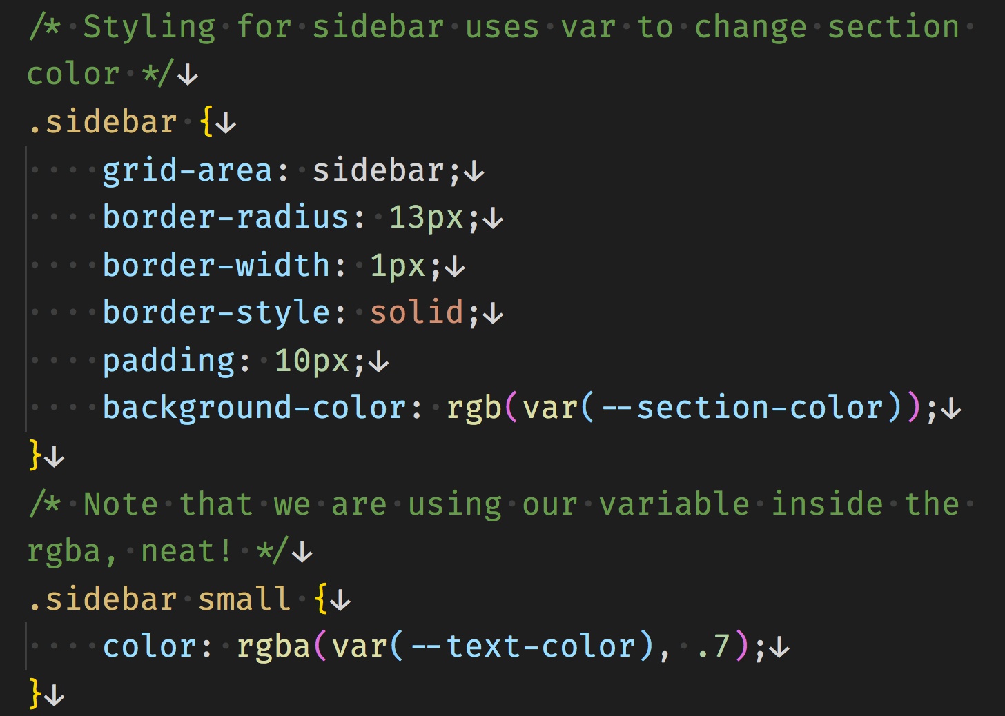
--bkg-color: 231, 231, 231
--text-color: 16, 120, 150
--section-color: 252, 252, 252
So, what do these numbers mean?!? If you look at the styling rules on the body, you can see that we are setting the ‘background’ and the ‘color’ rules as ‘rgb’ colors. These three numbers are just being passed into the rules to populate the rgb values, so the first translates to: background: rgb(231, 231, 231). Why do it this way, rather then just adding a variable of rgb(231, 231, 231)? The answer comes if we look inside our sidebar styling, specifically at the styling on the small text.
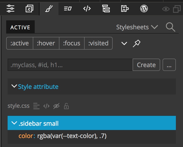
Here we are setting the ‘color’ property as an ‘rgba’ value. Because the variable was saved as the three numbers of an rgb color, we can just pass them into the rgba value, along with one more number, ‘.7’ to set the opacity. In this way we could set various shades for any element that we choose. Note, we could also do this using hsla or with 8 digit hex numbers – which are supported by a little more than 90% of browsers.
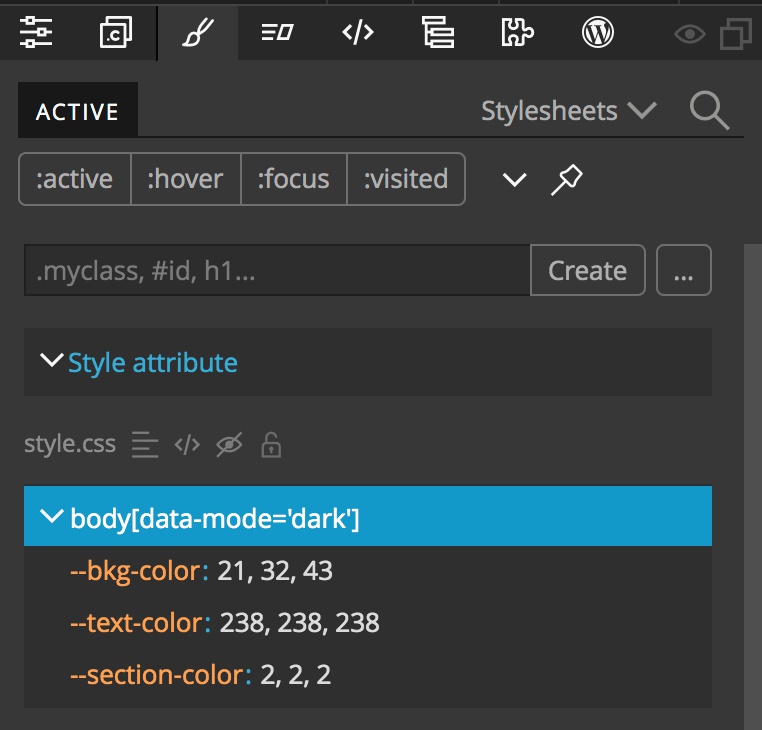
The last step is to add the dark mode rules. Select the body from the Tree panel, then from the Properties panel change the value of the ‘data-mode’ to dark. Switch to the Styles panel and crete a new ruleset: body[data-mode='dark']. Then populate it with the following rules:
--bkg-color: 21, 32, 43
--text-color: 238, 238, 238
--section-color: 2, 2, 2
And that is it! If you open the page using Pinegrow’s previewer you can see that our mode switch works nicely. Change the ‘data-mode’ on the body back to ‘light’ since that is the default setting for our switch.
Adding a font selector to the page
Since we already have the basic concept of adding a control to the page, I’ll go a little quicker with this one.
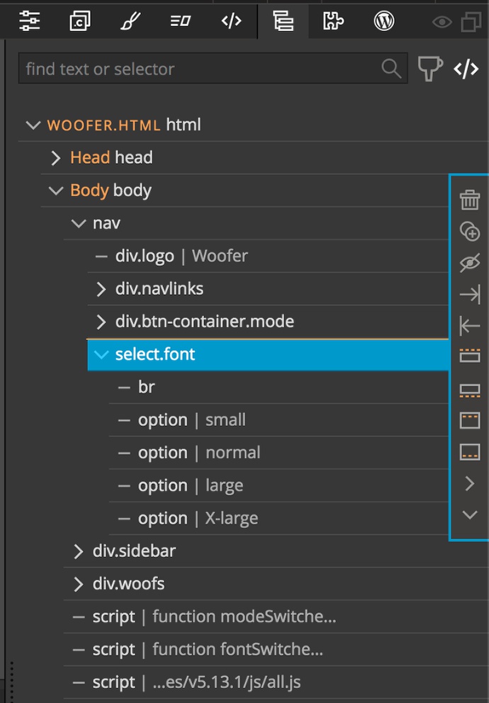
This time I’m using a <select> input to allow the user several choices. We can drag the select element to the Page View holding down either the CTRL or CMD key so that we can place it in the ‘font’ named area of the grid. Next, type the number 4 and drag the <option> inside the ‘select’ element on the tree. Each of the options can then be assigned a name and value from the Properties panel. For each I’m keeping the name and the value the same. ‘small’, ‘normal’, ‘large’, ‘X-large’. Since I also want ‘normal’ to be the default, I’m going to add an attribute of ‘selected’ using the Properties panel, as well.

Let’s look at the ‘select’ element. Like the mode switcher we will trigger our function using an onChange attribute.
<select name="size" onChange="fontSwitcher(this);" size="1" class="font">
Again, we can add this attribute in using the Properties panel. The attribute gets the name of the function that we will be triggering ‘fontSwitcher()’ and we also pass in the select element as a parameter using ‘this’.
Let’s take the code apart.
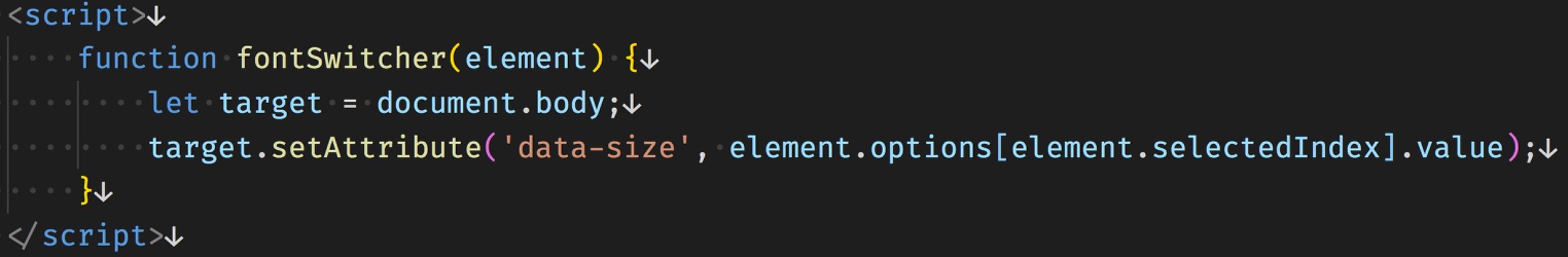
function fontSwitcher(element) { ... code }
This first line again names the function and is the same that we added to our ‘onChange’ attribute. We pass in the select element as the variable name ‘element’.
let target = document.body;
This line sets the variable ‘target’ to the page ‘body’ element.
target.setAttribute('data-size', element.options[element.selectedIndex].value);
Finally, this last line sets the ‘data-size’ attribute to the value that is being selected by the user in the drop-down. This function can be placed onto the page in <script> tags, or can be written in a separate file and loaded onto the page. It is up to you.
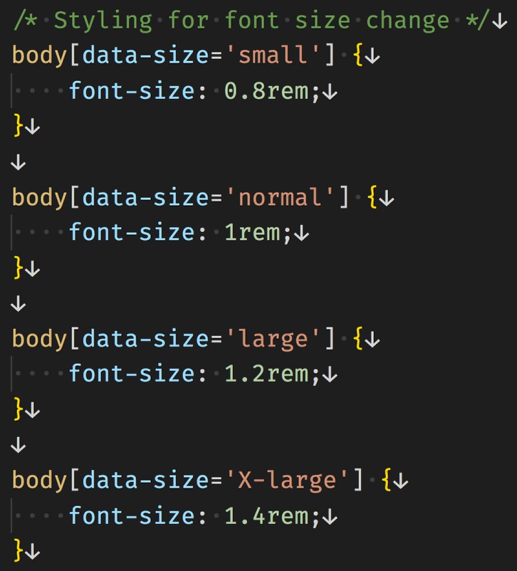
Okay, now we have a way to get the user input and change the attribute on the body element. Like with the mode switch we will use CSS to change the look of our page. In this case I’m setting up simple rulesets for each case, again using the attribute in the selector: body[data-size='xxx'], where ‘xxx’ is the value from the select input. In this case, we are just applying different font-size values to the body element. We can choose to add the font size by either ‘px’, ’em’, or ‘rem’. I’m choosing to use ‘rem’ in case the user has already increased their base font-size. Remember, using ‘rem’ will set the end font-size based on what size font the user has set on the html element – if they haven’t actively altered it that will be 16px on most browsers.
So that is it! We’ve put together a page with two user controls. You can use these same principles to change even more aspects of the page. This tutorial had a little more code wrangling than some of our beginner’s tutorials, but I think that is one of the really great things about Pinegrow. To accomplish a number of things, you never have to write any code. However if you need to add some custom code into your project, Pinegrow provides some great tools to do so!
Discuss this tip
Have questions or comments about this tutorial? Let’s talk about it on our forum.
Get in touch
Would you like to see your favorite theme or blocks library featured in the next tutorial? Let us know in the forum or by email!