Creating responsive layouts
Responsive websites adjust their layout and content so that they work great at any screen size. This is done with CSS rules that use media queries to target different screen sizes.
Introduction
Although frameworks like Bootstrap and Foundation provide responsive features out-of-the-box you can use Pinegrow to add customised responsive behaviour to any HTML page or to fine-tune responsive behaviour of elements on Bootstrap or Foundation webpage.
Breakpoints
Breakpoints are screen widths at which page changes its behaviour. For example, we can define a breakpoint at 500px and display a single column content at sizes of 500px and below and two columns at sizes larger than 500px.
To define breakpoints choose Manage breakpoints in the display size menu of the page.
There, you can add breakpoints manually or let Pinegrow guess breakpoints by analyzing attached stylesheets.
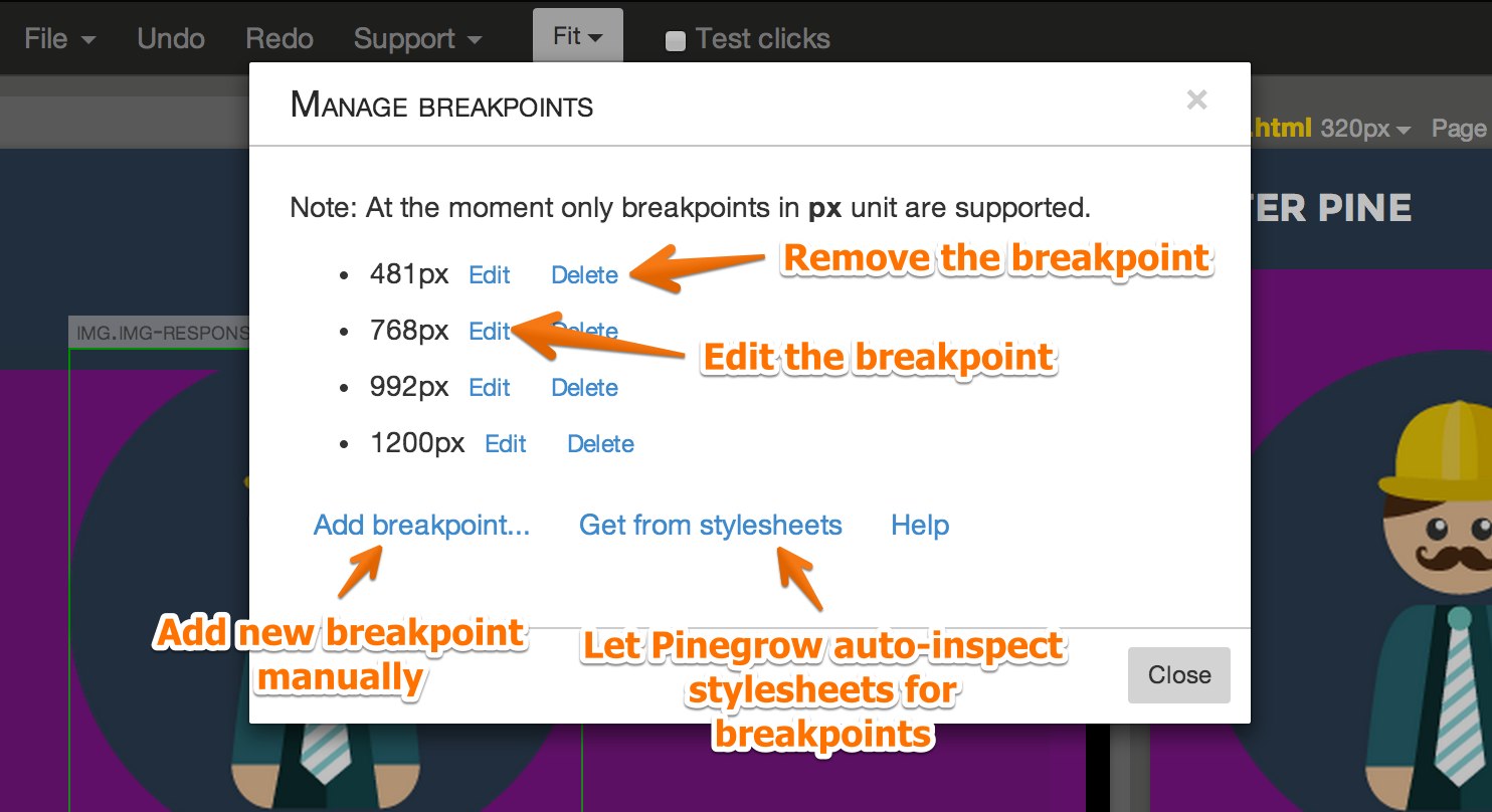
You can also edit or delete an existing breakpoint. If you change a breakpoint, Pinegrow will go through attached stylesheets and replace occurrences of the original value with the new value.
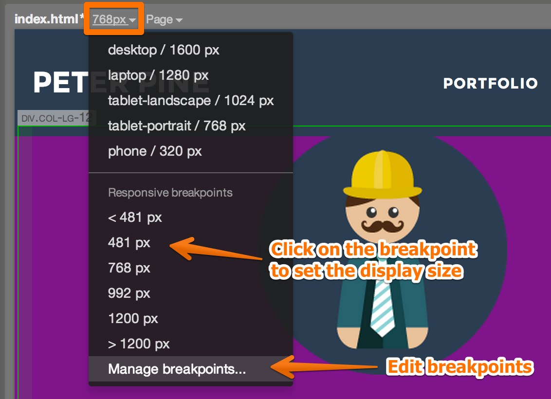
Choosing the screen size
If breakpoints are defined, the display size menu lists them as choices for the current display width. Use this menu to inspect your page at various screen sizes.
You can open additional views of the page with different display size settings. Any change you do to the page will be reflected in all its views.
See Multi-page editing for details.
Media query helper
Once our breakpoints are defined we can start creating CSS rules that target specific screen sizes.
Each CSS rule in CSS panel has a Media query property. Click on the magic wand next to it to open the Media query helper.
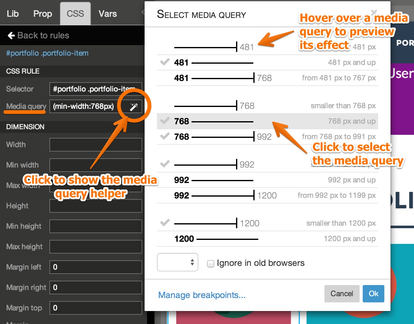
Media query helper will list all different media query combinations for your breakpoints.
Check-mark indicates that the media query is active for the current display size.
Hovering over a media query will let you preview its effect on the CSS rule that is being edited.
Clicking on the media query will set the media query property of the CSS rule.
Media queries in CSS rule list
Media queries are listed in the CSS rule list in the CSS panel.
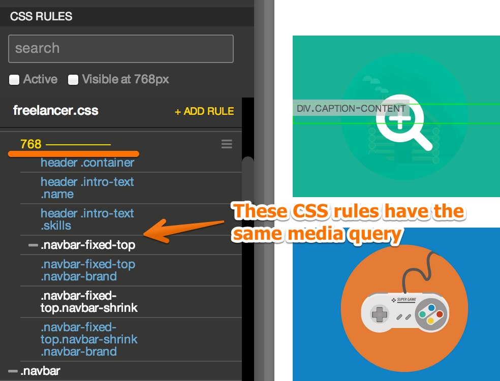
Multiple CSS rules can be nested under the same media query. Dragging the media query will move all nested rules as well.
Moving individual CSS rules under a media query will set its media query property.
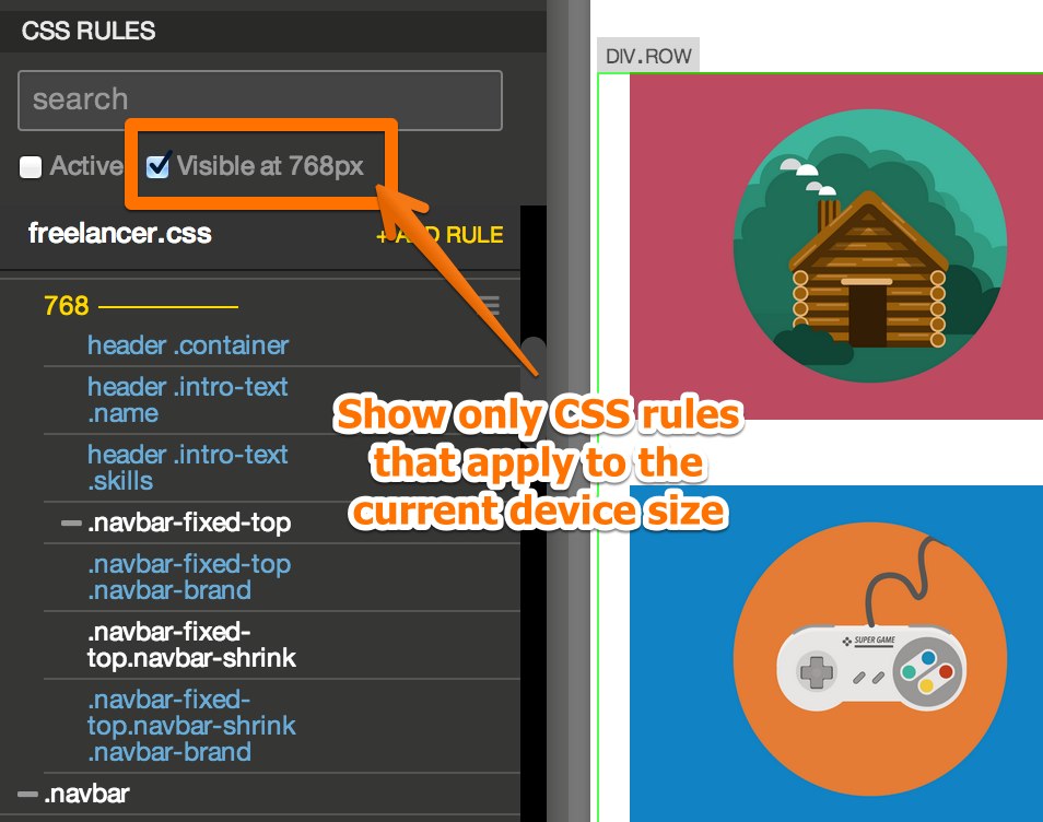
Visible at X
Visible at X setting in the CSS panel will list only those CSS rules that apply to the current screen size.