Fantico – Creating a landing page with TailwindCSS and Tailwind Visual Editor
A step by step tutorial about building a landing page with TailwindCSS.
Before we start
What you’ll learn?
By following this tutorial you will learn how to:
- Use TailwindCSS to create a landing page for a fictional business called Fantico.
- Use powerful tools in Tailwind Visual Editor to work with TailwindCSS visually.
What you’ll need?
Of course, you can just watch the tutorial to see how TailwindCSS and Tailwind Visual Editor work. But we recommend that you follow along the tutorial, doing all the steps on the provided landing page. To do that, you’ll need:
- Pinegrow Web Editor, either a free trial or activated license that includes Tailwind Visual Editor add-on.
- Download the starting project without styling. Unzip the file and open it as a project in Pinegrow Web Editor.
- You can also download the finished project as a reference.
If you already have Pinegrow Web Editor, but don’t have the Tailwind Visual Editor add-on you can start a trial in Support -> Purchase & Activate under Add-ons Tailwind Visual Editor.
Want to know more about Tailwind Visual Editor?
Visit the documentation portal to learn more.
Need help?
Post any questions and feedback about this tutorial to a dedicated Pinegrow Forum topic.
Watch the whole tutorial
The tutorial has 8 parts, total length is a bit less than 1 hour.
We recommend that you watch the whole tutorial and follow along with the provided project.
Note that Display helpers (selected element borders and menus) are turned off in the videos, so that it is easier to see what’s going on on the page. Display helpers can be toggled with CTRL + T (CMD + T on Mac).
Alternatively, you can scroll down past the video to watch and read transcripts of individual tutorial parts.
The following section contains the videos and transcripts of individual parts of the tutorial:
1. Introduction / Creating New TailwindCSS Project
Hi! We have a new tutorial related to TailwindCSS. I’m going to introduce you to our new Pinegrow add-on, Tailwind Visual Editor. And I’m going to show you how easy it is to build an amazing website with TailwindCSS right from the Pinegrow Web Editor.
We’ve designed and developed a landing page for a fictional company called Fantico. You can check the final result that we’re going to achieve. You can also download the finished project for your reference.
For this tutorial I’m going to start with a base layout which will have all the content already in place. To make this tutorial short I will not be covering all the layout parts. So, I’d recommend you to download the starter web page and follow along this tutorial.
In this tutorial you are going to learn, how to:
- Apply TailwindCSS classes to any element
- Build layouts
- Use Class Style feature to group and reuse sets of Tailwind classes
- Make design responsive and style elements in the hover state
So let’s open Pinegrow Web Editor and get started.
Let’s create a TailwindCSS project and then we’ll start with our own layout.
Open up the Pinegrow Web Editor and click on Add page or project
- Now select Tailwind from the list, not the Tailwind UI, Tailwind UI is a library for TailwindCSS from the same team, which we will cover in future videos
- Click on index.html and your page should load
- Now to save the project, create a new folder. Here I’m going to name it “tailwind-project” and click on save
- You should get a prompt saying, “Would you like to open the folder as a project”
- Now click Yes
Now you have your page ready with TailwindCSS. It doesn’t have any other dependencies and we are not using any build tools, so this only has TailwindCSS linked through CDN. Now we are ready to build our TailwindCSS project.
For this tutorial I’m going to start with our starter web page which has all the content and layouts ready.
- Go to starter project folder
- Copy index.html and images folder
- Go to our new project folder and paste the files
- Replace the index.html file
Now in Pinegrow Web Editor,
- Close the index.html
- Go to Project panel
- Click on the dropdown where our project name is displayed
- Click on Reload project
- Now click on index.html to re-open the file
Now you should see all the contents and if you check on the Tree panel the HTML layout is structured according to the design of the page. In addition I’m going to useFont Awesome for icons and a Google font for the text.
Let’s add them first. To add Font Awesome
- Go to Page on the top menu
- Click on Manage libraries & plugins
- Go to Font Awesome 5 and click Activate
- On the popup it will ask you to add Font Awesome files on the current page or all the page on your project folder
- Currently we only have one file, so click on the first button, Add to or update index.html
- It will then ask you to use Javascript or CSS option, you can choose whichever you prefer, for now I’m choosing Add with CSS
The Page should get updated automatically. Close the pop-ups and scroll down a little and you should see the icons.
Now let’s add a Google font to our project, adding Google font is also very easy on Pinegrow.
- Go to Page on the top menu
- Click on Manage Google fonts
- On the popup click Add Google Font
- On the search bar type Montserrat
- For this one select the main Montserrat font and click on the setting icon at the right, on the next popup we can choose the font styles. As loading all the font styles make the site loaded.
- Select the font styles 400, 500 and 600 and click on Accept button
- Now click on Add selected fonts
- Now you can close the popup
Save the page and let’s start working on styling the page now.
We are using TailwindCSS through CDN so we are not creating any custom classes from Tailwind. So only for the font I’m going to use inline CSS for this page and everything else will be covered by TailwindCSS classes.
We should apply fonts or any other global CSS to the body elements.
- So go to the Tree panel
- Click on body
- Go to Style panel
- Go to Visual Editor
- On Font Family choose Montserrat
Now we are done with adding the Google font. Let’s start using TailwindCSS.
On the body element I’m going to add text color and a background color as well.
To add Tailwind classes go to the Properties panel and the bottom panel is where you add Tailwind classes.
- Keep the body element selected on the Tree panel
- Go to Text section > on Color > Select Gray 700
- Now go to Background section > on Color > Select Gray 100
2. Navigation Section
Now we are done with the body element. Let’s move to the header section. Our header section has a site logo, a menu and a button for responsive menu trigger.
Go to the Tree panel and select the header element.
- Go to Properties panel
- On Background section > on Color choose White
- Go to Margin & Padding > select 4 for padding top and padding bottom
- Now go to Border section > for border bottom select 2
You may know that TailwindCSS doesn’t provide any prebuilt layouts or components. So we have the freedom to create our grid system as we need.
Now let’s work on the Nav section inside. I’m going to add a container class which adds max-width for different breakpoints.
In Pinegrow 5.97 this Tailwind class is not represented in visual controls. We’ll fix that in the next release. But for now, we can simply use the standard tool for adding classes to the elements:
- Select the Nav block > press Ctrl + L (Cmd + L on Mac) to add class
- Enter container and press enter
Now by default .container does not center itself so let’s add margin: auto for left and right position. So let’s center this block with margin auto.
- Go to Properties panel
- Go to Margin & Padding
- For margin left and margin right select auto
Now our nav block should be centered.
With TailwindCSS we have an option to create Class Styles which is actually a group of classes that can be applied to different elements. In the same way we apply normal classes. This will be very helpful so that we don’t have to redo the same thing repeatedly. And also it provides consistency because we can edit the Class Style and all the elements will have the same changes.
Container layout will be used in multiple places so I’m going to create a Class Style for these 2 classes .container and .mx-auto. To create a Class Style,
- Select the element which already has the clases. Here we’ve our nav block
- Now go to the Properties panel > click on the pencil icon where it’s written inline
- It will change into a input field, now type your desired name, here I’m going to enter Container
- Now Container class style is created, we can add more classes just by adding class to this same element. But Container style should be selected on the TailwindCSS panel
- Beside that we can add more inline classes to the same element, to create variations. For that inline should be selected on the TailwindCSS panel
It is important to remember that we don’t have to create Class Styles for every element. We only do it in cases where we will reuse the same set of classes on many elements in the project.
Now I’m going to apply flex properties to the nav block, to manage the layout of inner elements.
On the Tree panel, we already have the nav block selected.
- Go to Properties panel
- Now select inline as we don’t want to edit Container style
- Now go to Display section > on Display select Flex
- Go to Flex Container section
- On Wrap > select Wrap
- On Align Items > select Center
We should also add little spacing
- Go to Margin & Padding > for Padding right select 4 and for Padding left select 4
We’ll manage the spacing from the child element so now we are done with the nav block.
Let’s go to the logo image, we should set a width to the logo image.
- Select the image
- Go to Properties panel
- Go to Dimension > on Width > select 40
Next we have a button element which can be used for responsive menu trigger. First I’m going to work on the span elements inside and then we’ll work on the button element.
- Select all 3 span element inside the button
- Go to Properties panel
- Go to Display section > on Display > select Block
- Go to Border section > on border bottom select 2
- On Border color select > current, which is the first on the list
- Now go to Dimension > on Width > select 6
- Go to Margin & Padding section > select 1 for margin top and margin bottom as well
Now we should see 3 horizontal lines inside the button. Now let’s work on the button element itself.
- Select the button
- Go to Properties panel
- Go to Border > click on the both equal icon, so that all 4 sides will have same values
- Now set one of the border to 2
- And for border radius select md
- No Border color select Indigo-600
- Also go to Text section > on Color > select Indigo-600
We should add some spacing in the button
- Go to Margin & Padding section
- For padding top and padding bottom select 2
- For padding left and padding right select 3
Our button is ready but we also need to add styling for hover state. To add Tailwind classes for hover state,
- go to the Properties panel
- click on Pseudo State selector and select hover
- The selection should change to hover and will have an orange color
Now any class you apply will be for hover state. Let’s change the colors for the hover effect.
- Go to Background section > on Color > select Indigo-600
- Go to Text section > on Color > select White
Now you should also see the changes, as hover state is on. To go to normal state click on the Pseudo State selector and select none.
Now select the next block which has our menu links. Again let’s work on the links inside and then we’ll work on the main block.
- Select all the 5 links
- Go to the Properties panel
- Go to Text section > on Weight select medium
- Go to Margin & Padding section
- For padding top and padding bottom select 2
- For padding left and padding right select 4
Now to add classes for hover state
- Click on Pseudo State selector and select hover
- Go to Text section > on Color > select Indigo-600
- Go to normal state by clicking on the Pseudo State selector and select none
We should create a Class Style for these menu links, so if we need any changes we can implement them easily.
- As we’ve our menu links selected
- Go to the Properties panel > click on the pencil icon where it’s written inline
- It will change into a input field, here I’m going to enter Nav Link
We will need to come to Nav Link again, so let’s move on the next block. Next we’ve a div block which has a separate link element. This link element will have a different design then the nav links, so you will have to separately work on this.
Let’s select the div element and go to the Properties panel, this block has to appear on the same line with other nav links.
- So let’s go to Display section
- On Display > select Inline Block
- Now go to Margin & Padding section
- For padding top and padding bottom select 2
- For padding left and padding right select 4
Now select the a element inside.
- On the Properties panel > go to Text section > on Color select White
- Go to Border section > click on the both equal icon
- Select 2 for any border side and select md for border radius
- For Border color select Indigo-600
- Go to Margin & Padding section
- For padding top and padding bottom select 2
- For padding left and padding right select 6
- Go to Background section > on Color> select Indigo-600
- Go to Text section > on Color > select White
- Go to Display section > on Display > select inline block
Let’s work on the hover effect as well.
- Click on Pseudo State selector and select hover
- Go to Text section > on Color > select Indigo-600
- Go to Background section > on Color > select Indigo-100
- Go to normal state by clicking on the Pseudo State selector and click none
We’re done with this link but I’m going to use this same style for other links on the page so let’s create a new Class Style for our links.
- On the Properties panel > click on the pencil icon where it’s written inline
- And enter Button
Now we are done with this link.
Now let’s manage the layout on the nav block. We also need to make it responsive so that nav links block should hide on smaller devices and the trigger button should be hidden on the bigger screen.
- So let’s select the button
- Go to Properties panel
- Go to Margin & Padding section > on Margin right select auto
Now to hide the button for the larger screen, we’ve to work it under a breakpoint. TailwindCSS has defined its breakpoints as SM, MD, LG and XL. Here we’re going to use LG for our main responsive breakpoint, which is 1024px.
- Now go to the Properties panel > click on LG tab
- Now we can apply classes for this breakpoint
To hide the button, go to Display section > on Display > select Hidden
Our button should be hidden now, which should be visible on small screens. We can easily check a page for different breakpoints, within the Pinegrow Web Editor.
To add multiple page views
- Go to top tab of the page view
- Click on the icon with + symbol
- You should get second page view now, you can change the breakpoint from the dropdown, I’m going to select MD
Now you can see on the small page view, our button is visible but it is not on the larger page view.
Similarly let’s work on the nav links block. First select All on the breakpoints tabs.
- Select the div block, parent of nav links
- Go to Properties panel
- Go to Margin & Padding section > on Margin right select auto
- Go to Dimension section > on Width > select w-full
Now before hiding this block I want to work on the child elements of this block. So that each link should be in a single row.
- From the Tree panel > select one of the link element, which has Nav Link class style applied
- Now any change we do on this element will result on the changes for other elements as well
- First go to Display section > on Display > select Block
- Now on breakpoints tabs click on LG
- Again go to Display section > on Display > select Inline block
For applying responsive styles, you have to always think of this from the smaller screens to bigger screens. First you should apply styles for the smallest screen and then using breakpoints you should apply styles for bigger screens.
Now let’s work on the parent div block again. As you can see our menu block in below the logo on the bigger screen and it should hide on the smaller screen.
- Select the div block
- Go to Display section > on Display > select Hidden
- Now on breakpoints tabs click on LG
- Again go to Display section > on Display > select Block
- Now go to Dimension section > on Width > select Auto
- When you are done, select All on the breakpoints tabs
Now you can see our header layout is complete. Our menu hides on small screens and we also have a button to trigger a responsive menu.
TailwindCSS doesn’t provide a pre-built feature for responsive menu buttons. So to implement any script you have to work on it manually. But luckily we’ve Pinegrow Web Editor with the help of Pinegrow Interactions you can implement such interactions easily.
Currently I’m not going to cover it in this tutorial. But you can watch our other tutorials related to Pinegrow Interactions.
3. Hero Section
Now let’s move on to the first section inside the main block.
- Select the section on the Tree panel and go to Properties panel
- Go to Background section > on Color > select White
Now move on to the first child div element. This will be our container section for this section. And we already have a defined class style for containers. To apply class style, first select the div from the Tree panel.
- Go to Properties panel
- Click on the dropdown arrow beside where it’s written inline
- This will show all the class styles that we’ve already created
- Now click on Container and the classes from this style will be applied
Beside this class we also need to apply padding to this block. Let’s do that but for that we should click on inline so that Container style doesn’t get those changes.
- Go to Properties panel > click on inline
- Now go to Margin & Padding section
- For padding top and padding bottom select 20
Now let’s work on another div inside. This div will have the layout where contents will be divided in parts so let’s apply flex properties to this div.
- Select the div element > go to Properties panel
- Now go to Display section > on Display select Flex
- Go to Flex Container section
- On Wrap > select Wrap
- On Align Items > select Center
We are going to use this on multiple blocks so let’s create another class style for this one as well.
- On the Properties panel > click on the pencil icon where it’s written inline
- It will change into a input field, here I’m going to enter Row
As a concept this Row will have different columns. Which we are going to work on next.
Now select the first div element inside the Row block.
- Go to the Properties panel
- Go to Dimension section > on Width > select Full
- Now go to the Margin & Padding section > click on the equal icon on the bottom.
- Now select 4 for any padding sides.
Again let’s create a style for these classes as this will be re-used for other blocks as well.
- On the Properties panel
- Click on the Create a new style icon > it should change into a input field, enter Column
This is just a base for the column layout. So let’s add more classes to our current element.
- Switch to inline classes on the Properties panel
- Click on LG on breakpoints tabs
- On Dimension section > for Width > select 5/12
Now select the next div block and apply similar classes.
- Go to Properties panel
- Click on the Class Style selector
- On the popup select Column
- Switch to inline classes
- On breakpoints tabs, LG should be selected
- On Dimension section > for Width > select 7/12
- When you are done, select All on the breakpoints tabs
You can see now our layout is starting to look good. One thing I want to change on small screens is that the image block should come first and then the text content should appear.
First set the order for the small screen.
- Select the first Column div
- Go to Properties panel
- Class style should not be used, so select on inline
- On Flex Child section > on Order > select Last
- Select the second Column div
- Go to Properties panel
- Class style should not be used, so select on inline
- On Flex Child section > on Order > select First
Now let’s fix the position for the larger screens.
- On breakpoints tabs, LG should be selected
- On Flex Child section > on Order > select Last
Again select the first Column element.
- On Flex Child section > on Order > select First
- When you are done, select All on the breakpoints tabs
Now let’s work on the main contents inside.
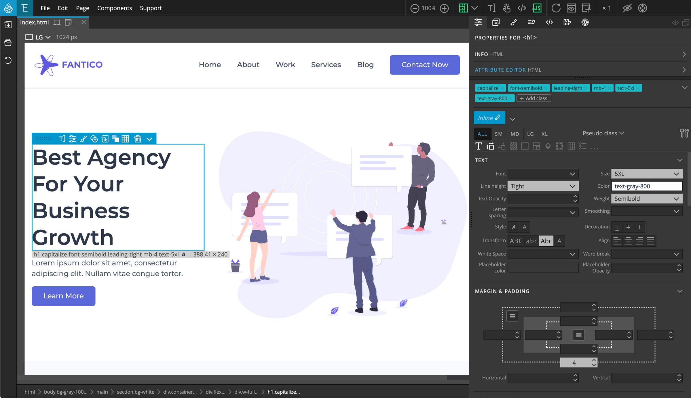
- Select h1 element
- Go to Properties panel
- Go to Text section > on Size > select 5XL
- On Line height > select Tight
- On Color > select Gray-800
- On Weight > select Semibold
- On Transform > select Capitalize
- Now go to Margin & Padding section > on margin bottom select 4
Next select the P element.
- Go to Properties panel
- Go to Margin & Padding section > on margin bottom select 4
Now go to the link element. For this link we already have created a class style called Button.
- Select h1 element
- Go to Properties panel
- Click on the Class Style selector
- On the popup select Button
And we are done with this link.
Next select the image on the other div.
- On the Properties panel > go to Dimension section
- For Width > select Full
Now we are done with the hero section on the page.
4. Services Section
Let’s go to the services section below.
- Select the first div inside the section, this will our container block
- Now go to Properties panel
- From the Class Styles selector > select Container
- Now click on inline
- Go to Margin & Padding section
- For padding top and padding bottom select 20
Now select the child element of this block. For this we are going to apply another Class Style Row.
- From the Class Styles dropdown > select Row
- There is another block below so let’s add margin bottom as well
- First click on inline, as we don’t need to change the classes of Row
- Go to Margin & Padding section
- For margin bottom select 4
Now select both child div within this row block, as we will apply the same Column style to them.
- From the Class Styles selector > select Column
Now we’ve to apply classes for responsive view.
- On the breakpoints tabs select LG
- Click on inline
- Select the first div
- Go to Properties panel
- Go to Flex Container > on Flex > select 1
For the same LG breakpoint, now select the second div.
- Go to Properties panel
- Go to Dimension > on Width > select Auto
- When you are done, select All on the breakpoints tabs
Now let’s work on the contents inside.
- Select the h6 element
- Go to Properties panel
- On Color > select Indigo-600
- On Weight > select Medium
These classes will be used for other elements as well so let’s create a new class style.
- On the Properties panel > click on the pencil icon where it’s written inline
- And enter Sub Title
Now move on to the h2 element.
- Select the h2 element
- Go to Properties panel
- Go to Text section > on Size > select 4XL
- On Line height > select Tight
- On Color > select Gray-800
- On Weight > select Semibold
- On Transform > select Capitalize
- Now go to Margin & Padding section > on margin bottom select 2
Let’s create another class style for these styles as well.
- On the Properties panel > click on the pencil icon where it’s written inline
- And enter Main Title
P element is left by default as it will get the base color and font size of the page.
Next we’ve a link element on the other div.
- Select the link element
- On the Properties panel
- Click on Class Styles selector
- On the popup select Button
Let’s move on to the div below. This should be a Row block, our Row style has items-center applied. Which we don’t need for this one so we should go with inline classes for this.
- Select the div
- Go to Properties panel
- Go to Display section > on Display > select Flex
- Go to Flex Container section > on Wrap > select Wrap
Now select all the child div within this block, as we will apply the same Column style to them.
- From the Class Styles dropdown > select Column
Now we’ve to apply classes for responsive view.
- On the breakpoints tabs select XL
- Click on inline
- We should keep selecting all 4 DIVs
- Go to Properties panel
- Go to Dimension section > on Width > select 3/12
- Agin on the breakpoints tabs select SM
- Go to Dimension section > on Width > select 6/12
- When you are done, select All on the breakpoints tabs
Let’s work on the element inside.
- Select the link element
- Go to Properties panel
- Go to Margin & Padding section
- For padding top and padding bottom select 16
- For padding left and padding right select 6
- Go to Display > select Block
- Go to Background > on Color > select Gray-200
- On Border > select equal radius button > select Lg for any of the radius
- Now go to Shadow section > for Box Shadow > select LG
Now to add hover effect
- On Pseudo State select hover
- Go to Text section > for Color > select White
- Go to Background section > for Color > select Indigo-400
These same classes will be applied for other 3 blocks. So let’s create another class style for service blocks.
- On the Properties panel > click on the pencil icon where it’s written inline
- And enter Service Block
Now select the other three link blocks. Press CTRL or CMD on mac, and click on the three link blocks.
- On the Properties panel
- Click on Class Styles selector
- On the popup select Service Block
Now we should work on the elements inside the service block. First we’ve a Font Awesome icon.
- On the Tree panel select all the icons from all 4 service blocks
- On the Properties panel
- Go to Text section
- On Size > select 4XL
- On Color > select Indigo-700
- Now go to Margin & Padding section > on margin bottom select 4
Next select h5 elements on all 4 service blocks.
- On the Properties panel
- Go to Text section
- On Size > select LG
- On Weight > select Semibold
- Now go to Margin & Padding section > on margin bottom select 4
Similarly select P element on all service blocks.
- On the Properties panel
- Go to Text section
- On Size > select SM
You can create Class Styles for these elements if you like. But I’m going to leave it inline for now.
Next we’ve a little variation on 2 Service Blocks
- Let’s select second and last service blocks
- Make sure you’ve selected inline classes
- On Breakpoint tabs select SM
- Go to Margin & Padding section
- On margin top & margin bottom select -16
From the last one we don’t really need the margin bottom.
- So select the last service block
- On margin bottom select blank
- When you are done, select All on the breakpoints tabs
Now we are done with the whole service block. And we’ve come around half of the tutorial. Next steps of this tutorial will be covered in Part 2.
5. About Section
Staring the About Section
- Select the next section block
- Go to the Properties panel
- For Background > select Indigo-200
Now we have to set our container style.
- Select the child div
- Click on the Class Styles selector
- In the dropdown select Container
- Next add padding as an inline classes
- Click on inline
- Go to the Margin & Padding section
- For padding top & padding bottom select 20
Now for the next div we’ll set it as a row.
- Select the child div of Container
- Click on the Class Styles selector
- In the dropdown select Row
We’ll have to set column style for child DIVs of this row.
- Select both child div of this Row block
- Click on the Class Styles selector
- In the dropdown select Column
Let’s set width for these columns.
- Switch to inline classes
- On the breakpoints tabs select LG
- Select the first div
- In the Dimension section > for Width > select 6/12
- Select the second div
- On Dimension section > for Width > select 5/12
- I’ve left a 1 column gap so let’s add margin left: auto to keep this div on the side
- Go to Margin & Padding section
- On margin left select auto
- When you are done, select All on the breakpoints tabs
To work on the content inside.
- Select the image
- Go to Properties panel
- On Dimension > for Width > select Full
Now select the h6 element on the next div.
- On Properties panel, click on Class Styles selector
- In the dropdown select Sub Title
Similarly select the h2 element
- Click on Class Styles selector
- In the dropdown select Main Title
For the P element, we just need margin bottom.
- Select the P element
- On the Properties panel, go to the Margin & Padding section
- For margin bottom select 4
Now we have a link element and we already have class style for this as well.
- Select the link element
- On Properties panel, click on Class Styles selector
- In the dropdown select Button
And just like that our about section is done.
6. Call to Action Section
Our next section is a call to action block. Let’s select this block and start working on it.
- Select the next section block
- Go to the Properties panel
- For Background > select Indigo-600
Now the next div will be our container.
- Select the child div
- Click on Class Styles selector
- In the dropdown select Container
- Next enable inline classes
- Go to Margin & Padding section
- On padding top & padding bottom select 20
- For padding left & padding right select 4
- Next go to Text section > on Align > select Center
Next select the h2 element, here we can use the Main Title style but we will have a little changes to the classes. So, we’re just going to copy the classes and form a class style.
- Click on Class Styles selector
- In the dropdown select Main Title
Here we don’t need the Main Title style, we only need to keep the classes
- So right click on the Main Title style > on the popup click on Remove & leave classes
- Now this block is not associated with the Main Title style
So let’s make more changes.
- Go to Text section > on Color > select White
- On Transform > click on Capitalize again, so there is no text transform
- Next go to Margin & Padding section
- On margin bottom change the value to 6
Next we’ve a link element. For this one we’ve going to select Button style.
- Select the link element
- On Properties panel, click on Class Styles selector
- In the dropdown select Button
But we’ll need a variation on this button style. Like we can create a Button Light style by using the Sub Style feature of Tailwind plugin. This way we can create different variations for a main class style.
Now to create a new sub style
- On the Properties panel
- Click on inline
- Now pencil icon on the inline will change to Create new substyle
- It will change into input field and now enter Light
Now we’ve created a sub style of the Button. Light is selected and now we can apply our classes.
- Now go to Text section
- On Color > select Indigo-600
- On Background Color > select White
- Now for the hover state, select hover on Pseudo state selector
- On Background Color > select Indigo-200
- When you are done, select None for Pseudo state selector
7. Latest Work Section
We are done with the Call To Action section now we have the Latest Work section.
- Select the child div block of this section
- Click on Class Styles selector
- In the dropdown select Container
- Next enable inline classes
- Go to Margin & Padding section
- On padding top & padding bottom select 20
- Next go to Text section > on Align > select Center
Now select the first child div of this container block
- Go to Margin & Padding section
- On padding right & padding left select 4
- For margin bottom select 4
- Now go to Dimension > on Width > select Full
- Now on breakpoints tabs click on LG
- On Dimension section > for Width > select 1/2
- When you are done, select All on the breakpoints tabs
- Go to Margin & Padding section
- On margin right & margin left select auto
- When you are done, select All on Breakpoint tabs
Now for the contents inside.
- Click on the h2 element
- Click on Class Styles selector
- In the dropdown select Main Title
For the next P element I’m going to leave it default.
Next we’ve the section where is 4 blocks of images and contents
Let’s move on with the first div block which will be our row block and the direct child will be columns.
- Select the child div block
- Click on Class Styles selector
- In the dropdown select Row
Beside the Row style I’m going to add margin bottom for this block.
- Enable inline and go to Margin & Padding section
- On margin bottom select 4
Now let’s work on the 4 DIVs inside which will be our columns.
- Select all 4 DIVs of this row block
- Click on Class Styles selector
- In the dropdown select Column
Now let’s apply width to these columns for responsive views.
- On the Properties panel
- Click on inline
- Select LG on breakpoint tabs
- Go to Dimension > on Width > select 3/12
Now for smaller screens
- Select SM on breakpoint tabs
- Go to Dimension > on Width > select 6/12
- When done select All on breakpoint tabs
Now select the a (link) element in all 4 columns.
- Press Ctrl (or Cmd on Mac) and click on each elements
These blocks have contents centered because one of the parent elements has a text-center applied to it.
- Now go to Properties panel
- Go to Text section > on Align > select Left
- Go to Display > select Block
Since this is a link block, for now I’m going to add a simple hover effect on this.
- On Pseudo state selector > select hover
- On Text section > for Opacity > select 75
- Now reset the Pseudo state selector to none and if you hover over the block you should see the effect
Now move on to the image inside these link blocks.
- Select all 4 images inside the link block
- On the Properties panel > for Width > select Full
- For Height > select 64
Since we’ve set a fixed height, our images will get stretched or contracted if it doesn’t fit the block. For this we can set the object fit properties.
- Now go to Display section
- On Object fit > select Cover
Now we’re done with the images, let’s work on the div which contains the texts and the icons.
- Select all 4 DIVs inside the link blocks
- On Display > select Flex
- Go to Flex Container section > for Align Items > select Center
- For Justify Content > select Space Between
- Go to Margin & Padding section
- On padding right & padding left select 4
- On padding top & padding bottom select 3
- Now go to Background > select Indigo-100
Now our Latest Work section is almost finished. Only elements left is the title text.
- Select all 4 h6 elements
- Go to Text section
- For Size > select Base
- For Color > select Gray-900
- For Weight > select Semibold
Now last in the Latest Work section we’ve a link element.
- Select the link element
- Go to Properties panel
- Click on Class Styles selector
- In the dropdown select Button
Now we are done with the Latest Work section. So let’s move on to the last Footer section.
8. Footer Section
Let’s style the Footer block itself first.
- On Tree panel > select the Footer block
- Go to Properties panel
- Go to Background section > on Color > select Gray-900
- Go to Text section > on Color > select White
Now select the direct child of the Footer, which will be our container block.
- Go to Properties panel
- Click on Class Styles selector
- In the dropdown select Container
Let’s add padding top to this block.
- Enable inline classes
- Go to Margin & Padding section
- On padding top select 20
Now select the next child div.
- Go to Properties panel
- Go to Display section > for Display > select Flex
- Now go to Flex Container section > for Wrap > select Wrap
Now select the 4 DIVs inside which have the main contents.
- On the Tree Panel select all 4 DIVs
- For these we should apply column style first
- Go to Properties panel
- Click on Class Styles selector
- In the dropdown select Column
Now let’s set width for these columns for responsive views.
- Select the first DIV
- Don’t forget to enable inline
- Select XL on breakpoint tabs
- Go to Dimension section > on Width > select 4/12
We’ll need to add a gap on the side as we will not be covering all 12 columns.
- Go to Margin & Padding section
- On margin right select auto
Now select other 3 column DIVs as these will have the same classes. We are going to work on XL breakpoint and we’ve already selected it.
- Also make sure inline is enabled
- Now go to Dimension section > on Width > select 2/12
- Now select SM on breakpoint tabs
- For Width > select 4/12
- When done select All on breakpoint tabs
Now let’s start working on the contents inside these columns.
- Go to the first column > select the logo image inside
- Go to Properties panel
- Go to Dimension > on Width > select 48
- Go to Margin & Padding section
- On margin bottom select 6
Next select the P element.
- Go to Properties panel
- On Margin & Padding > for On margin bottom select 4
- Go to Text section > on Size > select SM
Next we’ve a DIV block which contains 2 links. So we just need to add margin bottom to this.
- Select the DIV block
- Go to Properties panel
- On Margin & Padding > for margin bottom select 4
Now let’s work on the links inside and we need to add hover effect to these links.
- Select both the links and go to Properties panel
- On Pseudo state selector > select hover
- On Text section > for Color > select Indigo-200
- Now reset the Pseudo state selector to none
I want this hover effect to all other links in the footer section so let’s create a class style for this.
- Click on the Create new style button, the button icon
- Type Footer Link and click Ok
Now we’ve created Footer Link style and we’ll use this for other links later.
Now let’s move onto the next div which contains links with social icons.
- Select all 3 links element
- Now let’s apply the Footer Link style to these links
- Go to Properties panel
- Click on Class Styles selector
- In the dropdown select Footer Link
- Now for these social links we need more classes than the base Footer Link style
- So enable inline
- On Text section > for Size > select XL
- On Margin & Padding > for margin right select 2
Now we’re done with this, let’s move on to the other three columns. These 3 columns have similar contents, 1 title text and list blocks which contain links.
- Select the first h4 title text
- Go to Properties panel
- Go to Text section > on Size > select LG
- On Color > select Gray-400
- On Weight > select Medium
- For Transform > select Uppercase
- Now go to Margin & Padding > for margin bottom select 8
We’ve 2 more title texts on other columns so let’s create a Class Style for this.
- Click on Create new class style
- It will change into input field
- Enter Footer Title and press enter
Now let’s apply this to the other 2 title texts.
- Select h4 title text on other 2 columns
- Click on Class Styles selector
- In the dropdown select Footer Title
Now title texts are done, let’s work on the links. We need to add hover effect to the link and also we need spacing between the links.
- First select li blocks on all 3 columns
- Go to Properties panel
- Now go to Margin & Padding > for margin bottom select 4
We are done with the spacing. For the hover effect we already have Footer Link style.
- Now select the links on all 3 columns
- Go to Properties panel
- Click on Class Styles selector
- In the dropdown select Footer Link
We’ve applied style to the links, now if you need any changes to the links on the footer section. You can easily edit just from one place.
Now we’re at the end of our tutorial. At the end we have a copyright section. So let’s work on this.
- Select the last DIV block which has copyright content
- Go to Properties panel
- On Margin & Padding > enable the equal sign on the center
- For padding select 4
- Now go to Text section > for Align > select Center
Now select hr element inside.
- Go to Properties panel
- On Margin & Padding > for margin bottom > select 4
- Now go to Display section > for Opacity > select 25
Now for the last P element, let’s make it a little smaller.
- Select the P element
- Go to Properties panel
- Go to Text section > for Size > select SM
And now we have completed building a landing page using TailwindCSS with Pinegrow Web Editor.
Check the page if you’ve something missing or if you need to work on responsive views. With the help of our new Tailwind Visual Editor it makes it very easy to build and manage projects with TailwindCSS.
This concludes the tutorial. I hope the video was helpful.
If you’ve any questions please feel free to contact us via email or through the Pinegrow forum.
We will be coming up with more videos related to TailwindCSS and other Pinegrow related contents. So keep watching and following.
Thank you for your time and we will see you in the next video.