Adding web interactions to Booklers landing page
A step by step tutorial on adding web interactions and animations to a simple landing page.
Before we start
What you’ll learn?
By following this tutorial you will learn how to:
- Activate Pinegrow Interactions in your project
- Create parallax animations
- Reveal the content when the page is loaded
- Reveal the content when the section is scrolled into view
- Create a 3D interactive rotation effect
What you’ll need?
Of course, you can just watch the tutorial to see how Pinegrow Interactions work. But we recommend that you follow along the tutorial, doing all the steps on the provided landing page. To do that, you’ll need:
- Pinegrow Web Editor, either a free trial or activated license that includes Pinegrow Interactions.
- Download the example Booklers landing page without interactions. Unzip the file and open it as a project in Pinegrow Web Editor.
- You can also download the finished project as a reference.
Want to know more about Pinegrow Interactions?
Visit the Pinegrow Interactions Documentation portal to learn more about Interactions, actions, licensing, API and more.
Need help?
Post any questions and feedback about this tutorial to a dedicated Pinegrow Forum topic.
Watch the whole tutorial
The tutorial has 6 parts, total length is around 30 minutes.
We recommend that you watch the whole tutorial and follow along with the provided project.
Alternatively, you can scroll down past the video to watch and read transcripts of individual tutorial parts.
The following section contains the videos and transcripts of individual parts of the tutorial:
1. Introduction
In this tutorial, we are going to add interactions to a landing page to make it more engaging. We’ll be using Pinegrow Interactions, a Greensock powered visual editor for web interactions.
In this tutorial you’ll learn how to easily add engaging interactions to your websites, without any coding.
I’ve developed a demo landing page for a mobile app called Booklers.
We are going to add content reveal effects, a sleek parallax scroll effect, and a custom mousemove interaction to various elements on the page.
Before adding animations it is best to plan what type of animations you should add to the page elements:
- I’ll add a reveal or fade in effect to most of the content like heading, text and buttons like on the left of the hero section
- For the two hero images I’m going to apply scroll interaction, so these images move in opposite direction of my scrolling
- And third, I’ll show you how easy it is to implement an advanced custom interaction like animation on cursor movement.
So let’s get started.
I have my project opened up already. You can see that the page itself is done and what is left is to add interactions.
If you are new to the Pinegrow Web Editor, on the right site of the web editor we have a panel for adding interactions. You can click on the Interactions tab and you can see interactions that have been added to the selected element or we can add new interactions to that element. Currently this project doesn’t have any interaction. That’s why we see the Activate Interactions button.
Click on it to add the required resources to the project.
Let’s select an element on the page, for example the main heading.
The Interactions panel now displays the Interaction actions for the selected element.
The top part shows the actions that are already added to the element. It’s empty now.
The bottom part displays the list of all available interaction actions that we can add to the element:
- Interaction is used to animate the element when a certain event happens, for example when the element is clicked.
- Scroll Scene is used to animate the content when the element is scrolled in and out of the view..
- Hide at Start hides the element when the page loads (for example, in reveal effect we will hide the content at first and then display when page load completes).
- Show at Start shows the element when the page loads so that we can then hide with the animation.
- Smooth Scroll makes the mouse wheel scrolling more natural.
- Apply to Many is copies the interactions from the selected element to other elements. It let’s us define interactions on one element and reuse them on others.
We’ll go through all these actions in this and follow-up tutorials.
Ok, we are good to go.
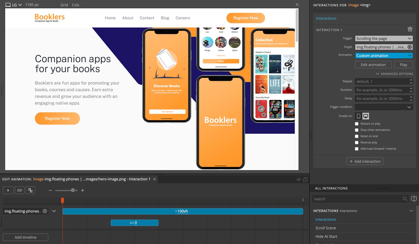
2. Animating the hero image
First, we’ll take care of the hero image.
We’ll animate it with a scroll parallax effect.
The hero section has 2 images: the first one is the background and the second one is the mobile app mockup display.
Let’s select the first image by clicking on it in the Tree panel.
We’ll be using the Interactions action to animate the element based on the how far down the page is scrolled.
To add an interaction select the element and click on the Interactions action in the actions list.
Let’s do that.
The Interactions action has three main components:
Trigger is the event that triggers the animation, for example mouse clicks, page load or page scroll.
Target is the element that will be animated. By default, the element with the action will also be animated. But in some cases, the element that triggers the animation and the element that is animated can be different.
Animation is the animation that will be played when the event is triggered.
The general rule is to add the Interactions action to the element where the trigger event will happen.
Here, the page scroll will control the movement of the image. We’ll use the trigger Scrolling the page.
Click on the Trigger field and you can see several pre-defined triggers like Click and Page load. For this one select Scrolling the page. This means animation will run as you scroll the page.
Below that is the Target field. We’ll leave it blank because we want to play the animation on the same element.
Next, we have to configure the animation.
Click on the Animation selector. There we find several predefined animations. These are useful animations that cover a lot of our animation needs. Of course it is also possible to define custom animations.
Here we can use a preset that is already available to us. Head over to Parallax and select Flying element. What this does is that it moves an element in the Y axis. You can test it on the page; now the image should move up in the Y axis when you scroll down and the image should move down when you scroll up.
Now let’s add the Interaction to the hero image on the front.
I’ll add similar animation like before, but in the opposite direction plus with a little tweak.
You can do the same thing as before:
select the image… add Interactions action… set the Trigger to Scrolling the page… and for the Animation goto Parallax and select Flying element.
Everything we did is the same as before and you should see both have the same effect when you scroll the page. Now we are going to customize the second animation. We’ll use the Timeline editor to do that.
In the Interactions panel, below the Animation option you can see the Edit Animation button. Click on the Edit Animation button and the Timeline Editor will popup at the bottom of the page view.
There we can see what animation has been applied for our hero image.
In the left of the Timeline editor is the Target element and on the right are the transitions that will be applied to the Target element. You can also edit your Target or add multiple animations for different targets. By default it will select the current element so we don’t need to change this for now.
Let’s edit our current transition so that our element will scroll in the opposite direction. Click on the blue transition bar in the timeline editor to open a popup with the transition settings. Any value that is listed there will be animated. You can add multiple properties to get the animation you desire.
And the top of the Transition edit box are the transition settings: the type, timeline start position, animation duration, ease function and stagger.
The transition can be of two types: Tween means the transition will animate properties from the current value to the specified value. Set will simply set the specified properties without animating them.
The selected transition has Y property set to -100vh. So when you scroll the page, the Y position of the hero image changes from 0 to -100vh. So to make it go the opposite direction we just have to make it 100vh. So just remove the “-” from the value.
Now as you scroll the page you can see both images have parallax scroll animation but in the opposite directions.
But as you scroll the page you can see our top hero image goes way down and it comes under the content of the section below. So, visually it doesn’t look that great. So, I’m going to add a fade out effect so that our image hides as we scroll further down the page.
To do that, click on the blank space inside the timeline editor, in the area where you see a dashed vertical orange line with the plus sign as you hover above the empty areas of the timeline.
Click to add a new transition at the position of the orange line. The Edit transition box will popup. Click on Add property go to Opacity and select Auto Opacity. Set the value to 0. That means that the element will become fully transparent.
Now the fade out effect is applied but you may need to change the duration and position for the best effect. You can test with different values to see what works best for you.
For this one I’ve used 0.2 for the duration and placed it in the 0.2 position. Duration and position values are specified in seconds.
Save the changes and check the page so when you scroll, the image should hide before the content appears from below.
3. Reveal the header content
Now let’s move on to animating the content reveal. We will use this animation on almost all elements on the page.
We are going to add this in 2 different ways.
One is when the page loads. We’ll use it for the contents in the header of the page that will become visible when the page loads.
And the second is displaying the content when it scrolls into the view.
The animation will be the same in both cases. But the way how the interaction is set will be different.
So let’s start from the top:
- Select the main page heading.
- In the Interactions panel add the Interactions action
- Set the Trigger to Page Load – Page fully loaded
- Leave the Target blank
- Set the Animation to Fading Entrances -> FadeInUp
Refresh the page and check how it works.
You should get the reveal effect on the heading as the page load is complete.
Now let’s do the same for the other header text and the button.
But instead of doing the same thing we can just copy and paste the interactions.
For that hover over the interactions panel, on the top right you’ll find a copy button beside the delete button. Click the copy button to copy the interaction to the clipboard.
Next, select the P element below the heading.
Press Cmd + V on Mac or Ctrl +V on Windows. And the interaction should appear in the top part of the Interactions panel.
We can do the same for the button:
Select the button and press Cmd + V on Mac or Ctrl +V on Windows.
Now refresh the page.
The reveal effect works on all the 3 elements. But they are all appearing at the same time.
Let’s change that and give a little gap between each reveal effect.
One way to do that is to just add the a delay to the animations.
To do that
- select the text (p element) below the heading
- in the Interactions settings click on Advanced Options
- set the Delay field to 0.3
Do the same for the button as well but enter 0.6 for the Delay.
But the animations don’t work properly yet.
The reveal effect takes the element from hidden to visible state. So to apply the reveal effect we need to make sure the element is hidden when the page loads.
We do that by adding the Hide At Start action to the revealed elements.
Hide at Start will ensure that the element is hidden when the page loads. And it will only hide the element if Javascript is enabled. That ensures that our page remains usable in case the browser can’t run animations.
We have to add this to all 3 elements and we can do this at the same time, by selecting all 3 elements. To select multiple elements press Shift on your keyboard and click on the elements that you want to select. If you want to select elements on different sections then press Ctrl (or CMD on Mac) and click on the elements one by one.
Now with 3 elements selected, click on Hide At Start action in the Interactions list. This will add the action to all selected elements.
Refresh and check your page. You should see those three contents being revealed one by one.
However, there is a slight problem with the Button – it’s not animated properly.
The reason for this is that the element already has a CSS transition applied to it. That will clash with our animation. Our button element contains a btn Bootstrap class that includes a property for the CSS transition. If you check the CSS you will find it.
In such cases we can customize the animation to make sure we override any existing transition setting.
Click on Edit Animation and in the Timeline Editor click on the purple Set transition.
Click on Add Property, click on Custom Property and type transition, click ok. Set the value for transition to none and save.
Refresh the page. The content is now revealed smoothly as expected.
4. Reveal the Benefits section
The header section is done so let’s move on the Benefits section below.
We are going to add the same reveal effect but in this case we’ll be using the Scroll Scene action to reveal the content when the section is scrolled into view.
For this we are going to use Scroll Scene action which observes the scroll position of the element and triggers animations based on that. One thing to remember here is to add the Scroll Scene on the container (section) element and not on the element that will be animated.
In the second section select the Div block with the class name of container, and add Scroll Scene action from the Interactions panel.
The settings here are a bit different from the Interactions action that we used before.
We are going to add multiple animations for the contents inside the section.
I’m going to leave the Scroll Scene setting to default.
For the first animation, set the Target to the h2 heading and for Animation go to Fading Entrances and select FadeInUp.
Refresh the page. You should see it reveals as we scroll.
Here the animation is synced with scrolling. But what we want instead is to trigger the animation at the certain scroll position and let it run by itself.
To do that, in the Animation setting click on Advanced Options and there you will see the Play option. Currently, with scroll is selected. Change that to independently and save.
Now check the page and the section heading will be revealed as we reach the section.
Now let’s repeat the same thing for the text below the heading.
This time click on the Add Animation at the bottom on the Scroll Scene action settings.
This will add “Animation 2” section to the Scroll Scene.
For the Target select p element and on Animation go to Fading Entrances and select FadeInUp and similarly click on Advanced Options and select independently for Play.
Now, for the four content blocks, I’m going to apply the reveal effect by selecting all of them at once using a Target class selector. With Pinegrow custom selector you can select any element in the page or select multiple elements that match the same selector.
I’ve already assigned a class name featured-post to these four blocks.
So let’s add new animation on the Scroll Scene by clicking on the Add animation button.
This adds “Animation 3” to the Scroll Scene.
Open the Target selector and hover over the first div element with the featured-post class name. This will open a submenu where you can select all elements with the class featured-post.
Now, all 4 elements have been selected as targets, so any animation you select will be added to all 4 elements.
As before for Animation go to Fading Entrances and select FadeInUp and similarly click on Advanced Options and select independently for Play.
Now save, refresh and check the page and you should see the animation.
But all those 4 blocks are appearing at the same time. Why not add a bit of delay between them?
We are not going to add delay here as this would require making individual animations for each element.
Instead we are going to use the stagger option which delays the animations over a group of elements. Stagger comes into effect when multiple target elements are selected like we have done for these blocks.
To apply stagger we have to customize the animation. So click on Edit Animation and on the Timeline Editor click on the main blue transition. There enter 0.25 into the stagger field.
That will delay animating each element by 0.25 seconds.
Save the changes, refresh and check; you should see the reveal effect runs when we reach the section and that 4 featured-post blocks appear one by one.
Additionally, we have to add Hide At Start to all elements that will be revealed.
5. Reveal the Latest Articles section
Now let’s move on to the third section, the Latest Article section.
We’re going to implement a similar approach as we did earlier.
Select the Div with the container class and add Scroll Scene from the Interactions panel.
Now on the Scroll Scene settings, in Animation 1 set the Target to h2 heading and on Animation go to Fading Entrances and select FadeInUp. In Advanced Options set independently for Play.
Now for the 4 blocks below, we are going to do the same as we did for the four blocks in the Benefits section.
The blocks have a class article-post.
So add Animation 2 to our existing Scroll Scene and on the Target hover over the first div element with article-post class name and select the article-post class from the submenu.
Now you should see that all 4 elements have been selected.
In Animation go to Fading Entrances and select FadeInUp. Next, click on Advance Options and select independently for the Play option.
To apply stagger we have to customize the animation. So click on Edit Animation and on the Timeline Editor click on the main blue transition. Enter 0.25 into the stagger field.
That will delay animating each element by 0.25 seconds.
In this way we’ve implemented reveal animations. You can add this to more elements if you like. But for now I’m going to implement the next interaction: a custom mouse move interaction which will animate images in the article-post section.
6. Rotate images with the mouse
We are going to implement a cool 3D effect on the post images in the Latest articles section.
For that purpose we have to first add the CSS perspective to the parent of the image.
In this case that is the <A> or anchor element. Go ahead and check the CSS to see how I already defined the CSS perspective.
In the interaction, we are going to slightly rotate the image over the X and Y axis following the movement of the mouse over the element.
So we have to detect the cursor position on X axis and then rotate the image on the Y axis. Similarly we have to detect the cursor position on Y axis and then rotate the image on the X axis.
Does it sound complicated?
Luckily, this is very easy to implement in Pinegrow Interactions.
Let’s select the a element, parent of the image from the first article-post and add new Interaction.
Now on the Trigger we need to detect cursor movement which is similar to a hover effect in CSS.
So here select Mousemove/Touchmove.
This reveals additional settings below.
In the Action field we can now select what our mouse move should trigger. There are four options detecting X position, detecting Y position, detecting distance from the centre and just running the animation.
Here we need to select Animate X position and we are going to rotate the image in Y axis. It now gives us another option Rest at % which means at what animation position should the animation rest when the mouse pointer is outside the element. We’ll do that at the end.
For the Target select the image inside the current element.
We are detecting the X position and are rotating the Y axis from -17deg to 17deg. So 0 is the center. And similarly we’re detecting the Y position and rotate in X axis from -17deg to 17deg.
So now let’s jump to Animation and create a completely custom animation.
Select the custom animation – or simply click on the Edit animation button.
In the Timeline editor, click on the blank area to create a new transition. Click on the transition and on the top select Set, enter 0 for Position. Add a new property and select Rotation Y from Transform. Set the value of Rotation Y to -17.
Now create another transition by clicking on the blank space. It should be set to Tween and now enter 0 for position, 1 for duration and add new property as before, select Rotation Y from Transform but for the Rotation Y to 17.
Hover over the image and it should rotate right-left as your cursor moves over the image.
By the way, most interaction changes are visible directly on the page. If for some reason, they are not active, try Refreshing the page view.
Now we are going to do the same for the Y axis movement.
Add a new Interaction action by clicking the button below Interaction 1.
For the trigger select Mousemove/Touchmove.
For Action select Animate Y position.
For Target select the image inside the current element.
For Animation select custom animation.
In the Timeline Editor create a new transition.
Select Set, enter 0 for Position, add new property, select Rotation X from Transform and for the Rotation X enter the value of 17.
Now create another transition, set it to Tween, enter 0 for Position, enter 1 for Duration, add new property and select Rotation X from Transform and for Rotation X enter the value of -17.
Now our image should move as we move our cursor. So now we’ve got what we are looking for but did you see that our image remains stuck where we leave it?
This is due to Rest at % option being left blank. So to reset the image position we should enter a number between 0 to 100. So let’s enter 50 on both interactions. Now check the animation again and you should see the image will reset to the natural position when the mouse pointer is outside the image.
There is one last thing I’m going to add here. If you check our example you should see that I have added subtle shadow effect as well. That shadow moves from left to right giving a more appealing 3D effect.
We can add it in the same way.
Here we need to detect X axis movement, which we already have on the top interaction. So let’s click on edit animation and we don’t have to create a new transition as our element already has it. So just click on the purple set transition and add a new property.
Go to Shadows & Filter and select Box Shadow, in the field assign this value 10px 10px 10px -5px rgba(0, 0, 0, 0.4). You may know that the first 2 values of Box Shadow are for the X and Y positions. We are going to transition X position of the shadow, so the first value.
So now click on the other transition in the blue box and add the Box Shadow property like before. In the field enter -10px 10px 10px -5px rgba(0, 0, 0, 0.4). You can see that we are animating box-shadow’s X position from 10px to -10px. In this similar way you can add any CSS properties and animated the elements as you need.
With this you should get the shadow effect when you move the cursor.
Now one last thing we need to do is to add the same animation to other images as well. Before we have done this using a class name but now I’m going to show you a different approach.
I’m going to add an Add To Many action to the same image which has the interaction applied.
Now Add To Many gives you the option to select the target. You can edit the selector and enter any element but for this one we are going to select the element directly clicking on it.
So on the Target click on Select on the page and now press Ctrl (or CMD on Mac) and click on the other three a elements of those images. On the popup you should see them selected so now click Done.
Activating changes to Apply to Many actions requires that we refresh the page.
Now save, refresh and check; all the images should have the same animation.
This concludes the Tutorial for Animating a Simple Landing Page with Pinegrow Interactions. I hope the video was helpful.
If you’ve any questions please feel free to contact us via email or through the Pinegrow forum.
We will be coming up with more videos related to Pinegrow Interactions and How to videos for creating more interactive animations. So keep watching and following.
Thank you for your time and we will see you in the next video.