Introducing the Visual CSS Grid Editor
Pinegrow Web Editor includes a powerful collection of visual tools for working with CSS Grid.
Visual CSS Grid Editor in Pinegrow can help you with:
- Editing the grid layout
- Managing named areas and named tracks
- Moving and resizing grid elements
- Dropping elements directly to the grid
- Making grid layouts responsive
- Creating fallbacks for older browsers
Continue reading the introduction by Matjaz, the main developer of Pinegrow, to learn more.
By now you’ve probably heard (a lot) about the CSS grid, a set of CSS properties for defining two dimensional web layouts.
Once you try the CSS grid, you realize that the grid is not just an addition to CSS as we know it, but a game changing approach to creating layouts for the web.
At least that was my experience when I started to dig deeper in the CSS grid.
The CSS grid is very well thought out, designed to fix most shortcomings of past attempts at creating web layouts with tables, floats and flexbox.
And it is here to stay. Today, the grid works in Chrome, FireFox, Safari, Edge, Opera and most modern mobile browsers - without vendor prefixes.
At first glance, statements like the one below appear very unfamiliar. We might even think that the grid a complicated thing.
grid: auto-flow dense 40% / [line1] minmax(20em, max-content);The good news is that we don’t have to master all of grid’s nuances in order to start using it. We can start with simple setups and then dig deeper when needed.
That said, since grid is a visual concept, visual tools can make the CSS grid easier to understand and to easier use.
And that’s what this article is about.
The latest release of our visual web editor Pinegrow comes with a set of powerful tools for working with CSS grid layouts.
Everything is covered: defining the CSS grid, placing elements in the grid and even creating fallbacks for browsers that don’t support the grid yet.
Let’s take a look.
Creating the grid
The CSS grid layout is defined on the container element.
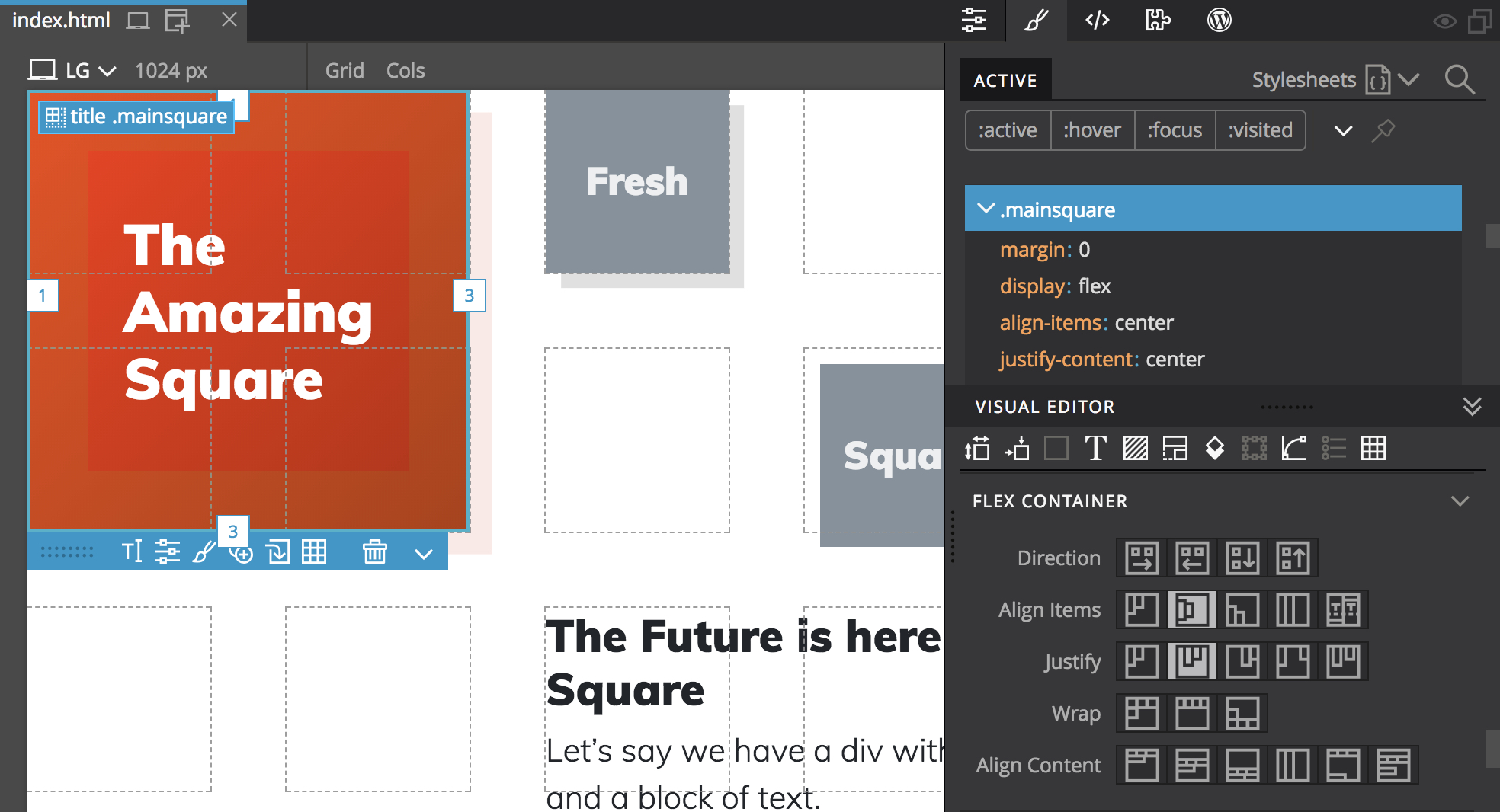
Let’s say we have a div with a heading, image, tagline and a block of text.
To arrange those elements into a grid, we create the grid on the parent div element by selecting it and clicking on the Edit grid icon or pressing CMD+G (CTRL on Windows and Linux) shortcut.
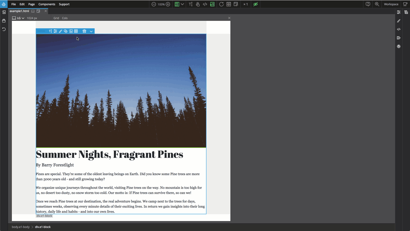
By default the elements are positioned automatically - one in each grid cell. In most cases, that’s not what we want.
Positioning elements with column and row lines
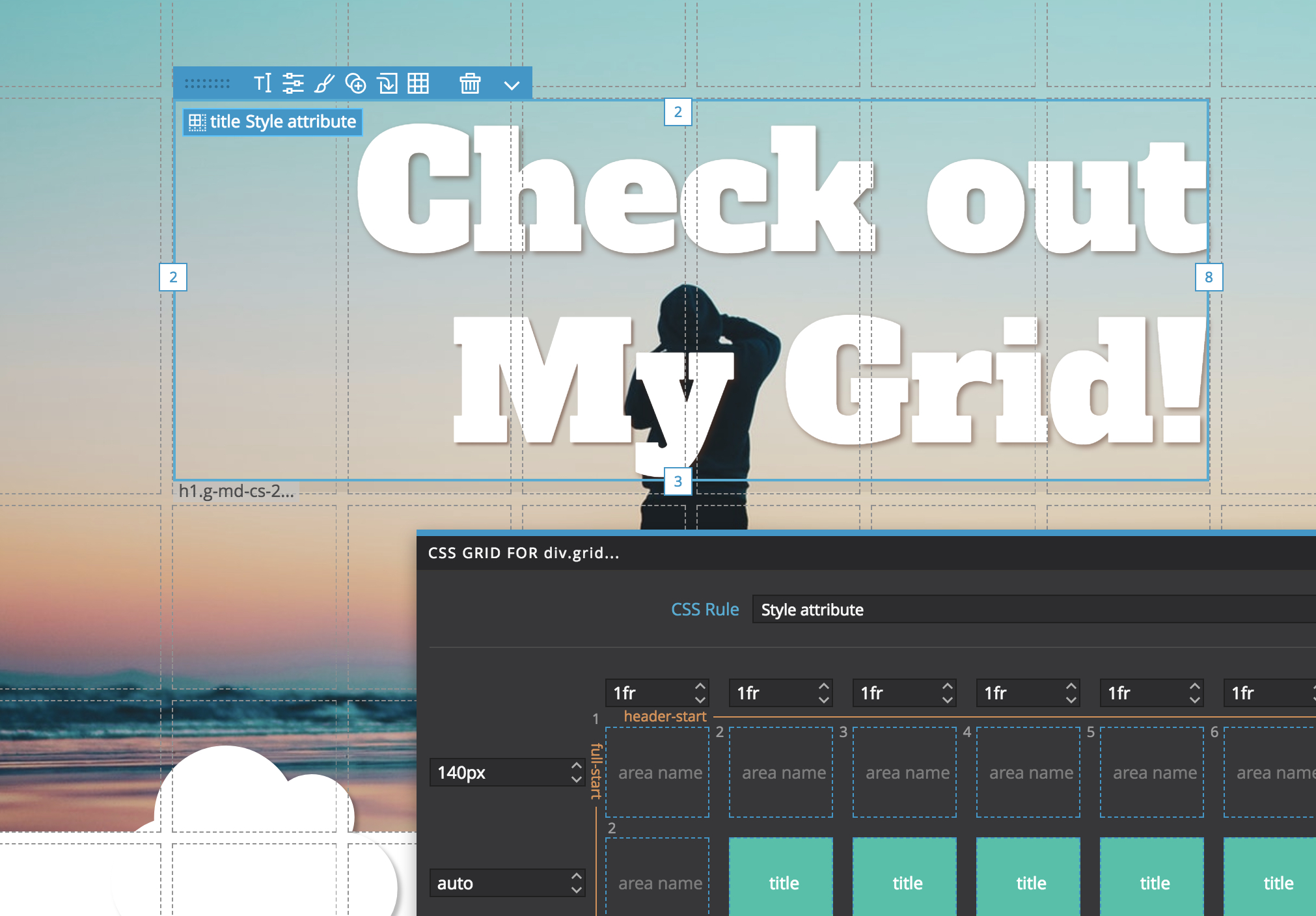
Grid elements are positioned with lines that define the grid, counting from 1 up, vertically and horizontally.
The position of an element is defined by the start row line, start column line, end row line and the end column line.
Pinegrow displays handles for each of these. We can simply drag the handles around to move and resize the element within the grid.
One important quality of the CSS grid is that the elements can overlap. Here the image lays in the background of the header.
Placing elements in the grid
If we add a new element into our main div element, it will be auto-positioned in the grid. We can than move it to its intended spot.
But Pinegrow can do better than that.
Hold down the CMD key (CTRL on Windows and Linux) while dragging the element over the grid to drop the element directly into a selected grid cell.
With one move, the element will be appended to the parent div element and its grid position will be set.
Clicking on the Grid item icon of the selected grid child element and choosing “Auto positioned” let’s us go back to grid handling the positioning of the element.
That said, for most situations, using row and column lines is not the most effective placement approach.
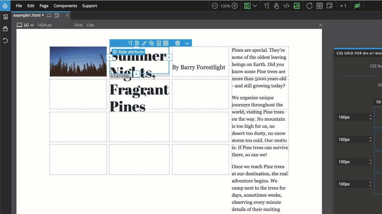
Named grid areas
Instead of using row and column start and end lines to position an element, we can give that area a name and then assign that named area to an element.
We can use the grid editor to create named areas. Just make sure that the areas are rectangular.
To place an element into a named area, we click on the Grid item icon and select the named area.
Another way to create and assign a named area with one operation is to move and resize the element with row and column handles and then click on the Grid item icon and chose “Set grid area…”
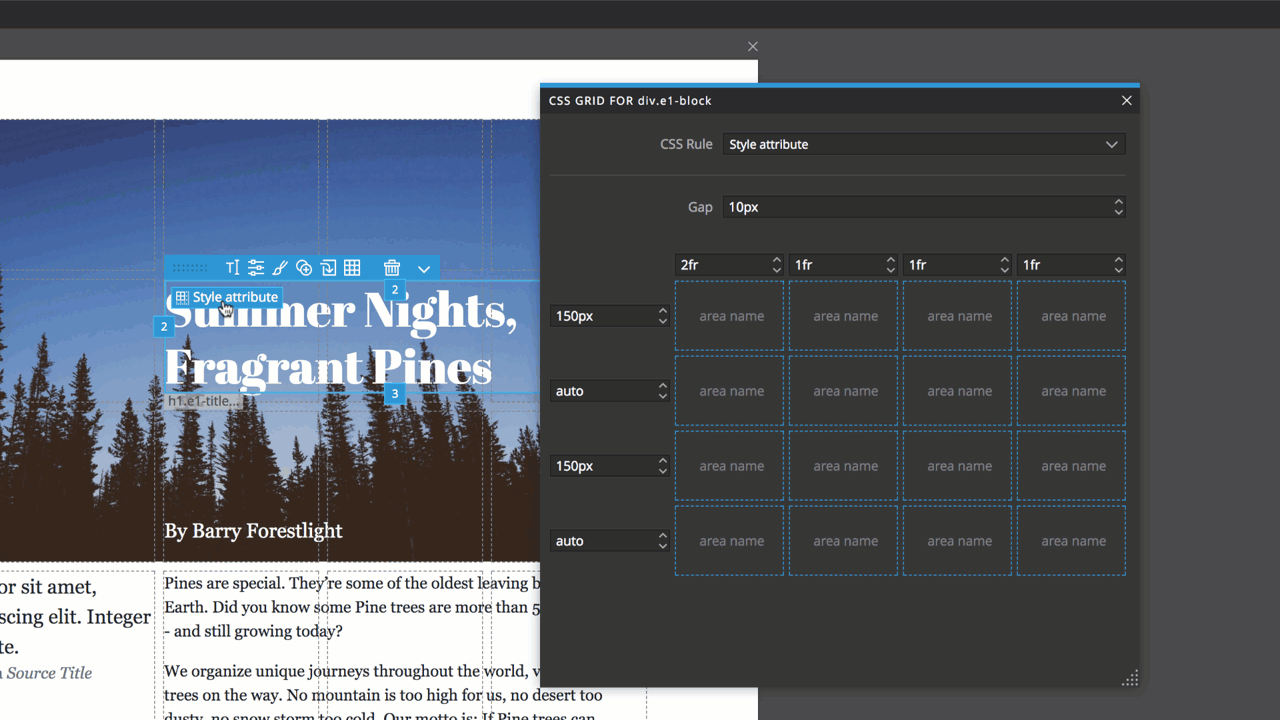
This will create a named area in the grid and place the element into it.
The same approach can be used to redefining existing named areas. Select the element in that named area, move and resize it with handles and then use “Set grid area…” with the existing area name to redefine that area.
Naming the tracks
Named areas are not always possible. For example, we might have a grid with variable number of rows. We can’t work with areas because the number of rows depends on how many elements will be placed in the grid. Instead of giving names to areas, we can name individual tracks.
Click on the vertical and horizontal tracks in the grid editor to edit their names.
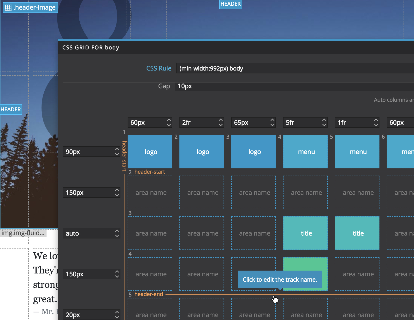
Then we position the elements using track names, instead of track numbers. That can simplify managing responsive layouts.
The best practice for positioning elements
Whenever possible, using the named areas or named tracks is the most effective and the easiest to maintain, especially with responsive grid layouts where we might end with multiple versions of the grid layout for individual display sizes.
The only limitation of named areas is that the named areas can’t overlap.
So, for those elements that are overlapped (or under-lapped) we can use the row and column lines placement.
In our example, we use the row and column placement for the underlying image and named areas for all other elements.
Where does the CSS go to?
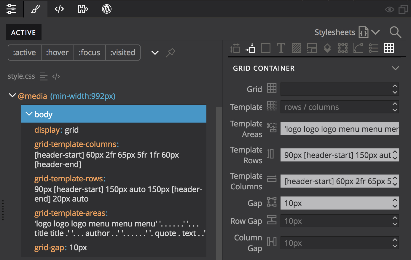
So, where do the grid-* CSS properties of the grid element and its children go when we’re using the grid visual tools?
Pinegrow tries to be smart and automatically determine the right CSS rule for storing the changed grid properties:
1. Select the top relevant CSS rule that already contains the relevant grid properties.
2. If (1) is not the case, store properties in the inline style attribute of the element.
Properties stored in the style attribute can be easily saved into a new CSS rule or added to an existing CSS rule.
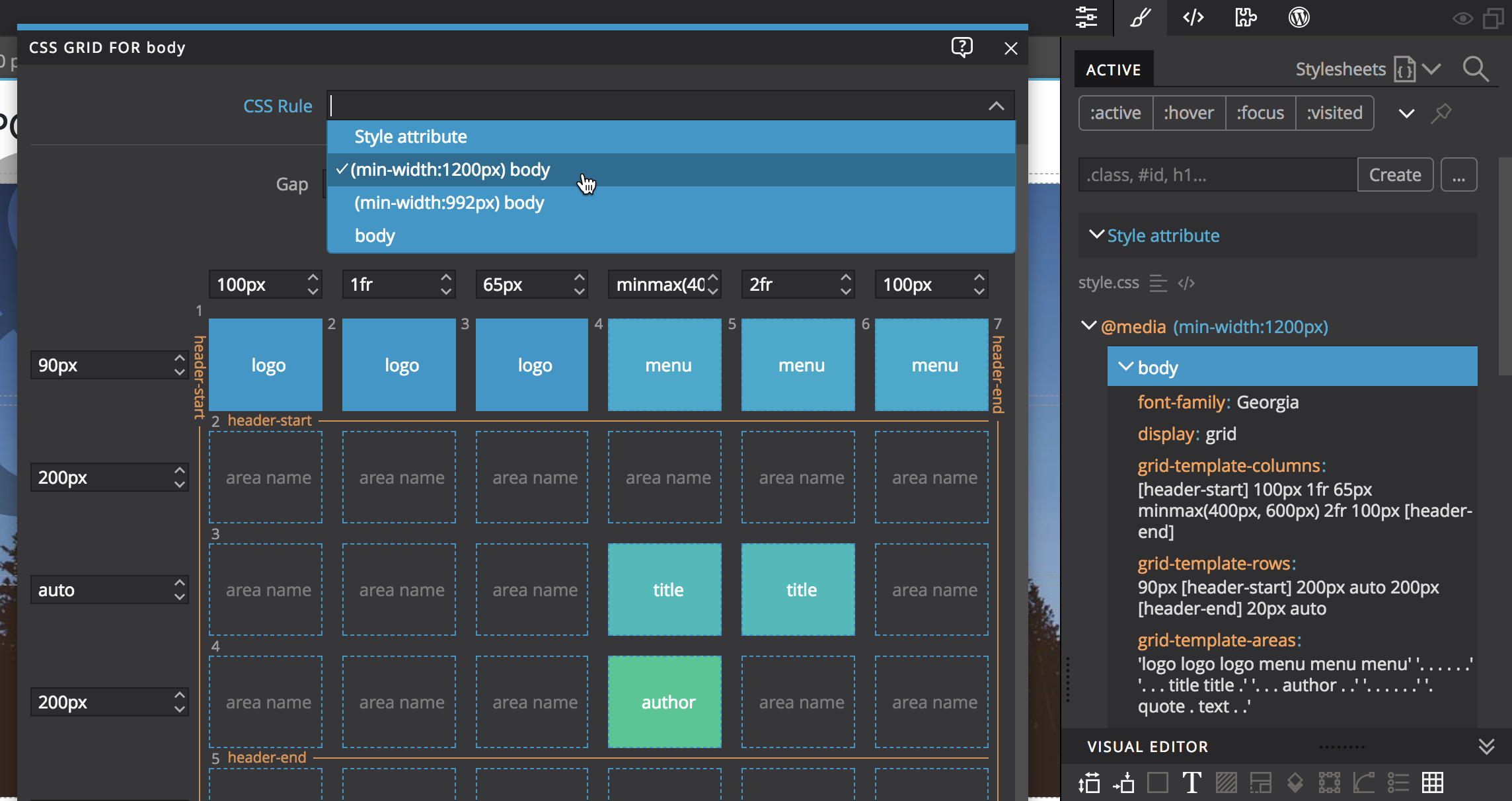
The target CSS rule can also be manually selected for both the grid editor and the placement of grid elements.
Note, if we want to use a new CSS rule for these properties we have to first create it in the CSS panel.
Toggle grid display in page views
Sometimes the CSS grid display helper and handles get in the way.
We can use the Display helper menu to configure if CSS grid is shown on the page.
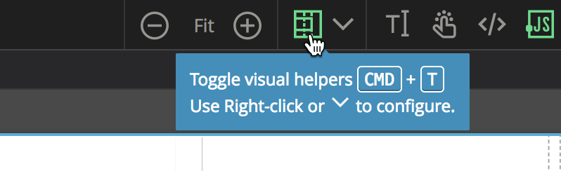
Use CMD+T (CTRL+T on Windows and Linux) to quickly toggle the display of all configured display helpers.
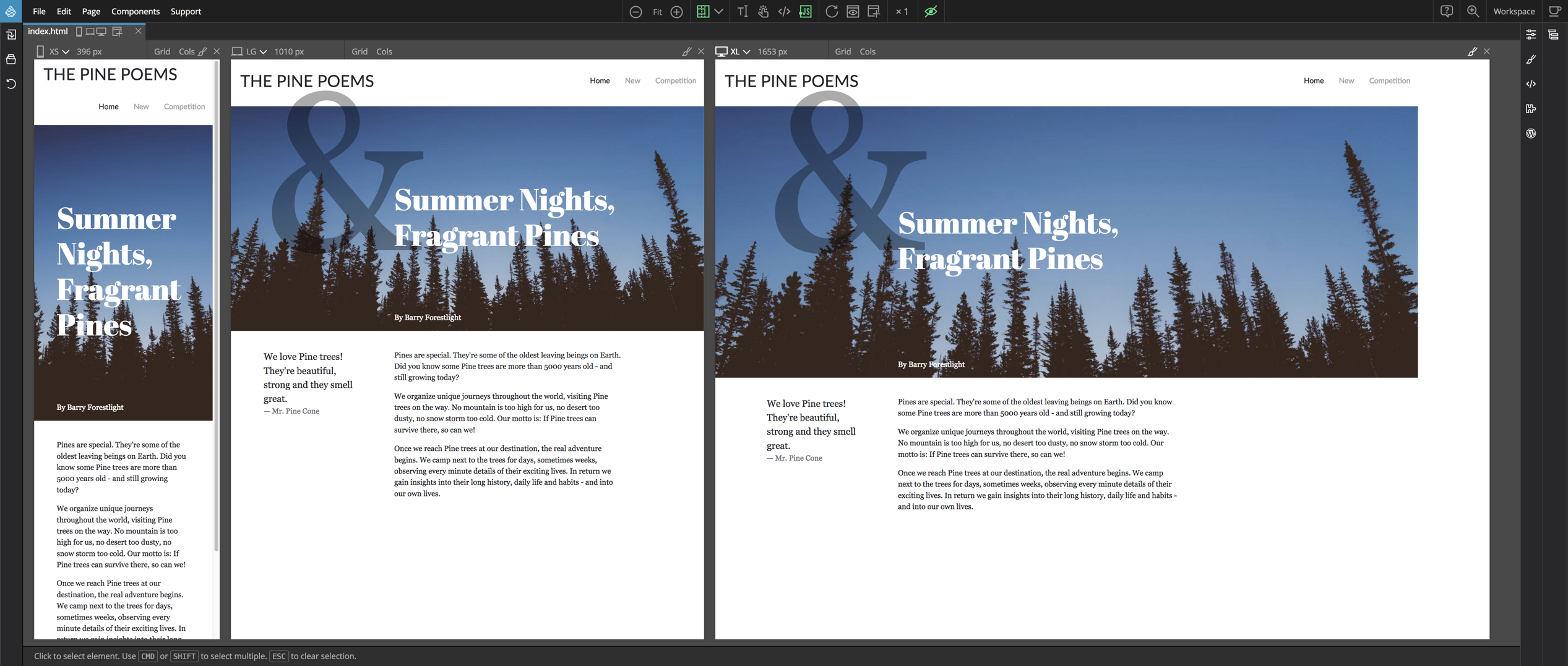
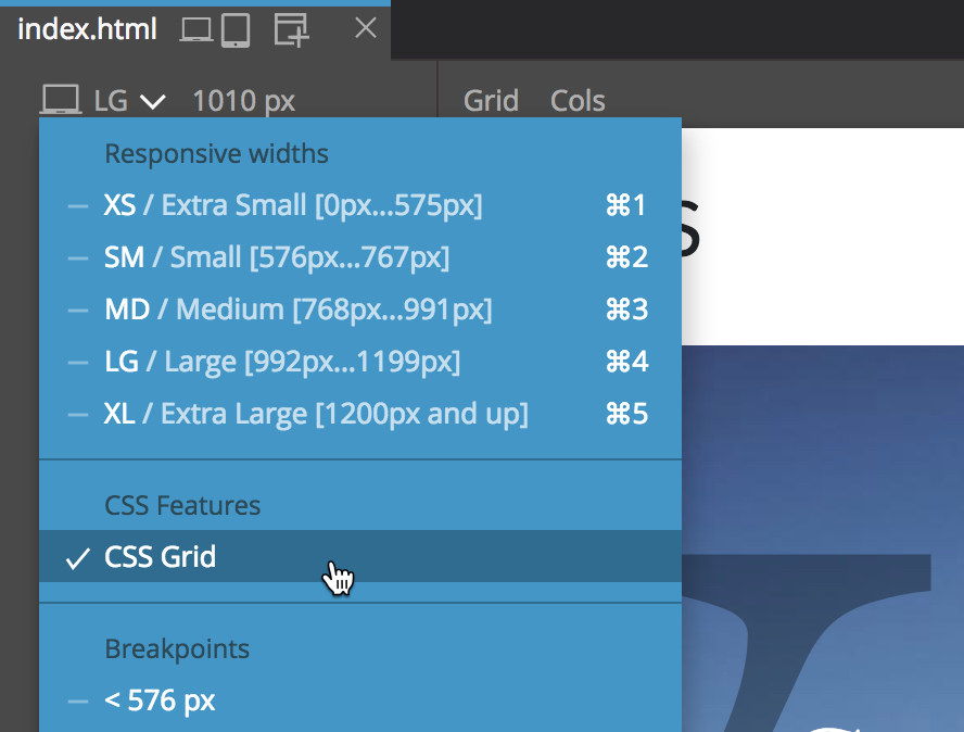
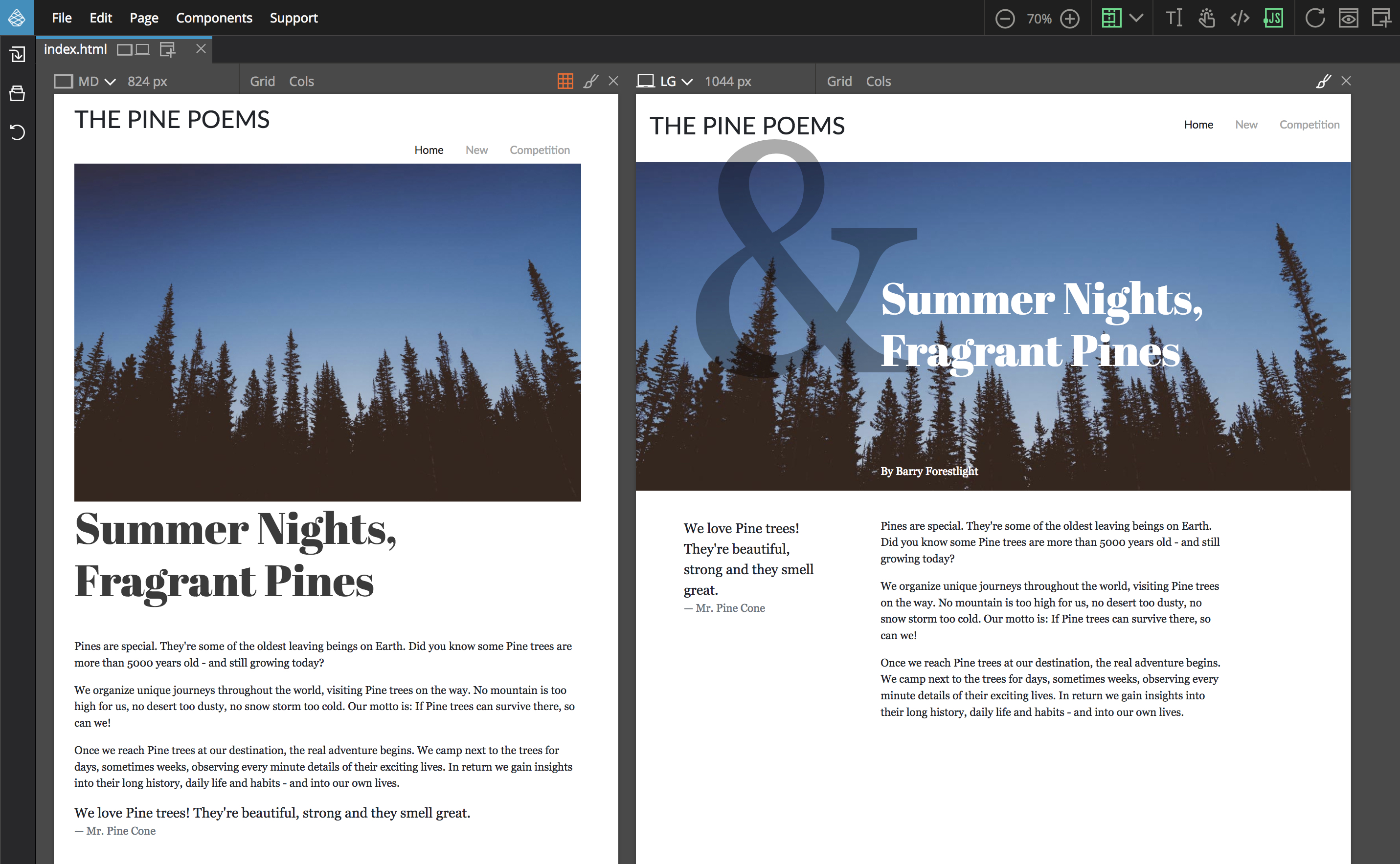
Responsive CSS Grids
In practice, it’s hard to come up with the single combination of the grid layout and elements positions that works well across different display sizes, from mobile to large desktops.
So, for different display sizes, we need to create either:
- Different grid layouts, or
- Different placements, or
- Both different layouts and different placements.
Option 3 is the least optimal. Things can quickly get out of hand and become unmaintainable messy. Imagine having different grid layouts and element placements for mobile, tablet, laptops and desktops.
We should strive for keeping things as simple as possible.
Using named areas and named tracks is a good approach. In that way we only need to deal with overriding grid definitions and only deal with placement of any elements that can’t use named areas and tracks, for example because of overlapping with other elements.
It’s also a good idea to choose (and stick with) a sensible media query strategy, for example Mobile first where CSS rules without media queries apply to all sizes and then media queries are used to redefine the styles from Breakpoint X and up.
Pinegrow lets us view and edit the page in multiple views. That’s a great help when we’re dealing with responsive designs.
Is CSS grid ready for production use?
According to Can I Use the CSS grid works on 88% of global devices. Although that’s an impressive (and growing) number, 10+% of users might still be too many to ignore.
Going into different fallback approaches is beyond the scope of this article.
The point is that Pinegrow can make creating fallback layouts much easier.
Turn CSS grid off to create fallback layouts
We can now toggle CSS grid support in individual page views in Pinegrow by toggling the CSS Grid setting in the device menu.
For example, we can have a page view with CSS grid support right next to a page view with disabled CSS grid support. All edits are immediately synced among the page views.
This feature make it easy to see what happens with our layouts in browsers that don’t support the CSS grid and to come up with CSS rules that target those browsers.
Using advanced grid properties
What if we need to use other grid CSS properties that are not editable with visual grid tools?
Pinegrow is a general purpose web editor that doesn’t tie you to using the visual tools alone. That means that we can use the CSS Editor or the code view to work with the whole set of grid properties alongside the visual grid tools.
Grid vs. Flexbox – a false choice
We might feel overwhelmed by the recent new CSS layout options: “Oh… I haven’t even mastered the Flexbox yet, and now it’s being replaced by the CSS grid!”
That’s a false choice. The CSS grid is not a replacement for the Flexbox. The CSS grid is used for defining true two dimensional grid layouts, while the Flexbox works only in one dimension, either columns or rows, not both.
Together they are a powerful combination.
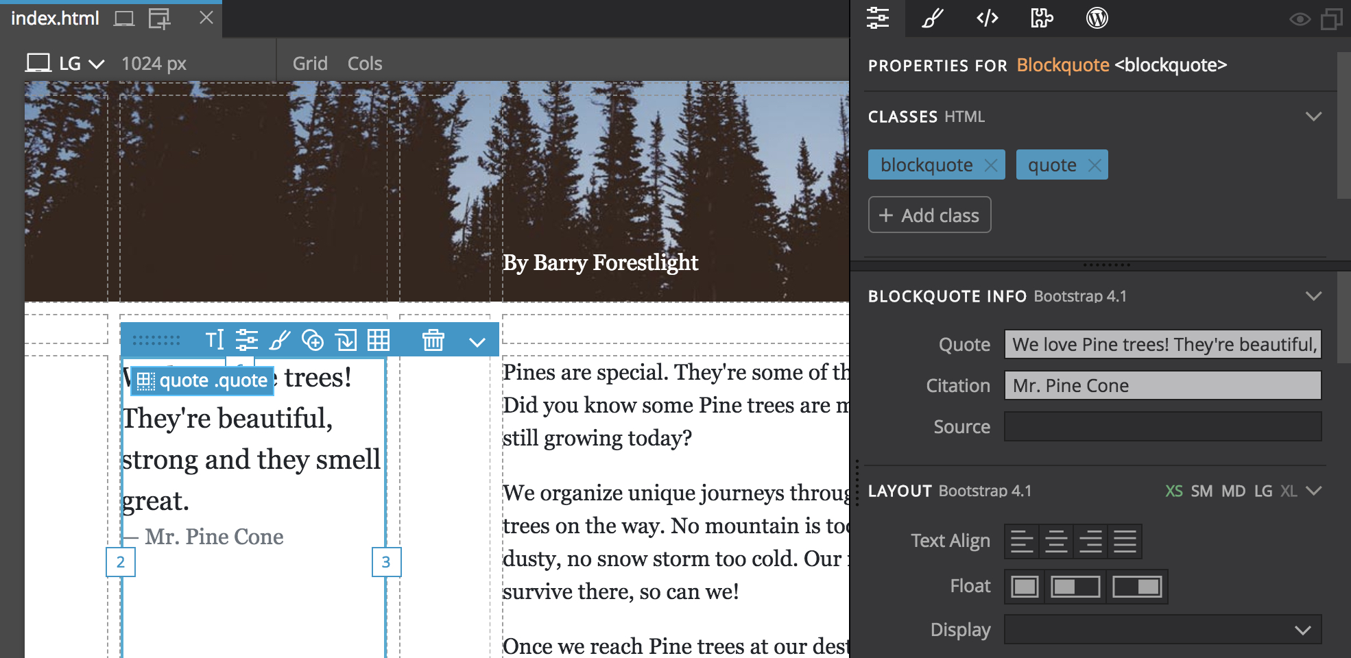
We can use the CSS grid to define the two dimensional layouts and use the Flexbox to define how items stack together within that layout.
For example, here we use Flexbox to center the quote vertically inside its grid area.
Grid vs. Bootstrap
At first glance it appears that the CSS grid makes Bootstrap obsolete. That’s true when it comes to the grid portion of Bootstrap: containers, rows and columns.
Those can be easily replaced and enhanced by using the CSS grid.
But Bootstrap is more than just columns: it provides typography, buttons, navigation bars, cards, modals and more, all styled to fit nicely together.
In fact, Bootstrap and the CSS grid can be effectively used together.
Bootstrap components can be easily placed into CSS grids.
And, with a couple of extra CSS rules, Bootstrap containers, rows and columns can even be used as a fallback layout for browsers that don’t support the CSS grid.
The CSS grid doesn’t add much bloat to our projects. If we’re fine with shipping Bootstrap CSS and Javascript assets without project, using the CSS grid will just add a small number of extra CSS rules and no outside dependencies.
Next steps
That concludes our overview of new Pinegrow visual CSS grid features. Just download the latest Pinegrow release and take them for a spin.
Check out the Summer Nights CSS Grid tutorial where we’ll create a responsive CSS grid layout with non-grid fallback from scratch.
Or take a look at the Learn CSS Grid with Pinegrow course covering the basics of CSS Grid.
If you just need a quick 3-minute overview of how CSS Grid works in Pinegrow, watch this video:
For the end, a warning:
Once you try the CSS grid, especially in combination with Pinegrow’s visual tools, it will be very hard to go back to using any other layout method. Proceed at your own risk of newly discovered web creativity. 🙂